Office Design: Commercial Integrity NW

A few weeks ago, we wrapped up one of our most recent projects, a commercial office revamp in downtown Portland for our clients at Commercial Integrity NW.  With every project, it presented itself with some challenges but the potential was completely evident from the beginning.  For the later part of 2017, we spent some time developing a new layout for this special space, sourcing new furnishings, as well as creating custom pieces and art to create a cohesive and refined look that better represented our clients and their business.  The result: A warm and inviting office space that exudes the old world/modern vibe our clients desired.   We are in love.

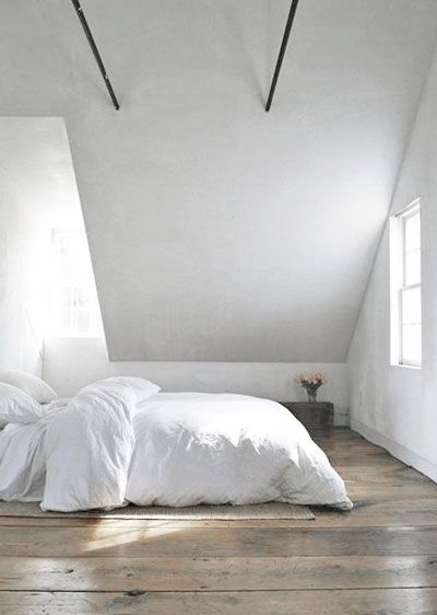
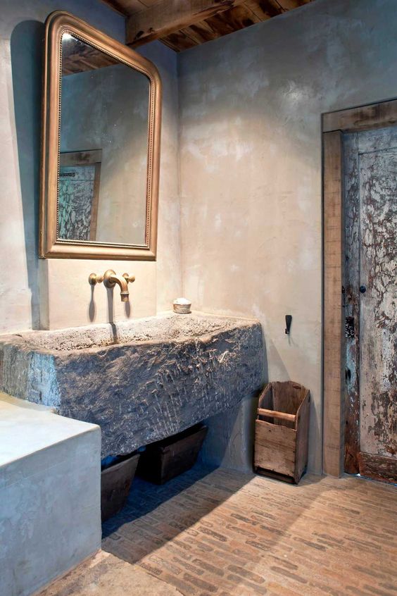
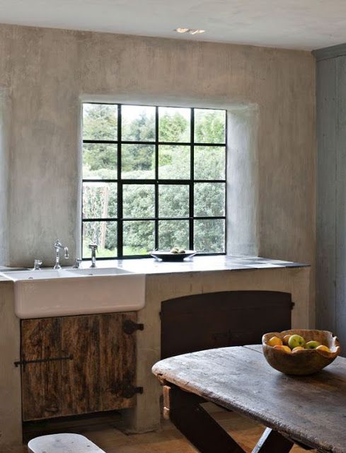
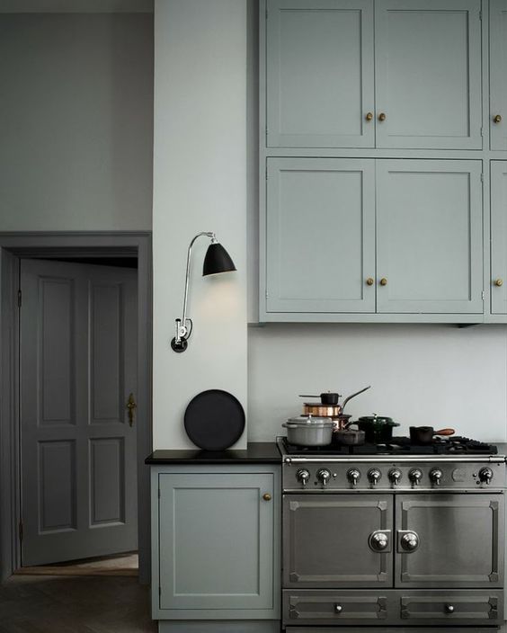
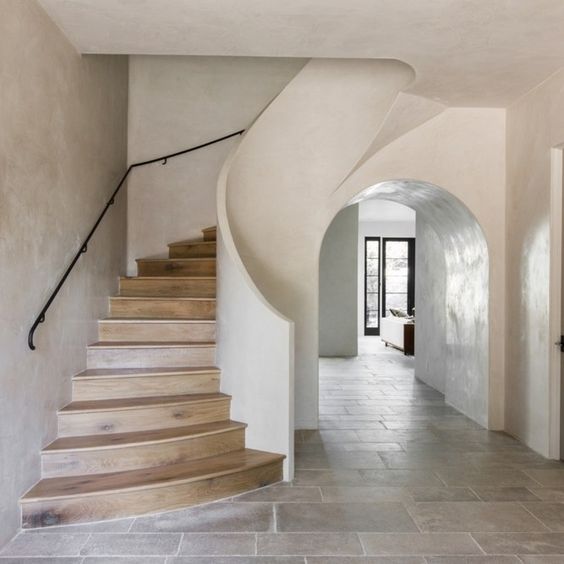
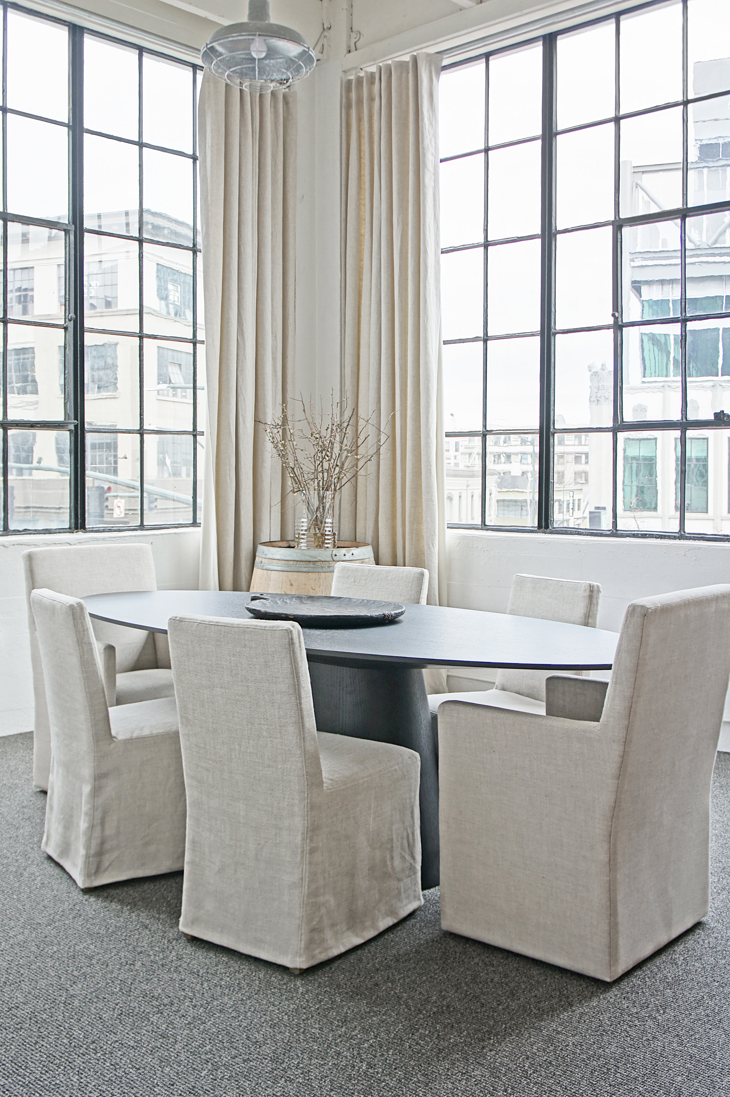
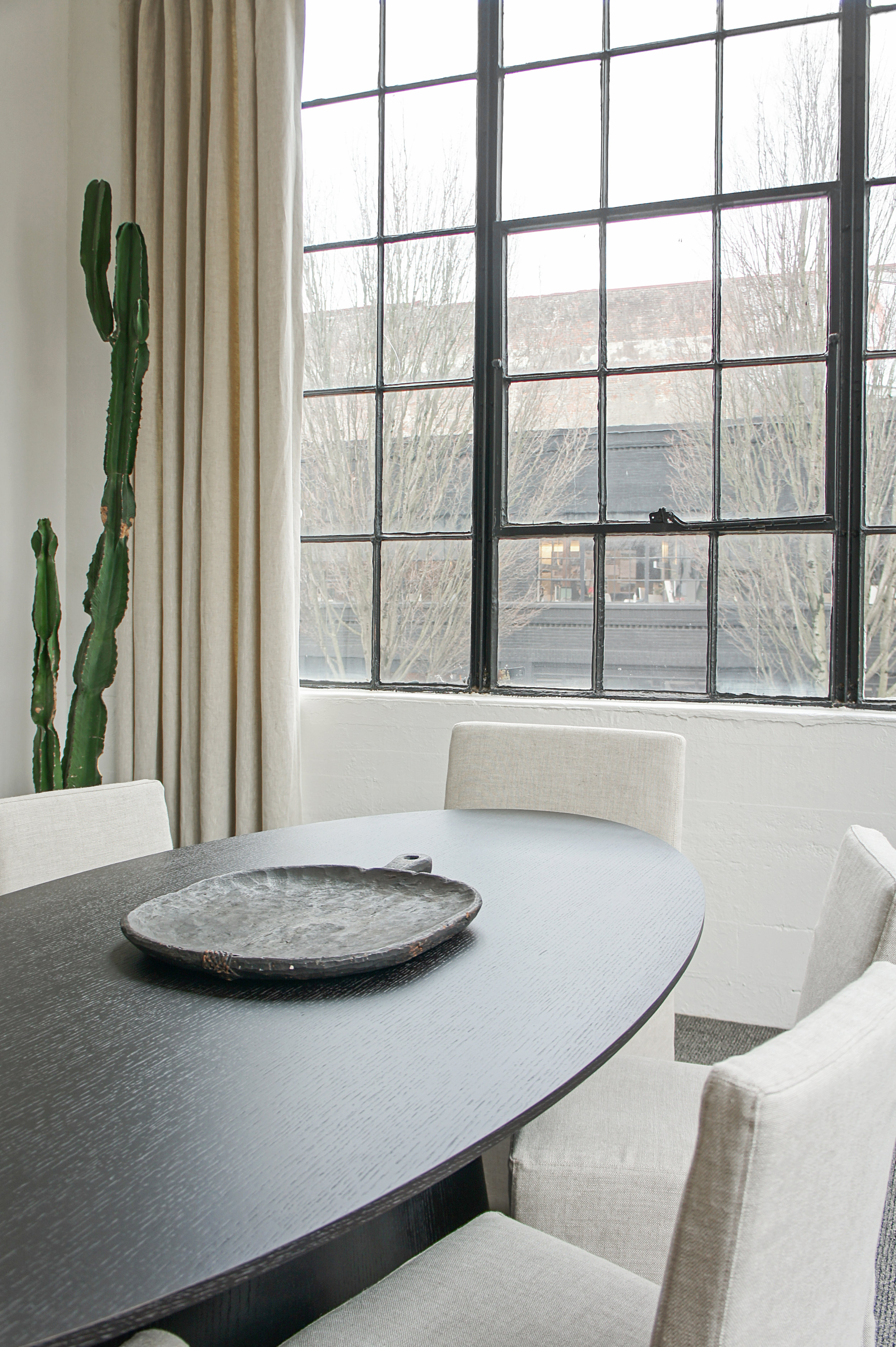
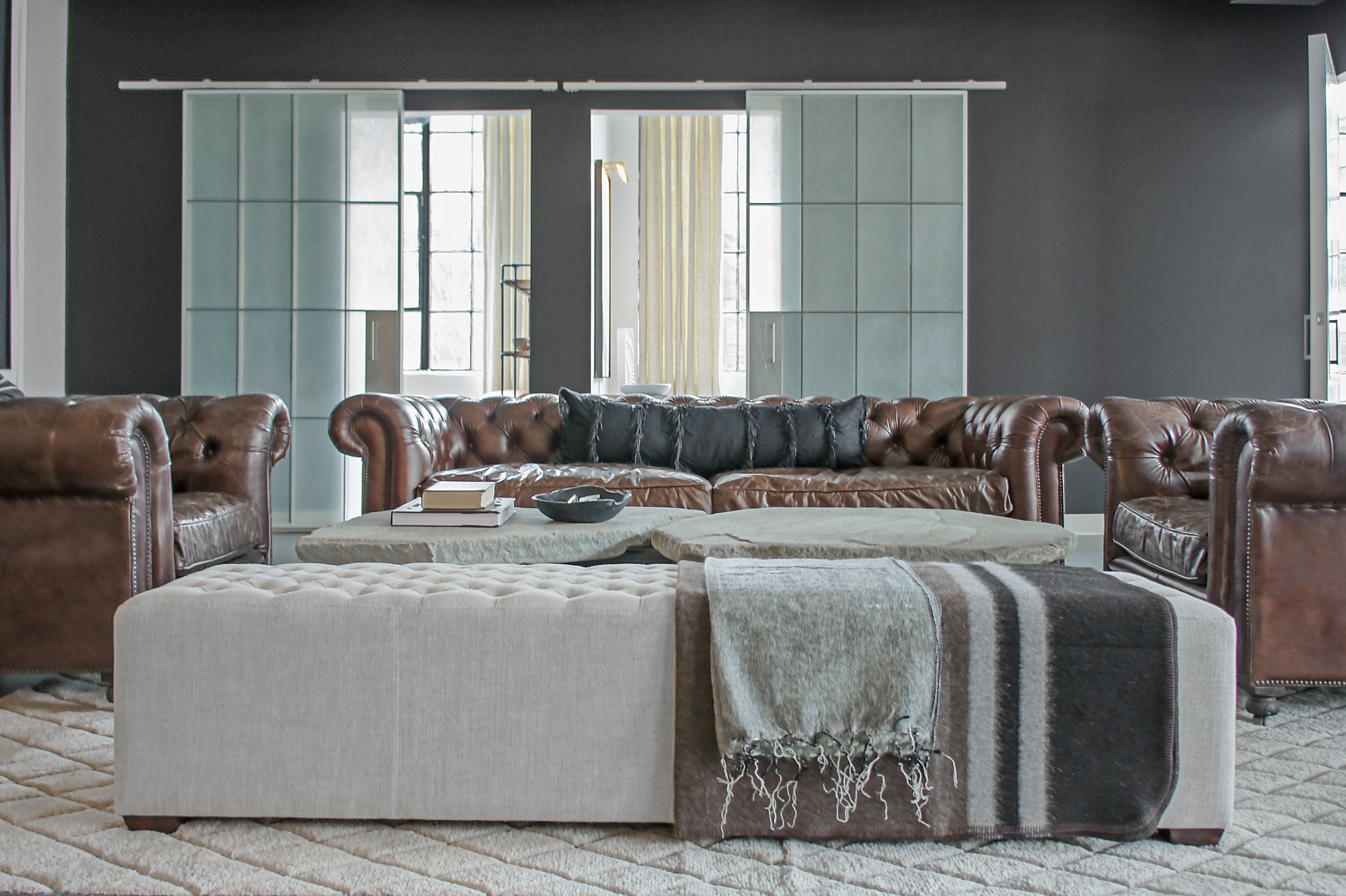
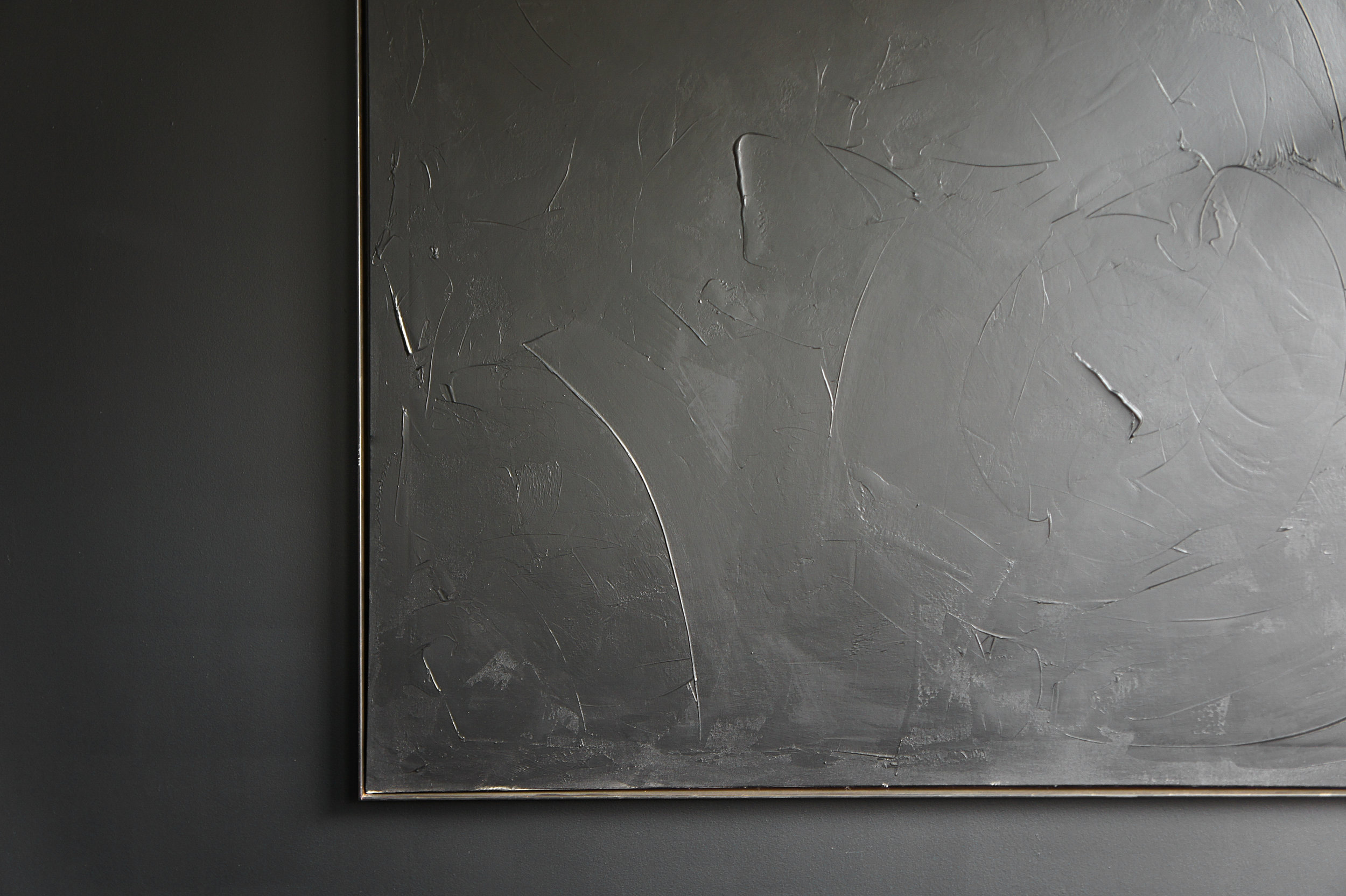
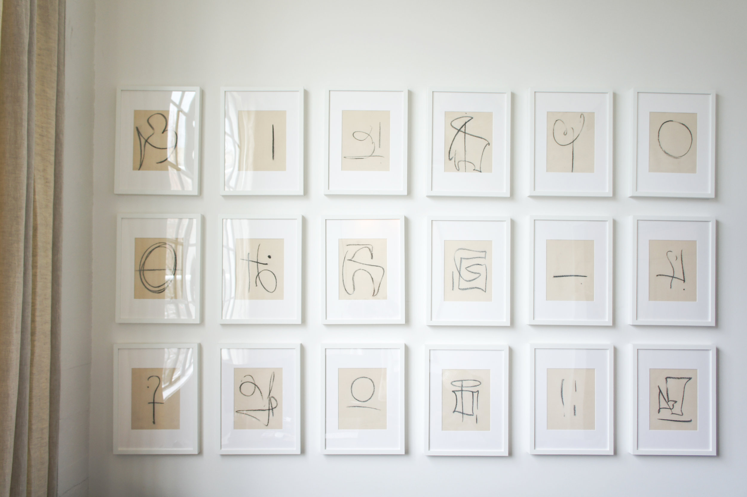
The office space is located within an older industrial building in downtown Portland.  The existing bones and character of the building were a great starting point to work off of with the design.  We loved the industrial vibe of the space, with the original steel windows, high (beamed) ceilings and elements of concrete throughout but we wanted to make the space feel more inviting...almost like walking into a fabulous hotel.  With that in mind, our plan was to soften the industrial a bit, bring in more natural and rustic character and add some amazing large scale art (because this space could definitely handle it)!

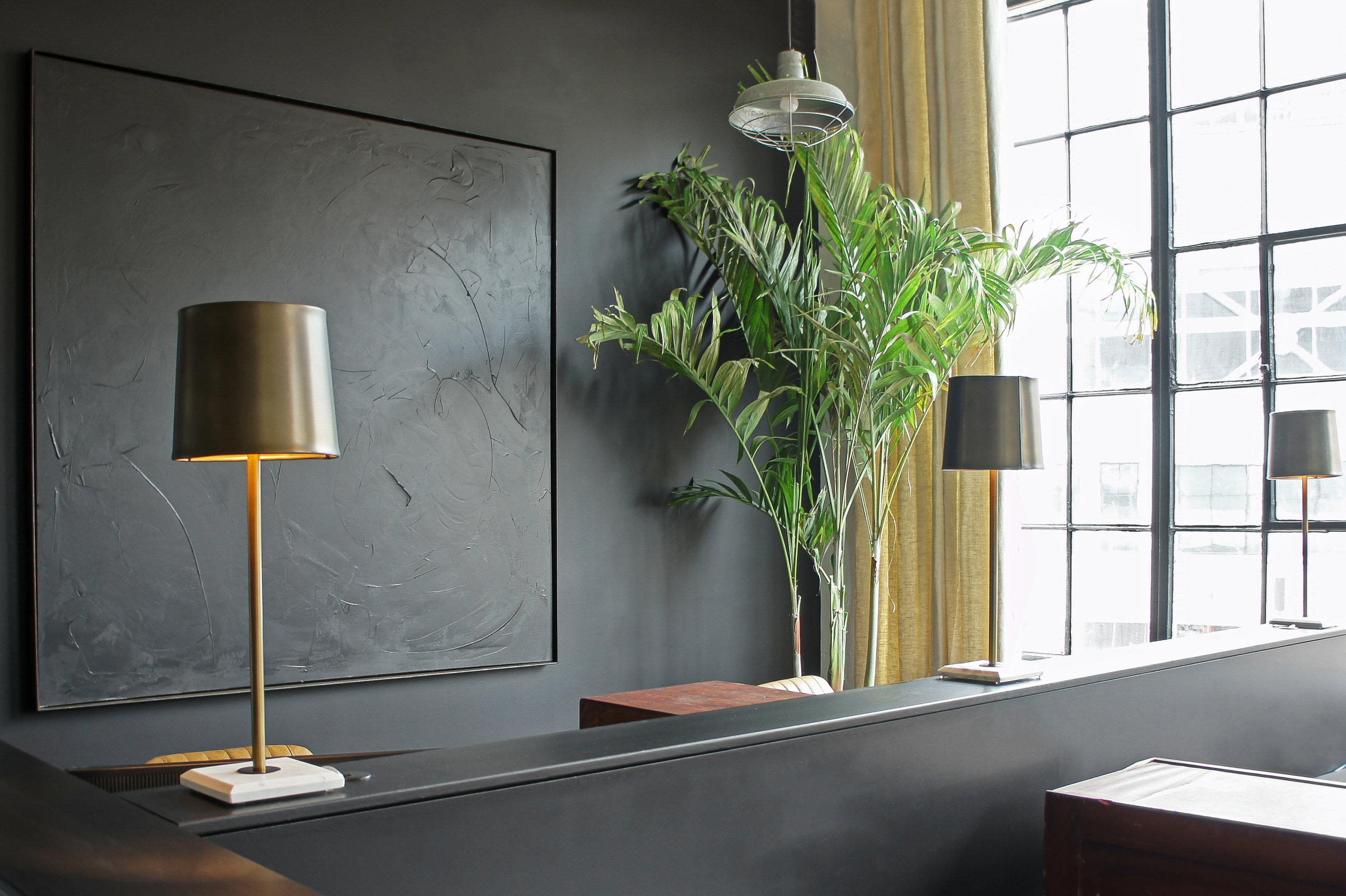
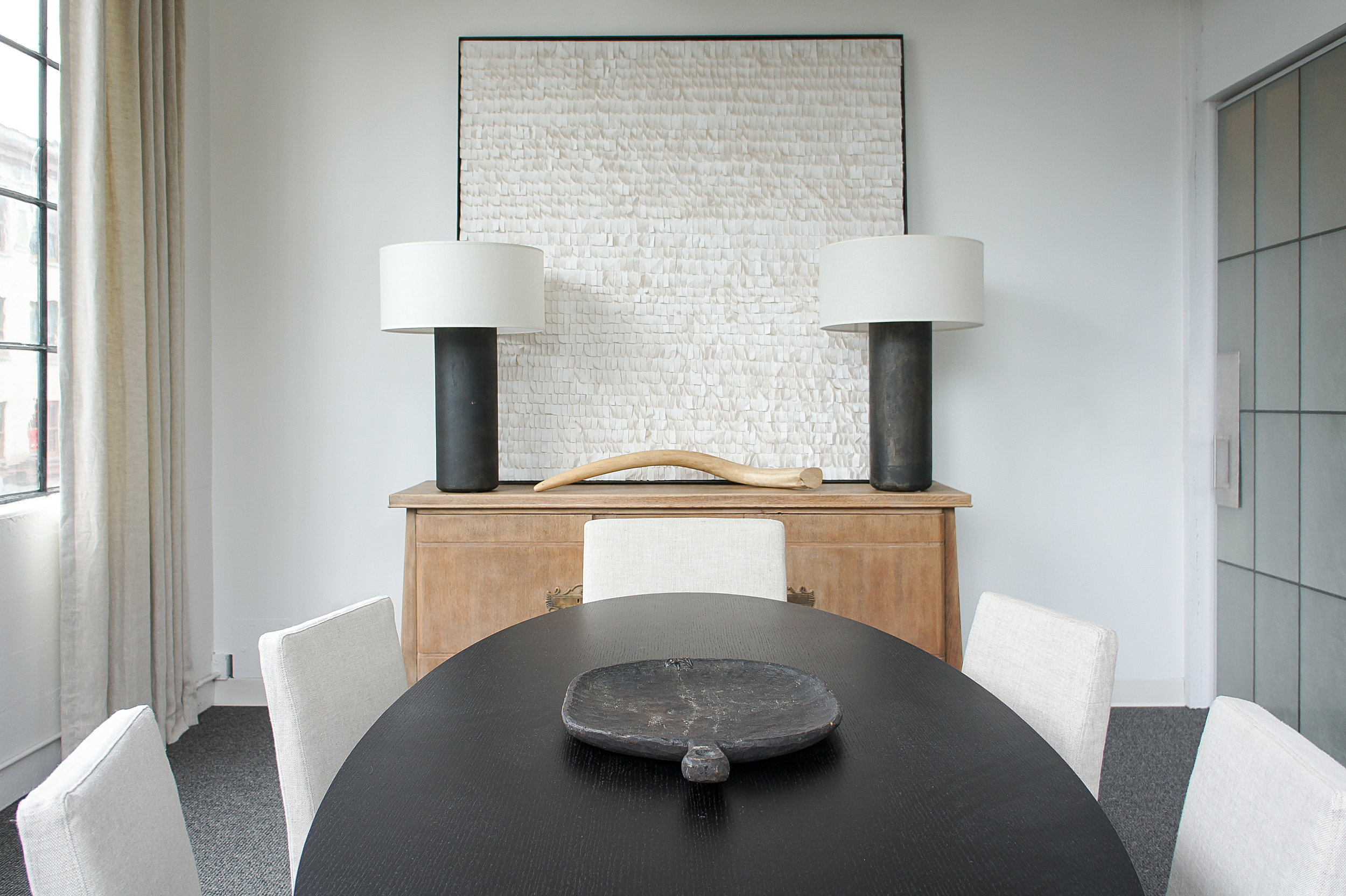
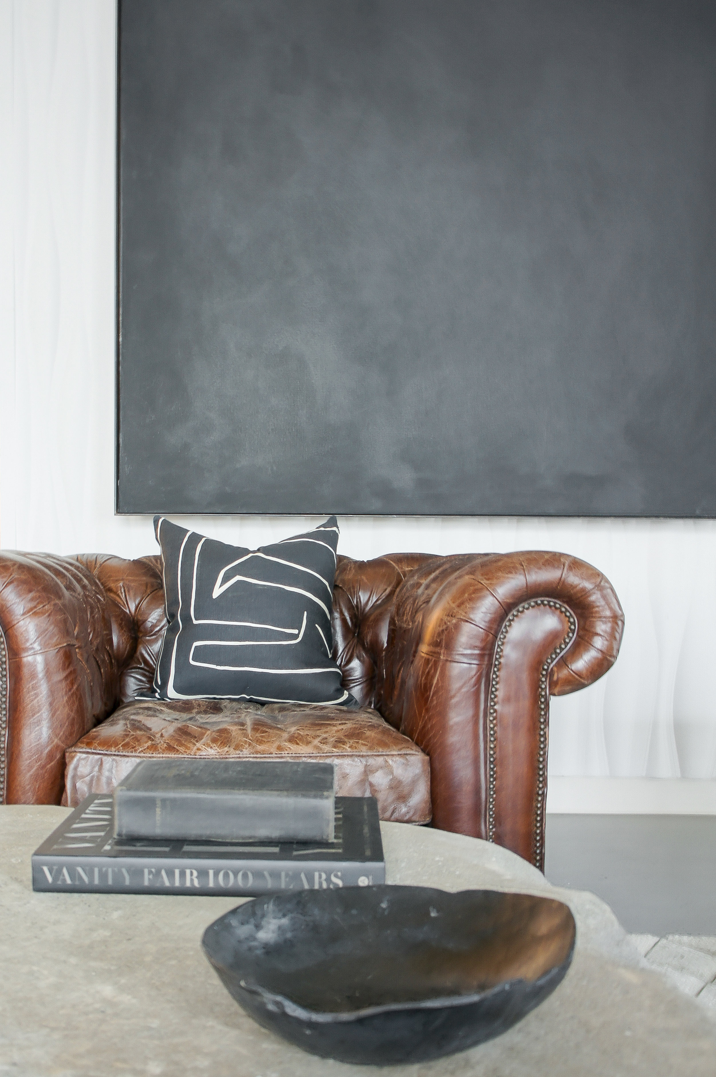
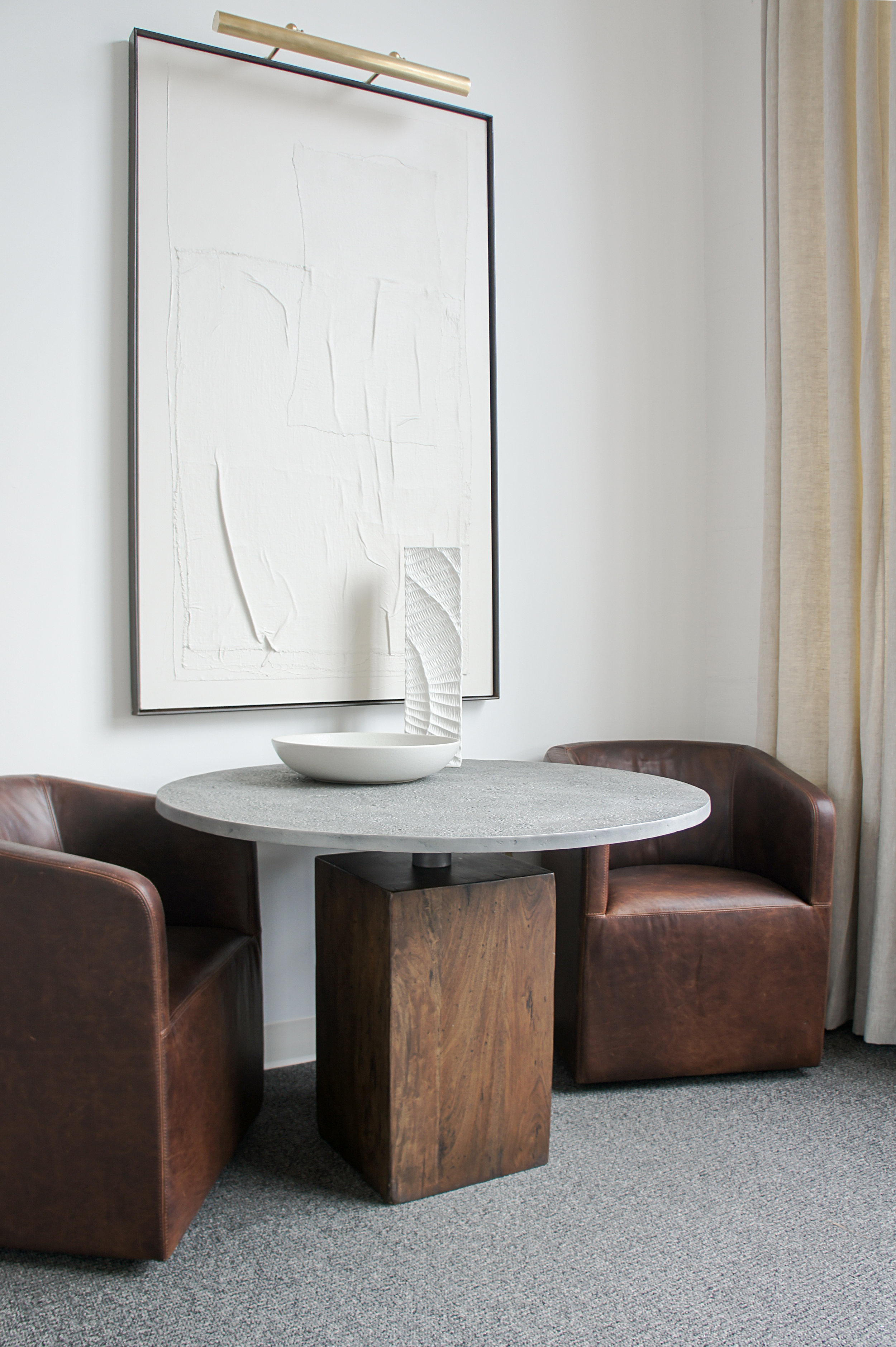
We balanced black with white, new with old, soft with hard.  To us, that tension is what makes a space interesting and it worked perfectly for this project.

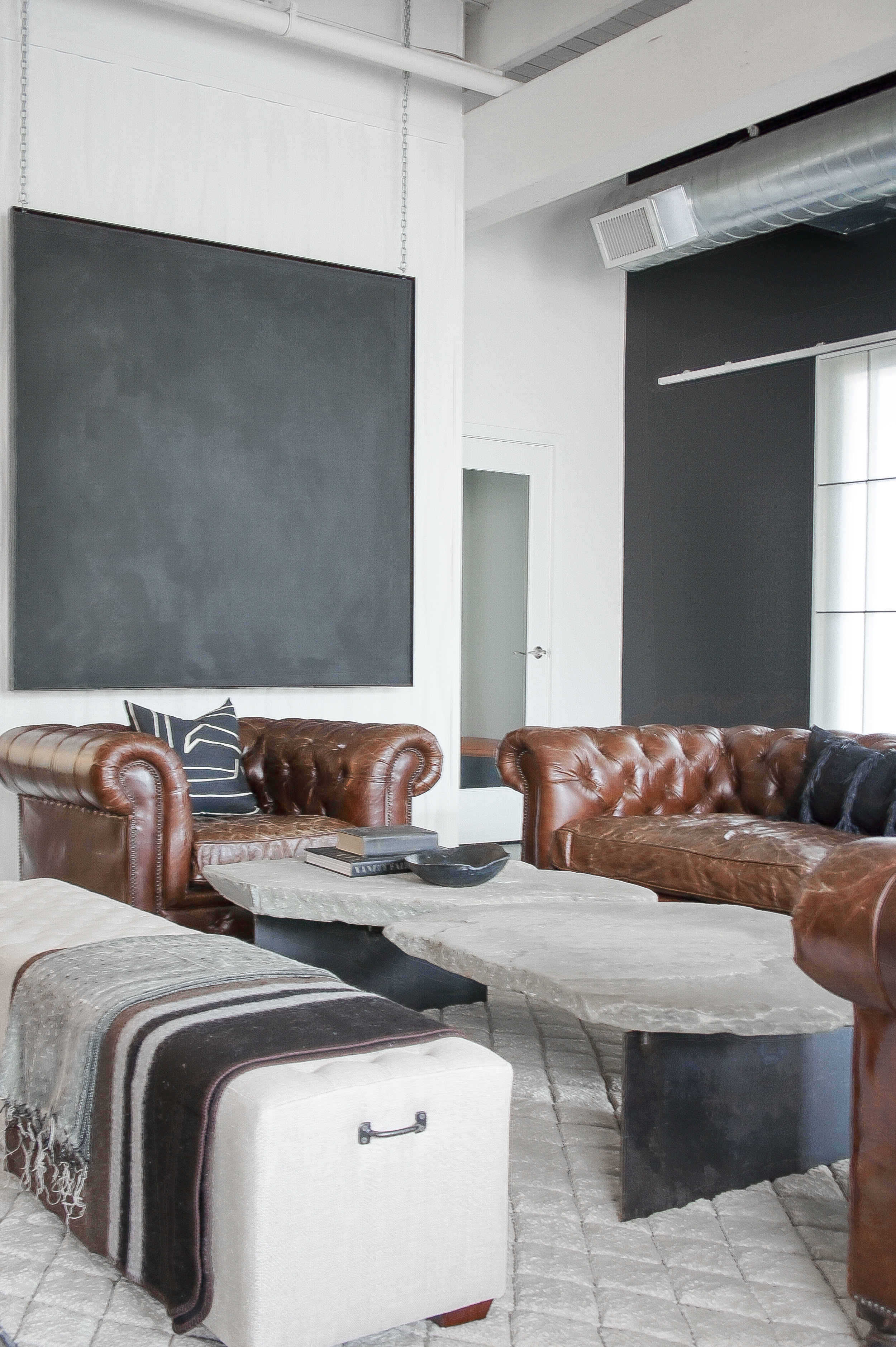
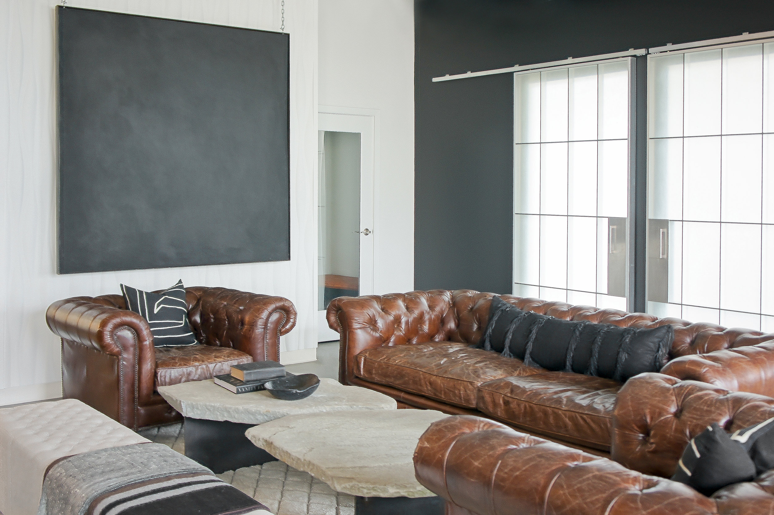
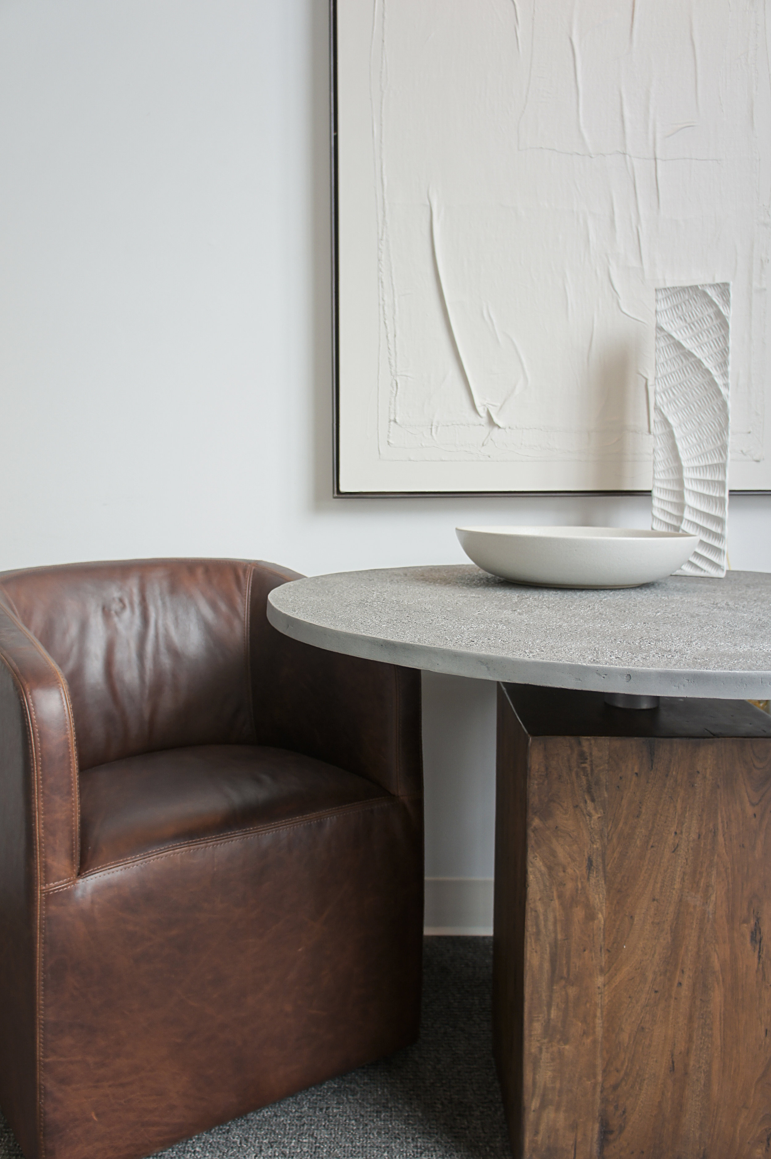
We were able to incorporate some of the client's existing pieces into the design (i.e., the leather chesterfields) and balanced them with a custom, rustic but modern coffee table and modern art.  Keeping that old world/modern aesthetic in mind, the ultimate goal for the design was to create an uplifting and inspiring vibe for the office.  The bright spaces were kept bright and the areas that lended more to the moody vibe, got that exact treatment.  The result creates a beautiful balance and much intrigue when walking the spaces.

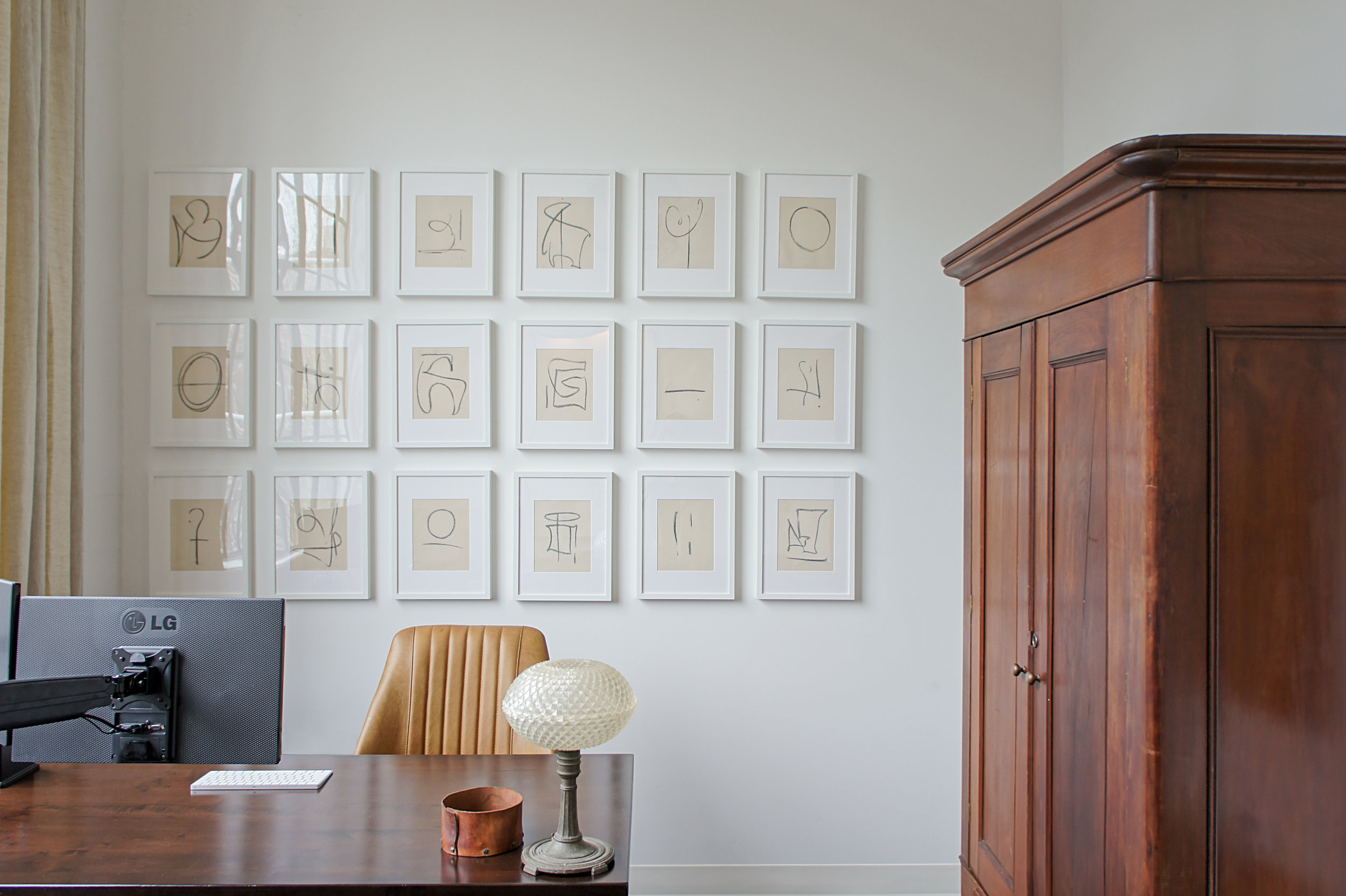
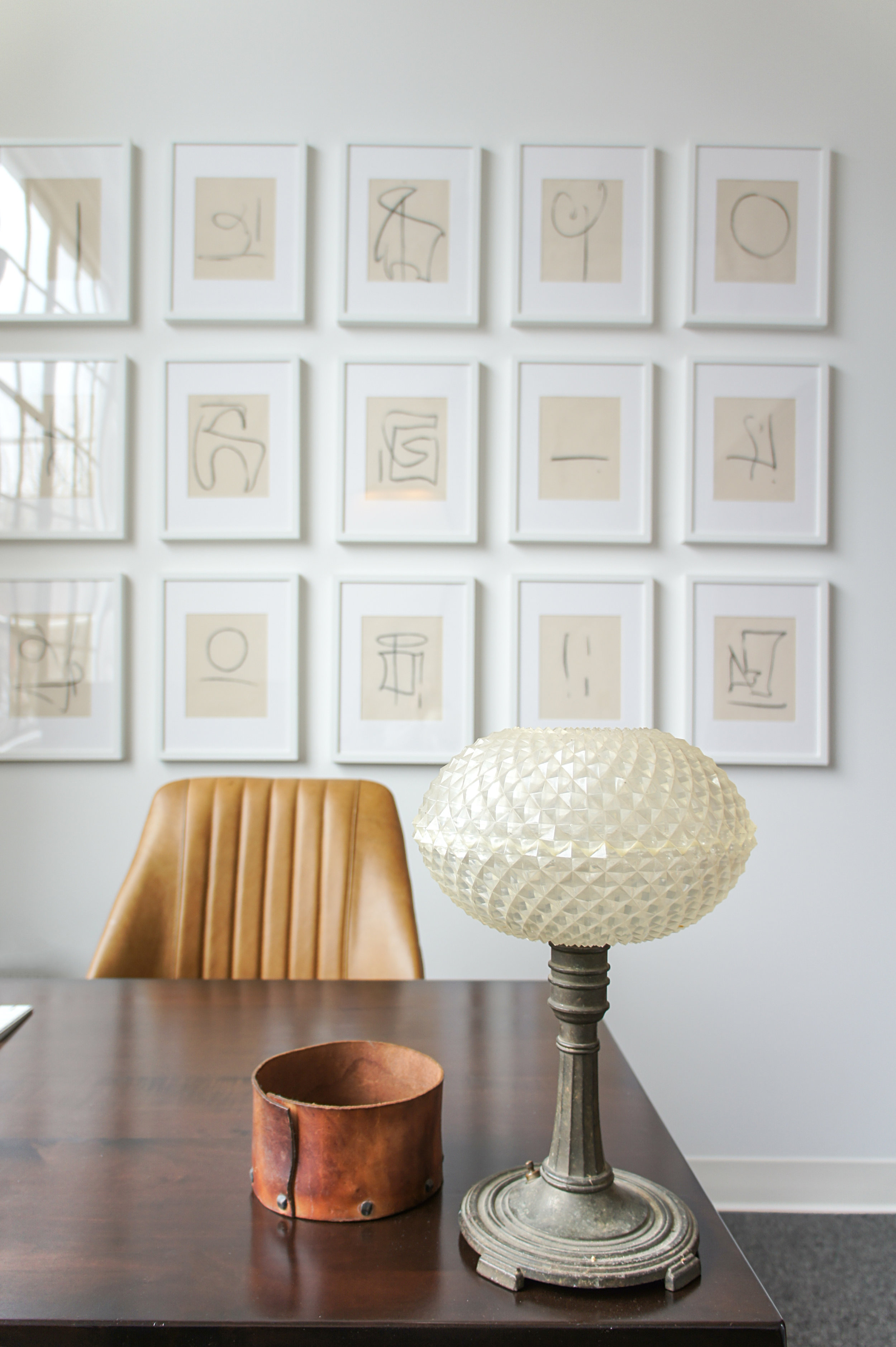
Since this is a commercial office space, we kept the styling and accessories to a minimum.  We didn't want our clients or the people they bring into the space to feel overwhelmed with visual clutter.  First and foremost, this is a place of business and we wanted to respect that.  However, a commercial space does not have to feel "commercial" and that is where we chose to change things up a bit.

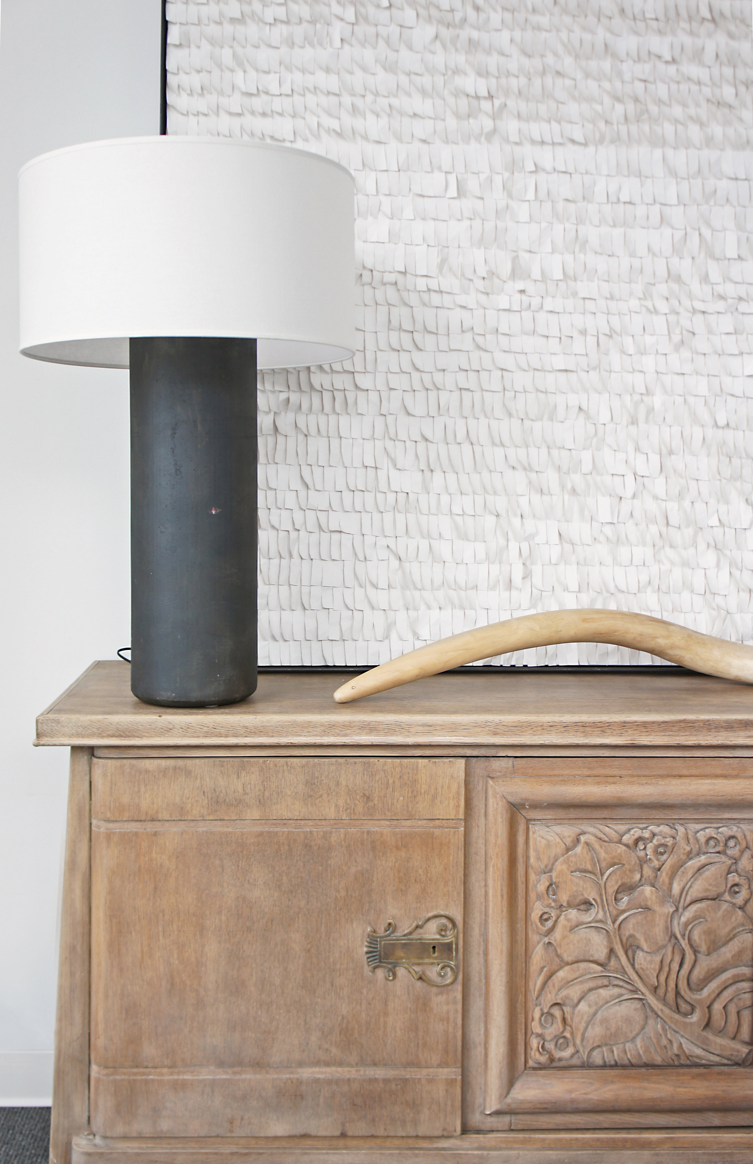
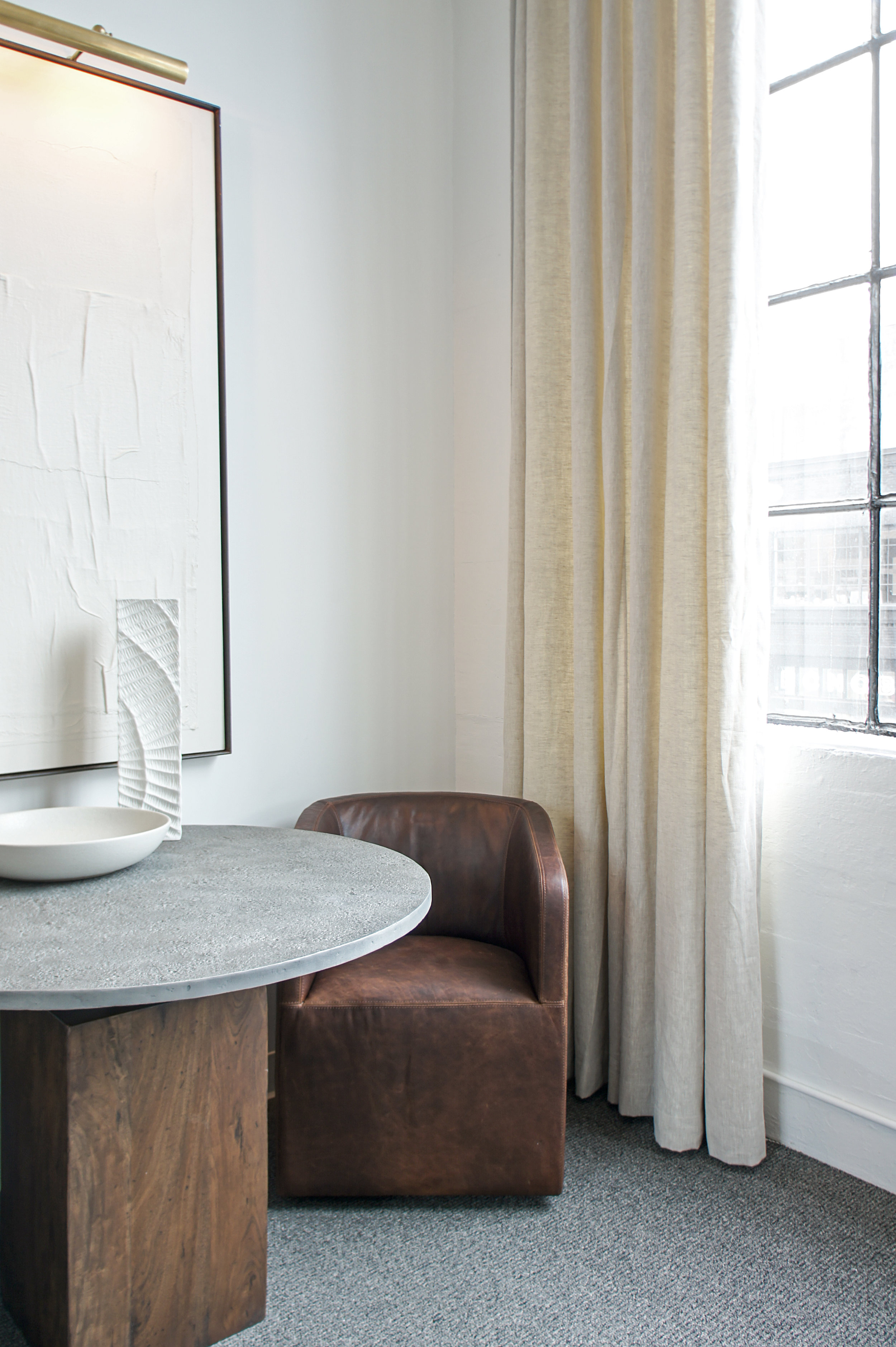
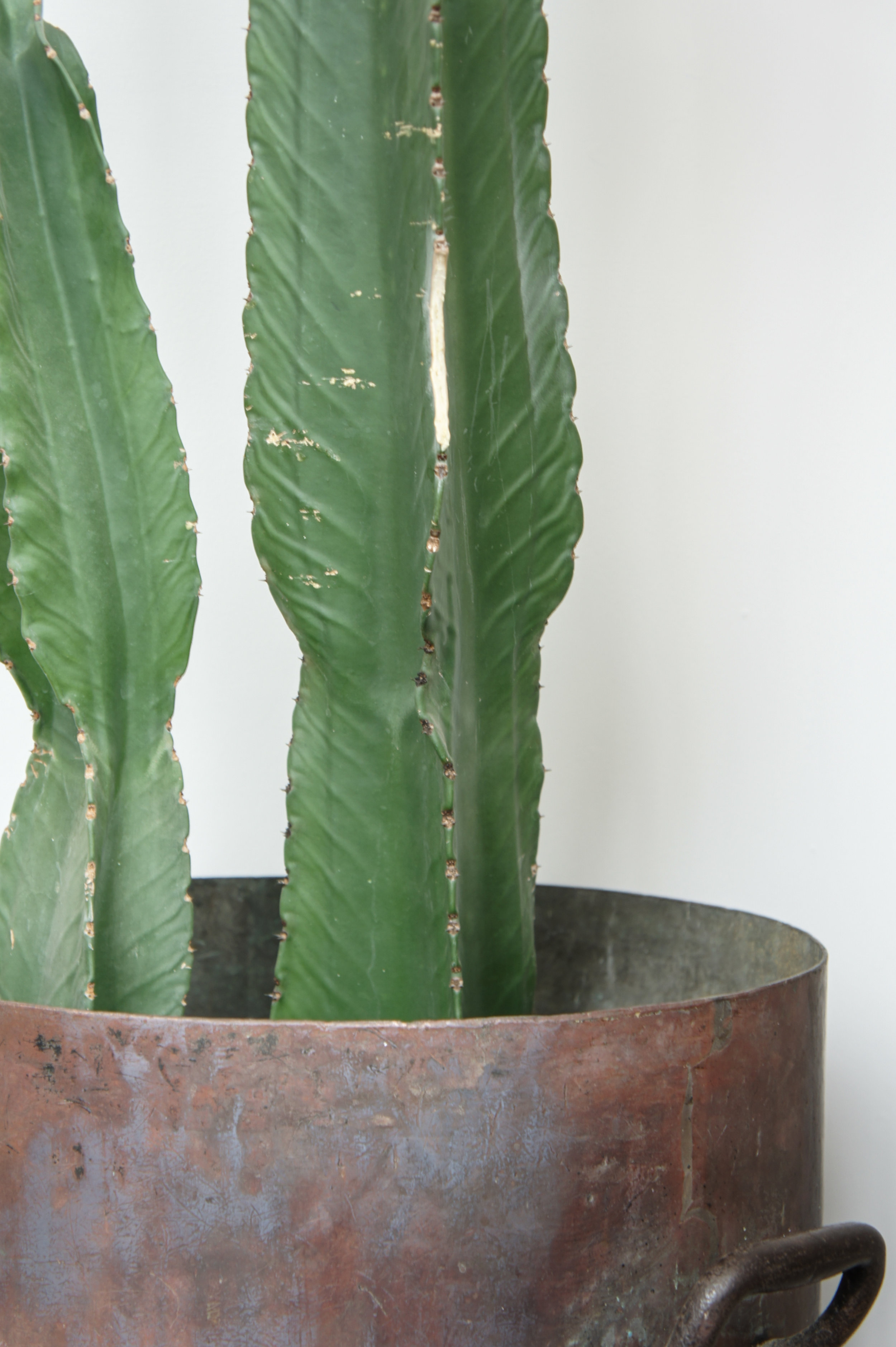
We opted for a more neutral color palette with this design and instead, played with tones, texture and natural materials.  You know us, we love a space that begs to be touched!

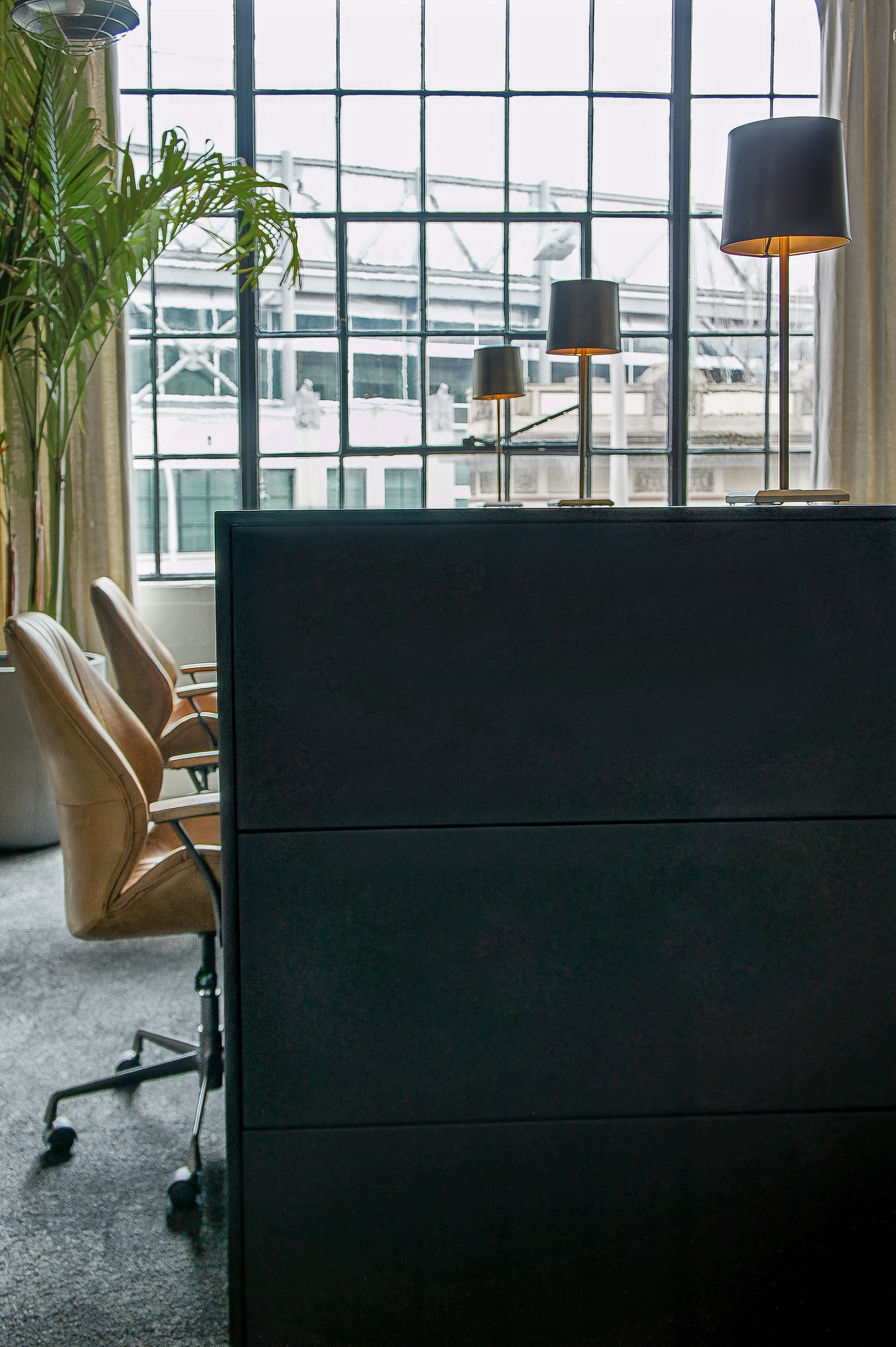
One of our favorite additions to this project was designing and building this large modern wall that sectioned off the public desk spaces from the lounge area.  Being a slightly open concept office, we didn't want to divide this space completely off but we did want to give it a little privacy.  We also wanted to clean up the look of the previous layout and thought hiding the desks  and their contents was of utmost importance.  Fitting in with the old world/modern look, we created a streamlined modern wall but balanced it with aged brass library style lamps.  We then separated the desks on each side of the wall with antique filing cabinets for privacy and of course, juxtaposition!  The office chairs finished off the look being the perfect combination of all the elements.

Again, so ecstatic to see this vision come to life.  The clients, the space, the results, we couldn't have asked for more.  Cheers to your new space Commercial Integrity NW and thank you for choosing us to be part of it!

~C&B

In the Works...

Since it has now been over three months, we thought it would be appropriate for an update here on the blog.  Yikes.  2017 has been a year of changes for us, but it has been exciting and gratifying.  At the beginning of the year, we converted over to a full-service design firm and it has brought a variety of opportunities and wonderful client relationships.  We have some exciting projects in the works that we will update more on very soon...can't wait to share!  We can however, share a more personal project we are breaking ground on today.  For years, we have dreamed of designing and owning our own rentals and after months of planning, we have finally decided there is no better time then now.  We are finally doing it...we are building an ADU!

We have already started the preliminary architecture and design on our "little house" and we are quite excited about it.  Since the rental will be on our property, it will be our most personal project to date.  We will be treating it as a design testing grounds for a larger and even MORE personal project coming soon, our house.  The "little house" will be the first in a series of many projects on our property.  You know us, we are huge dreamers and we love buying homes that need (a lot of) love.  So here's a little peek of what is inspiring this new, and very personal project!

The building will be small (approx. 400 sq/ft) but our goal is to pack it with a ton of character.  The plan is to keep the shape simple, much like the architecture of our house and add character with materials and architectural detailing...think smooth stucco siding with deep window wells on a simplistic, slightly modern shape.

We absolutely love Belgian and European farmsteads with their series of disconnected or semi connected buildings.  We do not live on a farm...actually quite far from it, but our property is larger than most in Portland and we always dream about owning farmland.  Our thoughts are this, since we are unable to live in the country right now, we will bring the farm (and country vibe) to us!  Our setup will be on a smaller scale, but similar in vibe.  We absolutely love the idea of multiple structures that surround a general courtyard, it's intimate and inviting.

For the inside, we want warm, humble, natural materials with a slightly modern aesthetic.  We want to try our hand at frameless oak doors (major swoon) and custom iron collar ties that will show off the vaulted ceilings and plasterwork.

Again.  More natural materials and warmth.  We are currently obsessed with customizing a monolith sink (coined and inspired by one of our current clients *wink *wink) similar to the one above.  We may have to crane it in and build it in place, but anything for the sake of design!  Since the space is smaller, we have made the layout fit as a studio, but with all the amenities of a home.  We have a small kitchen designed that will be packed with functionality and yes, aesthetics.  

We are excited to finally start on this project and can't wait to source and create the unique pieces to fill the space.  Our hope is that we will be done by spring 2018 (fingers crossed).  We can't wait to share this project with everyone!  Look for more updates on our Instagram and stories.

~C&B

The Art of Mixing Metals


Remember sometime in the not so distant past when someone came up with the idea that every single piece of hardware should match in a home?  Yeah, we get the idea...matching is good.  To us though, matching versus cohesiveness take on completely different meanings.  We like cohesive.  We like interest.  We like authenticity.  You get the drill.  Our thoughts are this, when you match every piece of hardware in your home, that authentic look is immediately lost.  Matching also creates a predictable look that can read as bland, and in some cases, boring.  In other situations, matching can take on the opposite effect, resulting in a garish look that overwhelms.  So our opinion is...mix the metals people!  Here are some excellent examples of some spaces killing the mixed metal game!

We believe design is less about the "rules" and more about having an open mind.  

Tip:  First and foremost, have no fear and have an open mind...don't be scared to experiment!

Belgians are the masters of mixing materials...so when it comes to mixing metals, they are the forerunners.  

Tip:  Be unconventional in the mix.  We love how Benoit Viaene chose to incorporate this polished bronze sink paired with a blackened tap.

Another master of the mix, Studio Piet Boon makes a statement with their metal usage.

Tip:  In a neutral or tonal space, make the metals the focal point.  We love how the brushed nickel taps act as a neutral while the blackened steel mirrors and lights add contrast.

Well, of course we had to include ourselves in this post, we LOVE mixing metals!

Tip:  Don't just limit yourself to two different metal types, add another to the mix!  Here we are using three different metals, brass, aged zinc and blackened steel and they all play together nicely.

Yeah, we did.  We included the piece de resistance to our theory...and another example of our love for a healthy patina, but we will save that conversation for later!

Tip:  Treat your metals like you would paint.  Mostly, metals play as neutrals, so why not use them to cover a surface?  We love this usage of aged brass and zinc...jaw dropping!

~C&B


Our Most Dramatic Before and Afters: Part One


As some of you know, we are no strangers to the most dilapidated, nasty houses out there.  In fact, we are drawn to them.  We can't help it, it is in our blood to walk down the street, stop in our tracks and gawk at the ugliest house; dreaming up solutions to make it dreamy.  So we thought it would be appropriate to share our most dramatic transformations over the years.  Take a look at the magic!

One of our most popular houses, the exterior transformation of Tabor takes the cake.  This house sat on the market for months before we decided to set foot inside.  I know.  Even we didn't want to look at it!  It was ugly and forgettable.  Once we had the chance to tour Tabor, our opinions changed.  The inside was charming and we couldn't beat the location.  So we got to work.  First things first, take off all the cheap awnings.  We then proceeded to simplify the roofline and give the house some much needed street presence.  We deliberated on color and decided on this moody, edgy charcoal brown...it was the perfect choice.  The final touch was to add a little character back with the reclaimed wood entry awning and aged brass lanterns.  It is now our version of a modernized Tudor/Storybook home and we still adore it!

While not as dilapidated as the rest of the homes we have worked on, Emerson's transformation was dramatic in a different way.  The previous owner had done a quick clean up and reno of the house before putting it on the market and although it was clean and relatively new, there was a lot of room for improvement.  Case in point, the kitchen that we turned into a built-in dining room.  The original layout of Emerson was...interesting, so in order to improve it we swapped the locations of the original kitchen and dining room with each other.  The space for the original dining room was large, so why not make that the kitchen and utilize the space the original kitchen was crammed into to make a cozy built-in dining area?  No brainer to us!  Since the space was around 7X10 we knew we had to get creative.  We had the idea to completely customize the space and build it into the existing room, creating an oversized built-in dining nook.  Don't let the pictures fool you...the space is larger than it looks and can seat up to 10 if two chairs were pulled to the head of the table.  To create that cozy nook vibe, we had the room clad in reclaimed fir, which was also used for the built-in benches.  A custom hand made zinc table completed the look and infused the space with the warmth and character is was lacking originally.  This is one of our all time favorite rooms we have created.

Yes, those photos are taken from the same location.  The upper floor in this particular home was extremely chopped up and not functional.  The two rooms before posed and interesting problem, they were both tiny, interestingly shaped and on separate levels!  This home was built by a ship Capitan so those original spaces and layouts make a little more sense?  Who knows?  Anyway, the potential of these two odd rooms excited us and we decided to incorporate their oddness into our design concept.  Our thoughts: simplify the two spaces by taking out that wall in the middle and combine them into one.   However, we did not want to over simplify the space.  We chose to keep the connected rooms on separate levels by adding a set of stairs.  Since the upstairs desperately needed a bathroom, a bathroom it became.  Since we wanted to keep the space more traditional, we opted for classic white subway tile with the octagon and square tile as the flooring.  Brass hardware and a salvaged antique skirted tub also contributed to the traditional aesthetic.  We opted for darker walls and grout to add a little drama to the space and dramatic it is!

One of our all time favorite houses, Morrison wasn't the ugliest or the most dilapidated of the bunch...it was simply out-dated.  Although we spent a good amount of time time fixing the bad renos it had endured over the years, the house was an amazing project in need of some smart design decisions to bring it back to life.  From the beginning, we spent a large amount of time researching Victorian homes since there were a lot of layout changes that needed to be made.  One obvious change that immediately went into effect was opening the wall underneath the stairway...true to an original Victorian layout.  From there, we had to relocate the kitchen back to it's original spot which had been moved elsewhere sometime in the past.  However, one of the most simple, but dramatic transformations this house endured was giving that staircase a new coat of paint.  We chose a charcoal color to modernize the look of the stairs, painting them all one color...something we have been known to do a time or two!  The before/afters are simply stunning and proof that a simple coat of paint can completely change a space.

There you have it!  A handful of our most dramatic transformations over the years.  Since there is a whole lot more where that came from, we decided to make this a multiple part series.  Transformations...they are kinda our thing!  More to come!

~C&B


OBSESSIONS: Plaster staircases


Plaster.  Oak.  Steel.  Three of our all-time favorite elements in a home.  Add them to a dreamy and architectural staircase, and amazing things are bound to happen.  More typical in European design, the use of plaster is gaining popularity here in the states and we love that.  When added to something as architectural as a staircase, plaster has a way of simplifying something that can be quite complex to the eye.  Let's not confuse simplicity with plain or boring though, because plaster has depth and texture it adds to the mix.  That depth creates a livable, touchable, surface that in most cases, needs nothing more added to it.  Applied to the walls of a staircase and mixed with wood and steel, the space becomes nothing less than a work of art.  Here is a small collection of some of our long time and even more recent favorite plaster staircases.  We look forward to creating some of our own!  Enjoy! 

-C&B

Design: Vincent Van Duysen

Design: Vincent Van Duysen

Design: Benoit Viaene

Design: Benoit Viaene

Design: Axel Vervoordt

Design: Axel Vervoordt

Design: Leigh Hezig

Design: Leigh Hezig

Design: Benoit Viaene

Design: Benoit Viaene

Design: More Design

Design: More Design