Tabor House. Done.


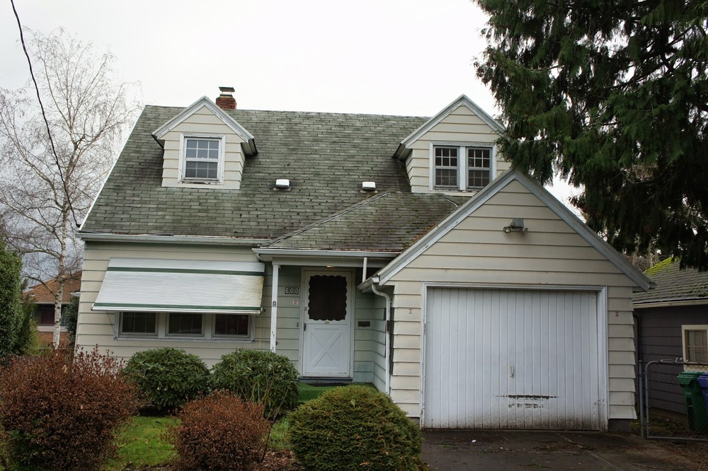
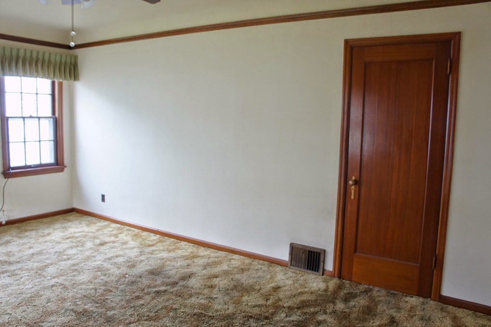
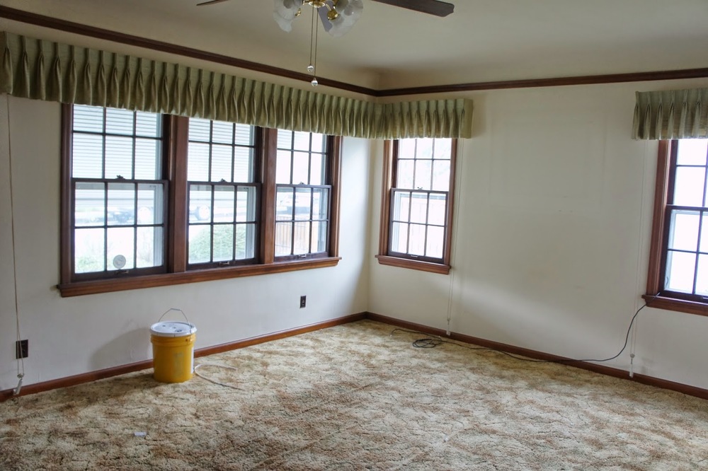
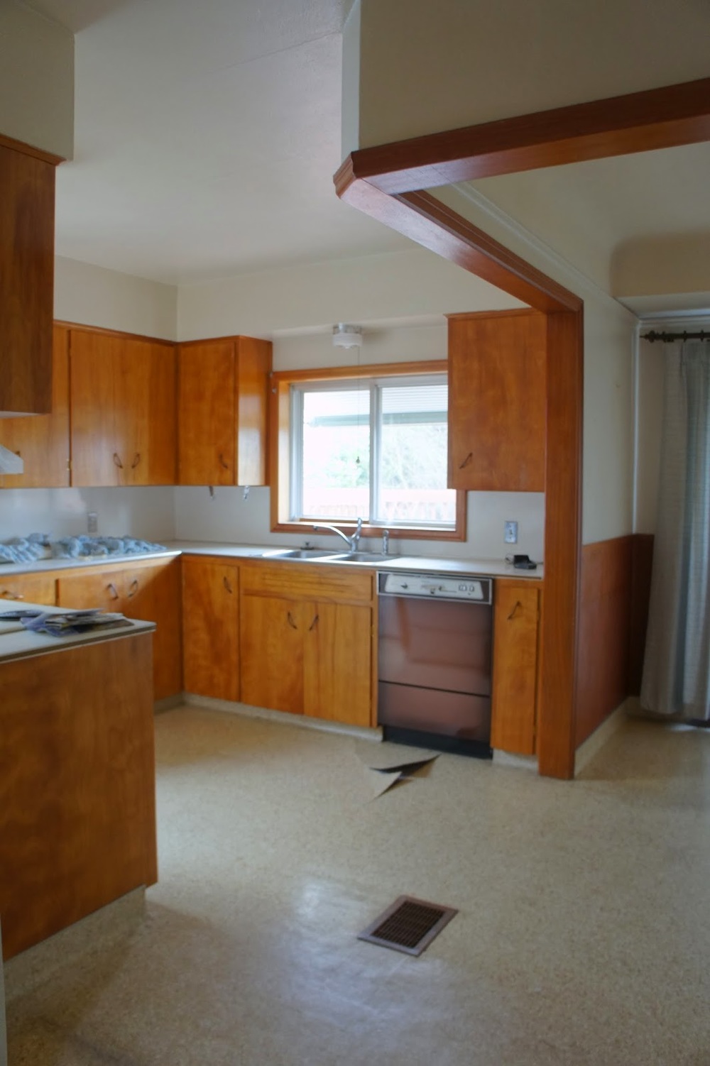
So it's been a while...but a lot has happened in these past few months!  Where do we start?  Well let's just say this house has surprised us.  Big time.  As we searched for our next project last fall, the Tabor House just sat there, for days, weeks, waiting for us.  We overlooked it a few times during our search, it just wasn't...right.  One day we had looked at another house in the neighborhood so we thought, let's just take a walk through.  Well, we weren't floored by our tour but the house had potential.  So we decided to give it a go.  That was the beginning.  Everyday after that, the house grew on us.  We pulled up the carpets to pristine oak floors.  We cleaned her out and reworked the layout.  Then we built the dormer...the house immediately changed.  This was going to be a good one.  Once the exterior paint went on, we were in love!  After that, inside changes started taking place.  We found and incorporated unique design and materials into each of the rooms and our love grew.  Well, now we are done and the house is gorgeous.  We were able to do things we have never done before on this house and it makes us want to push even more on the next project.  One thing is for sure, this house has shown us that even the most plain and ugliest house on the block can become the one of the best, that potential does not have a limit and that even we can surprise ourselves every once in a while!

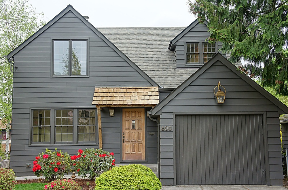
We felt like we picked the perfect color for the exterior of this house.  A custom color that is actually a very dark brown with charcoal undertones really modernized the outside.  We balanced the modern with more traditional wood tones and brass accents. 

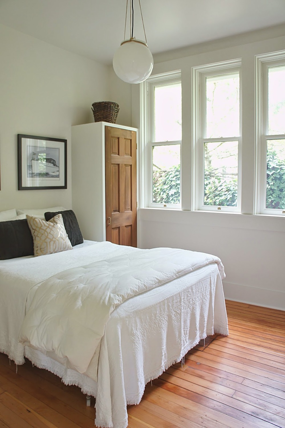
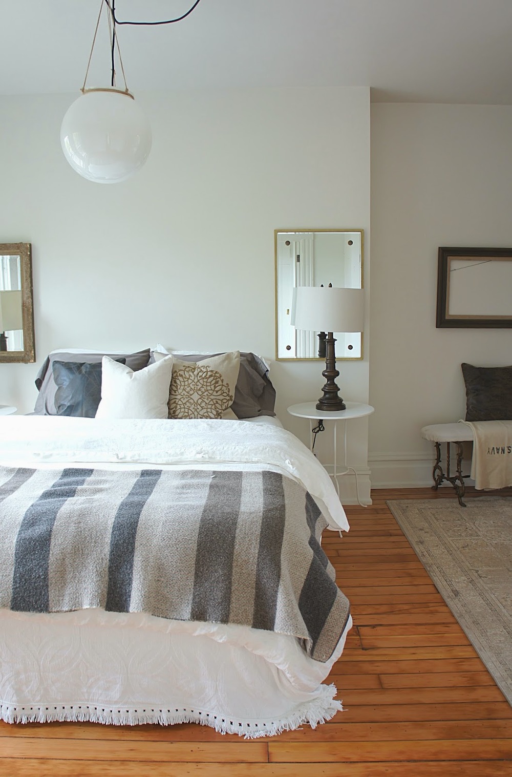
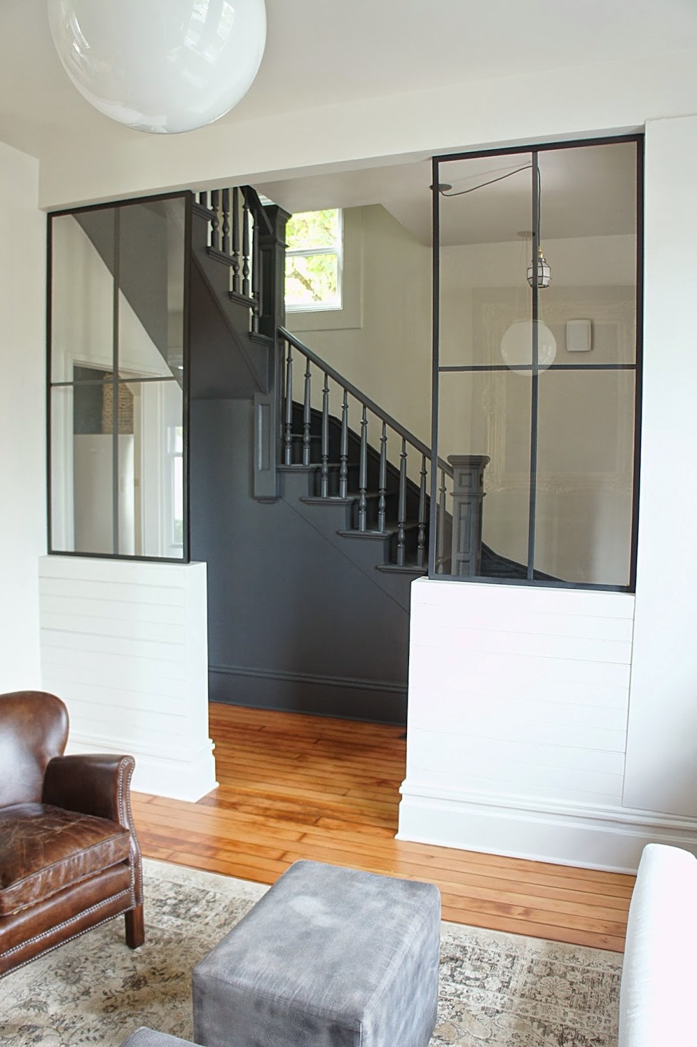
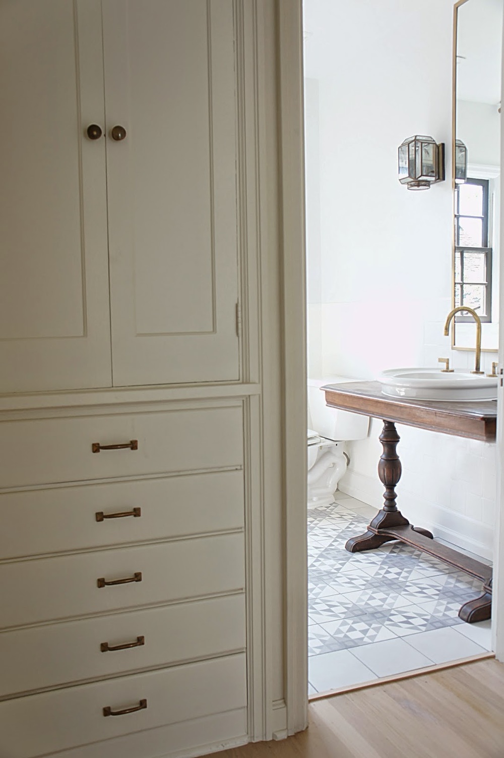
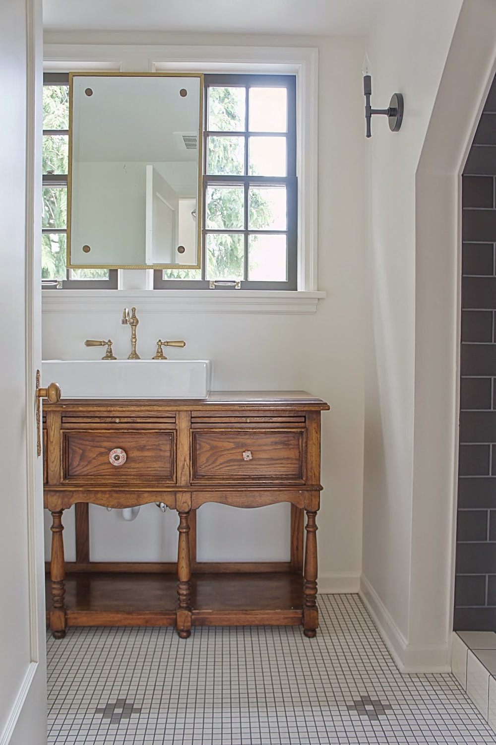
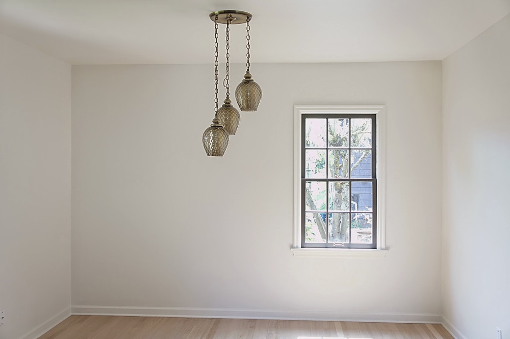
We like our interiors to be light and bright so everything went white...again!  We did however, keep the living room windows the original dark wood while painting the rest of the windows throughout the house the same color as the exterior.  

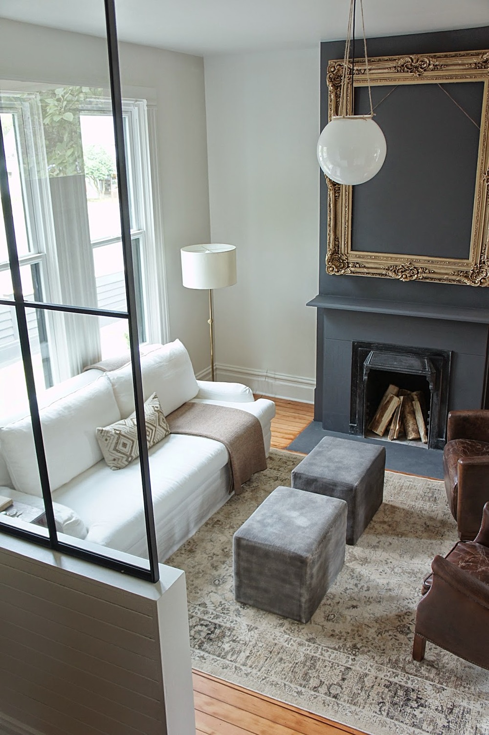
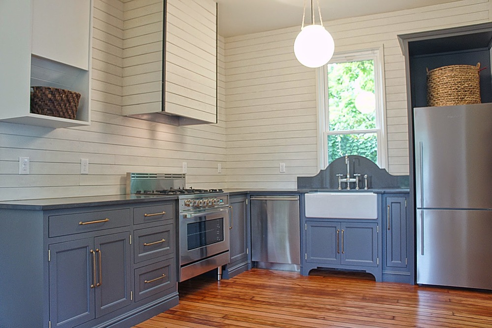
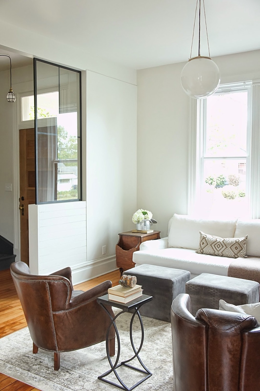
The whole house only had three major colors throughout with the addition of the unlacquered brass as an accent.  Whites, dark charcoal browns (also the exterior color) and medium grey/brown tones add contrast to each other while still remaining neutral and somewhat monochromatic.  This scheme makes the home feel bright and airy but also inviting and warm.

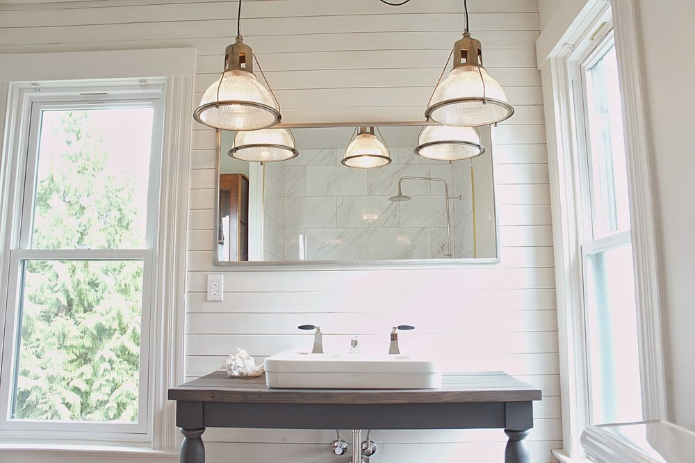
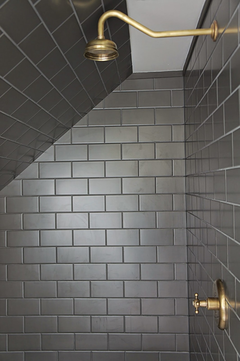
The tile in this bathroom was the main design inspiration for the whole house.  We felt it had a Navajo/Southwestern vibe...but more modern.  We love this tile!!!

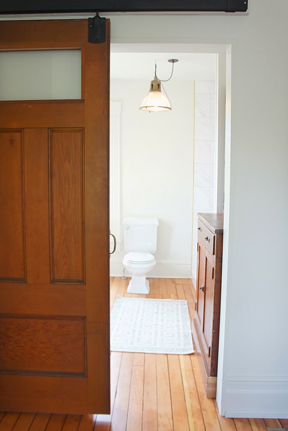
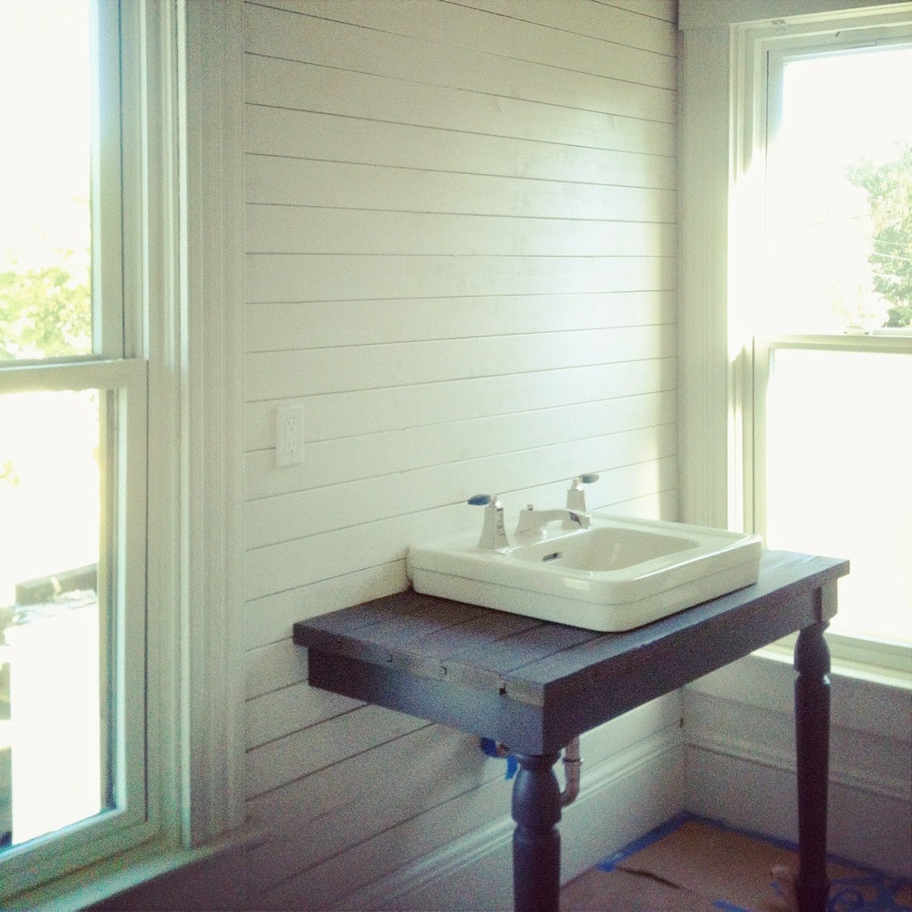
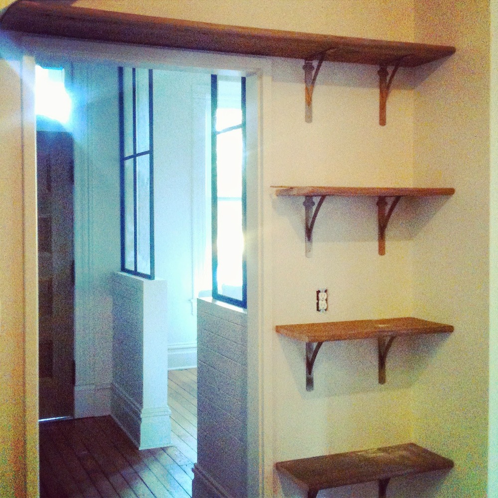
We used a variety of different materials throughout the house.  Though very dramatic and eye catching, each room is still a blank slate to add as much or as little as the future owner wants!

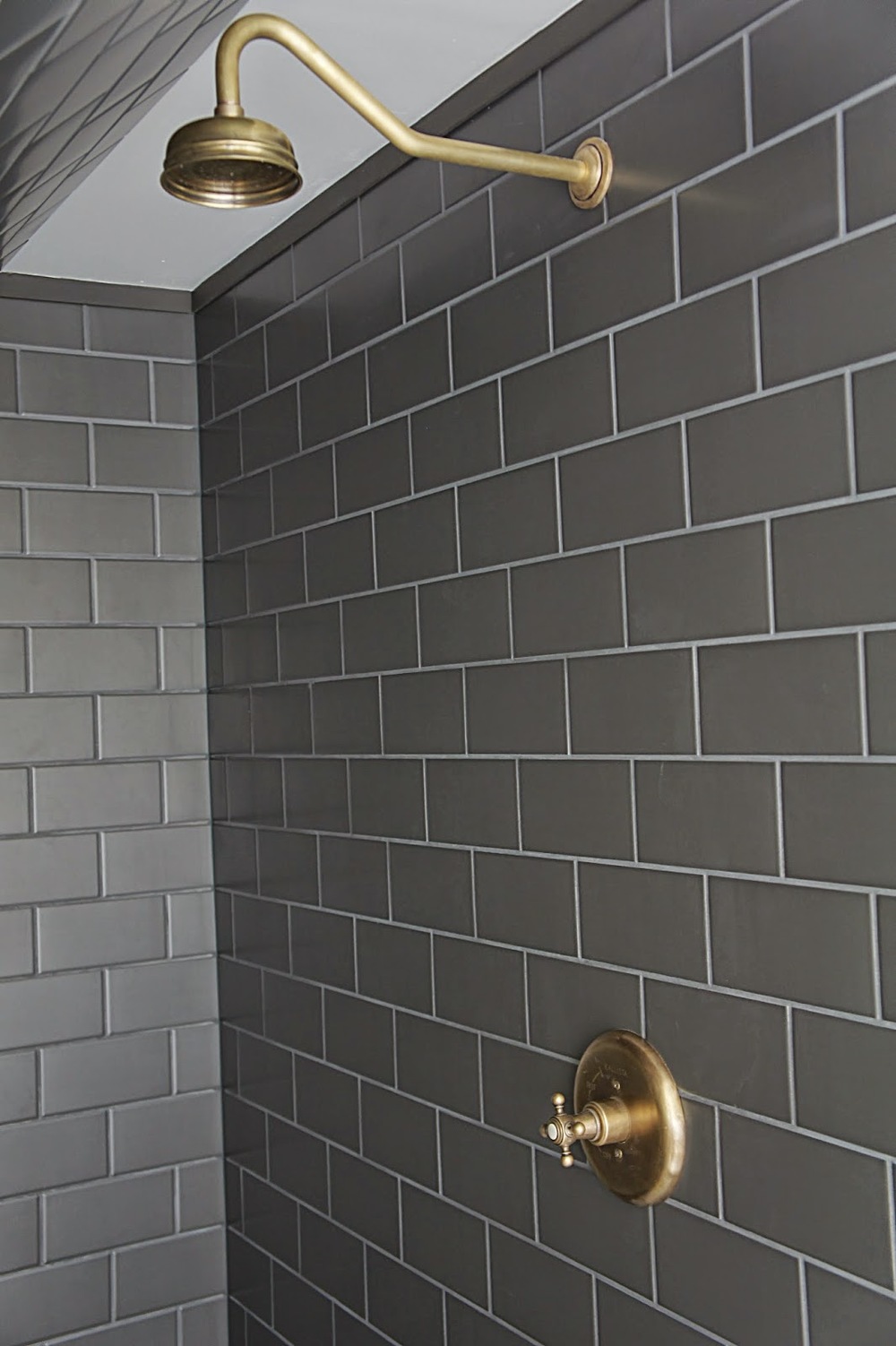
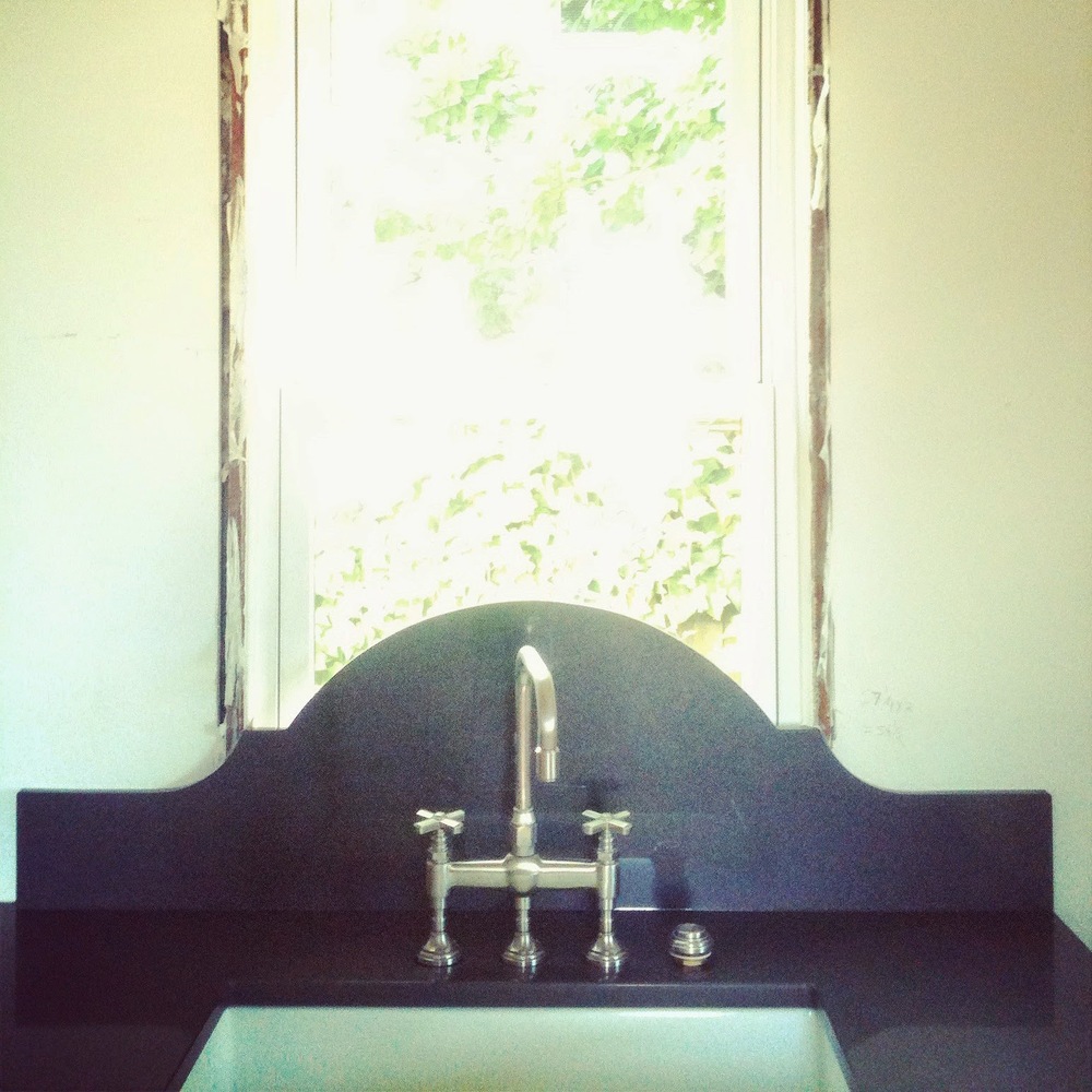
All of the brass and fixtures throughout the Tabor House were custom finished by us.  The process was very time consuming but now all of the fixtures and hardware look like they have aged a hundred years and will continue to do so with normal use.

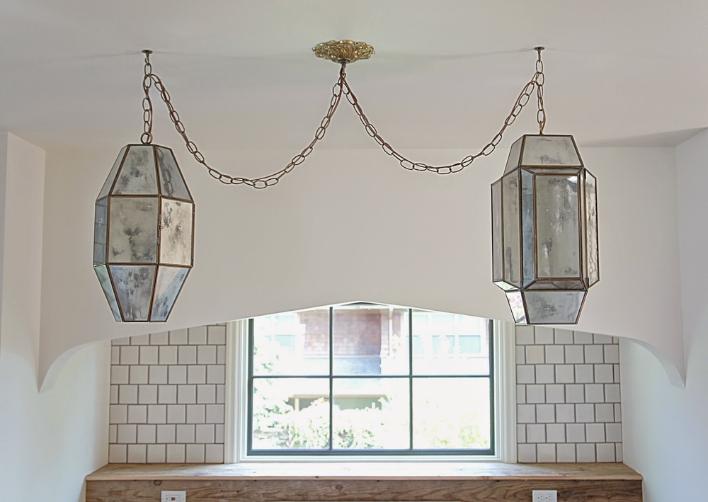
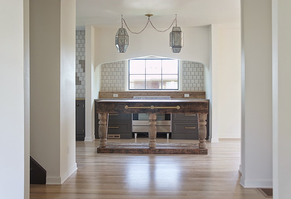
We custom made most of the lighting throughout the house.  It was a huge project, but well worth it in the end!  We wanted a Moroccan or worldly vibe with the lighting so we ended up creating this mercury glass effect on these amazing vintage shades we found.  The result is a beautiful reflective shade during the day and almost a prismatic light at night.

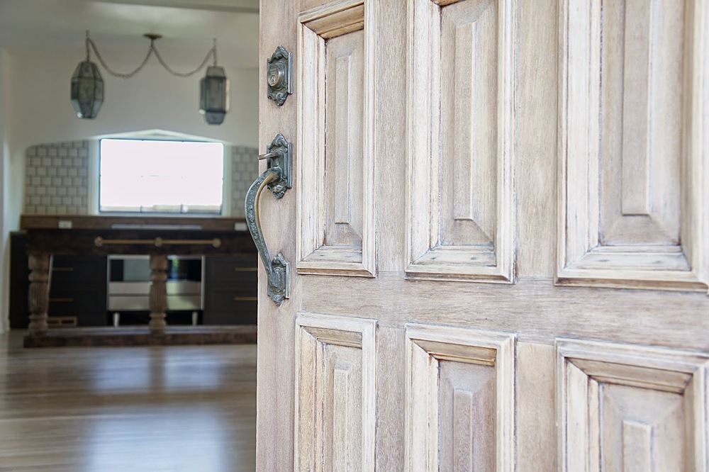
We kept the original (and gorgeous) front door.  It needed some work, so we stripped it down and applied a light white wash to the exterior to preserve the original color.  The door now looks perfectly aged and full of character...and that's a good thing!

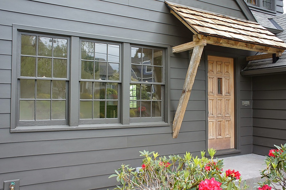
The front door needed an awning.  Once painted, the front of the house was very stylish but a little serious.  We originally planned to build an awning from the beginning but the materials and the actual design of the awning changed as the house progressed.  We felt we wanted a welcoming house with a modern vibe but didn't want stray from it's traditional roots.  We decided on a natural awning to match the front door made from wood we salvaged from the Japanese tsunami that washed ashore while we were still living in Lincoln City.  Now the house feels modern and classic and now has a great story!

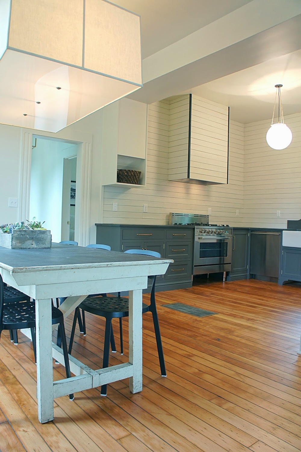
A lot of thought, inspiration and work went into creating this particular space in the kitchen.  Basically the first thing you see when you walk through the front door, this area is the main focal point of the whole house.  We created a "nook" that houses the range and framed that nook with a dramatic but slightly subtle arch that frames the area and houses the range hood.  To finish the look, we custom designed and built the island almost completely from salvaged materials.  We were very pleased with the result.

Now that the Tabor House is done, it's fun to look back and see how much this  since the beginning of the year.  The transformation of this house changed our hearts.  We feel we pushed ourselves (and the house) aesthetically to create a truly unique and custom home that is unlike any other in Portland.  It excites us to take the journey and lessons from this house and look onward toward our future projects.  We only wish we could have staged this one like we did the Morrison House...but...we sold her early!  Surprise!  Oh well, we'll have that opportunity on the next one!  Can't wait!


Musings on Tabor


Our minds have been whirling lately with ideas and thoughts on what direction we want to take the Tabor House design-wise.  We like the idea of changing design direction with each house because each house is different, and a lot of design styles appeal to us.  We enjoy the challenge of switching it up with every house because it keeps us on our toes creatively and we get the unique chance to create depth within our portfolio with the design styles that speak to us.  Another factor that is just as important in the way we go about creating a vision for a home is through our salvaging.  Sometimes we will find a unique item or material and our design either revolves around it or we find a way to work it into the design.  This is probably one of the aspects of our job that we love the most...it's our version of treasure hunting!  Anyway, what is speaking to us in terms of the Tabor House?  Let us show you!

Bill Ingram Architect

During our time off, we were able to get away and see some amazing architecture and design.  One thing that appealed to us was the use of dark charcoal brown on exteriors.  Used in a monochromatic way, this color has a traditional yet modern feel without being too edgy.  We found the perfect brown that we will be using on the exterior of the Tabor House that we plan to accent with rustic wood tones and aged brass.

Speaking of aged wood tones, this is the perfect example of what we are trying to achieve.  We discovered the art of cerusing or applying a lime wash to wood a few months back and we are dying to try this out.  We have yet to test it but our plan is to accent the exterior of the house with this washed wood look as well as the floors throughout the house...to be continued!

Commune Design

During one of our salvaging trips, we scored an amazing tile that was pretty much the jumping off point for the interior design on Tabor.  Before that tile was discovered, we really wanted to incorporate a worldly feel into this house through materials and lighting.  The combination of the two will live up to the traditional qualities that we have always loved while adding a little bit of modern flair.  A perfect example of this marriage would be the kitchen above...stunning! 

Tracery Interiors/cococozy

For the longest time, we have wanted to create a built-in range but have never had the right space or layout to accomplish it.  Well the circumstances in the kitchen at Tabor have worked in our favor and we have the opportunity to create a jaw dropping focal point not only for the kitchen, but the house.  We are excited about this one.

Studioilse/Aesop

We are also toying with the idea of incorporating this perfect green into the house somehow...the verdict is still out on this one.  The use of color and materials in this space blow our minds!  Aesop's interiors never fail to impress.

Elle Decor

Although a lot of these inspiration pictures appear to be more on the darker side, we are actually planning on making the interior light and bright.  All white walls, lots of light from the windows with only accents of darker shades.  This bedroom above is how we want Tabor to feel.  Bright, worldly, warm with a touch of modern.  

Tim Barber Architecture

This staircase is jaw dropping.  We may tackle something like this on Tabor's staircase but it all depends on the other patterns we choose (and choose not) to incorporate into the design.  Again a touch of modern and worldly...love the dark window muntins. 

Ett Hem/Dustjacket

The bathrooms will have the same modern, worldly vibe as the rest of the house (or even more so) but the master bathroom will benefit from an added shower somewhat comparable to this one.  We will also be using darker greys with brass for the shower but it will look and feel much different from this one.

There you have it!  A little glimpse into Tabor's future.  Lot's of great items, lighting and materials have been stacking up and we are excited to put them in place!


Tabor


We're back at it!  After some much needed time off, we were able to find our next house and here we are, our first official/non-official day back at work.  Out of all our past projects, this house is probably in the best shape of them all...BUT it's funky and needs some serious layout and cosmetic changes.  Though there's always a list of negatives when it comes to a fixer upper, this house has a plentiful list of positives...one being the location.  Just a short walk up the hill from the Morrison House, we are very pleased to be back in the neighborhood again!  We have always talked about doing multiple homes in an area and being able to secure another home in the Mt. Tabor / Montavilla neighborhood really excites us.  Mt. Tabor is one of our favorite neighborhoods in Portland and just coming off a remodel in Montavilla, this house just fit into place. 

A lot of work needs to be done on the exterior of this house.  Obviously the roof is the first thing to be remedied but our main objective for this place is to give it some appeal from the street.  Right now it's showing some wear and it's not very inviting.  Our plan is to take away the left dormer and replace it with a bigger, gable dormer that is built flush with the face of the existing house.  The new dormer will give the home some presence from the street and take away that large expanse of uninviting roof.

This is the view upon entering the house.  The entry is a part of the living room which is completely walled off from the rest of the house.  This wall will be opened up to the rest of the house including the kitchen.  Yes, we will be saving that door!

The living room is very charming and a decent size.  We love all the windows and the cove ceilings plus the oak floors under that carpet!

The main floor bathroom is a good size.  Horrible layout.  We will be changing the layout, updating the tile and adding some beautiful fixtures to make this room really shine.

The main floor bedroom is a great size and has lots of light, we will be sacrificing it however to make a larger kitchen and dining area.  This room will be the new dining room.

The existing kitchen and dining room are small and very choppy.  Our plans involve opening them up to the living area and reworking the layout.

This dining area will become a part of the kitchen while wall to the right will be taken down.  The now main floor bedroom will become the new dining room!

This gives a good idea of the layout issues with this house.  These walls will all be opened up into the hall and living room to accommodate modern living.  This will create a large kitchen with generous cooking and prep spaces and an overall large, open feel throughout the house. 

Another view.  These walls will all be open!

Minimal changes will be made in the upstairs hallway.  We plan on adding some warm lighting and updating cosmetically to make it more inviting.

The upstairs guest room will be getting the biggest makeover in the house.  This room is where the dormer will be placed which will make it larger and a more functional room.

The master bedroom is a decent size so we will be making minimal changes in here as well.  We plan on making more functional closet and storage space for this room and removing the bulky, nonfunctional closets flanking the window. 

The master bathroom will be expanded and changed layout-wise.  

The wall to the left will be taken down and that area will be home to the future shower.

Another view of where the shower will be.

The current basement is large and full of possibilities.  We plan on making it a multi-functional space that is perfect for anyone.

Other than completely updating the area, we plan on adding two full bedrooms in this space as well as a laundry area and a theater room.

This room will become the house's second living room or theater/entertainment room.

Exiting the house from the basement back door we will be creating an outdoor entertaining area (with no deck above it)!

The deck will be removed from the house and we will create a large lower patio for outdoor entertaining.

We plan on keeping the front door but giving it a facelift.  It's going to be gorgeous!

The garage is pretty charming in itself but we will be salvaging those cabinets and putting them back in the kitchen!  Aren't they awesome?

That's it.  Of course there are numerous details left out that would take a year and a day to explain on here but the main points were addressed!  Add curb appeal.  Open living and entertaining spaces.  Update bathrooms and kitchen.  Keep the character and add more where it's missing.  Create a functional floorplan.  Add extra living space downstairs.  Create outdoor living.  Sneak peek of exterior color?  Check.  This is going to be a good one.

She's not much now but with every visit, this house is growing on us.  Can't imagine how we will feel when it's all done.  Stay tuned...


The Morrison House: A Modern Victorian Farmhouse


The Morrison House is done.  We got her on the market last week...showings and open house through the weekend, and still didn't get a chance to take pictures until yesterday.  We can hardly keep up with ourselves these days!   One thing is for certain though, this house is very photogenic.  We want to live here.  Of course, our belief is to create homes that we would live in ourselves, but this house...is just different.  It was different from the beginning and it shows even more so now.  You just don't find a home like this in Portland and if you do, it's rare.  We knew this when we bought the place and our mission was to not only preserve the character it had left but to make it even more special than the house it was when we purchased it.  The results?  A modernized Victorian farmhouse that feels casual yet elegant.  We love this house.

Staging by:  

Kaemingk Design

Our main objective of this house was to open the living, dining and kitchen to create large living and entertaining spaces for modern living...large enough for an eight foot farmhouse table!

Like mentioned before, we wanted a modern farmhouse look for the house.  We clad the walls with wood to look like the tongue and groove walls you would find in an old farmhouse.  We kept the original wood floors looking rustic and added the modern element with minimal color.  The only color added was the charcoal seen throughout the inside and the outside of the home.

We were able to move the shed to a new location on the property and paint it in the same color scheme as the house.  We thought it would be perfect for a studio or guest quarters

We installed these salvaged wood shelves from floor to ceiling inside a niche that was created by the underside of the staircase.  Not only do they fit perfectly in this space, they create much needed storage for the kitchen.  Plus, these shelves were salvaged from another old Victorian in town...the stair treads from the front porch!!

Like the Port House, we created these built-in closets to flank each side of the bed.  Instead of being a big bulky closet in the middle of the wall, we feel these are more of a feature and together create the same amount of storage space.

The fireplace was original to the house, so we just modernized it a bit with charcoal paint and a stucco hearth.  It now feels grounded and grand.

Like the lower bath, we kept the color minimal with the master bath and added interest with the tile in the shower and our industrial lighting.  The space is now large and bright and nothing less than a retreat.

The yard is one of the best features of this house.  A little larger than normal in Portland, the house sits in such a way we were able to create multiple large entertaining spaces.  Or favorite space would have to be this dining area surrounded by arborvitae. 

When we first bought the house, our first plan of action was to close off the entry from the living room to define each as separate spaces while making them feel more intimate.  We custom built the walls of glass, metal and wood to create that separation while the glass still let the light flow through.  The metal added the touch of modern we needed to complete the space.

We wanted both bathrooms to feel casually elegant so we went minimal on the color, used natural stone, salvaged fixtures and added a little elegance with high-end polished nickel faucets.

These built-ins were a part of the house when we bought it.  We loved everything about them so all we did was give them a coat of paint and new brass hardware.  They sing now!

We opened up the entry to the kitchen create better flow when entering the house.  After some research, we believe that the home originally flowed this way (the living room may have been more closed off originally) and we were right when we uncovered the original opening that led into the kitchen!

We are so happy with the way this house turned out.  The potential this house had to begin with was incredible and we feel blessed to have been able to work on such a rare home in Portland.  Now it's time for a small break!  For before pictures of this project click the link:  The Morrison House


All Done.


The last three weeks have been a mad rush to finish the Morrison House and get it on the market.  Hardly any updates, we know, but the transformation is something we are truly proud of and can test is probably our favorite home to date.  The house hits the market today (yeah!) and the link is posted at the bottom of the page.  Over the next week, we will be working on taking some after photos of the project and getting them posted.  We are excited!  Until then, here is a peek of what we have been up to the last month via Instagram.

To see the listing information and beautiful pictures of the home, take a look at the link below!

http://tours.capella-tours.com/virtual_tours/28443/mls/motion_picture