Our Thoughts on Shower Curtains.

 
Design: Kaemingk Design

Design: Kaemingk Design

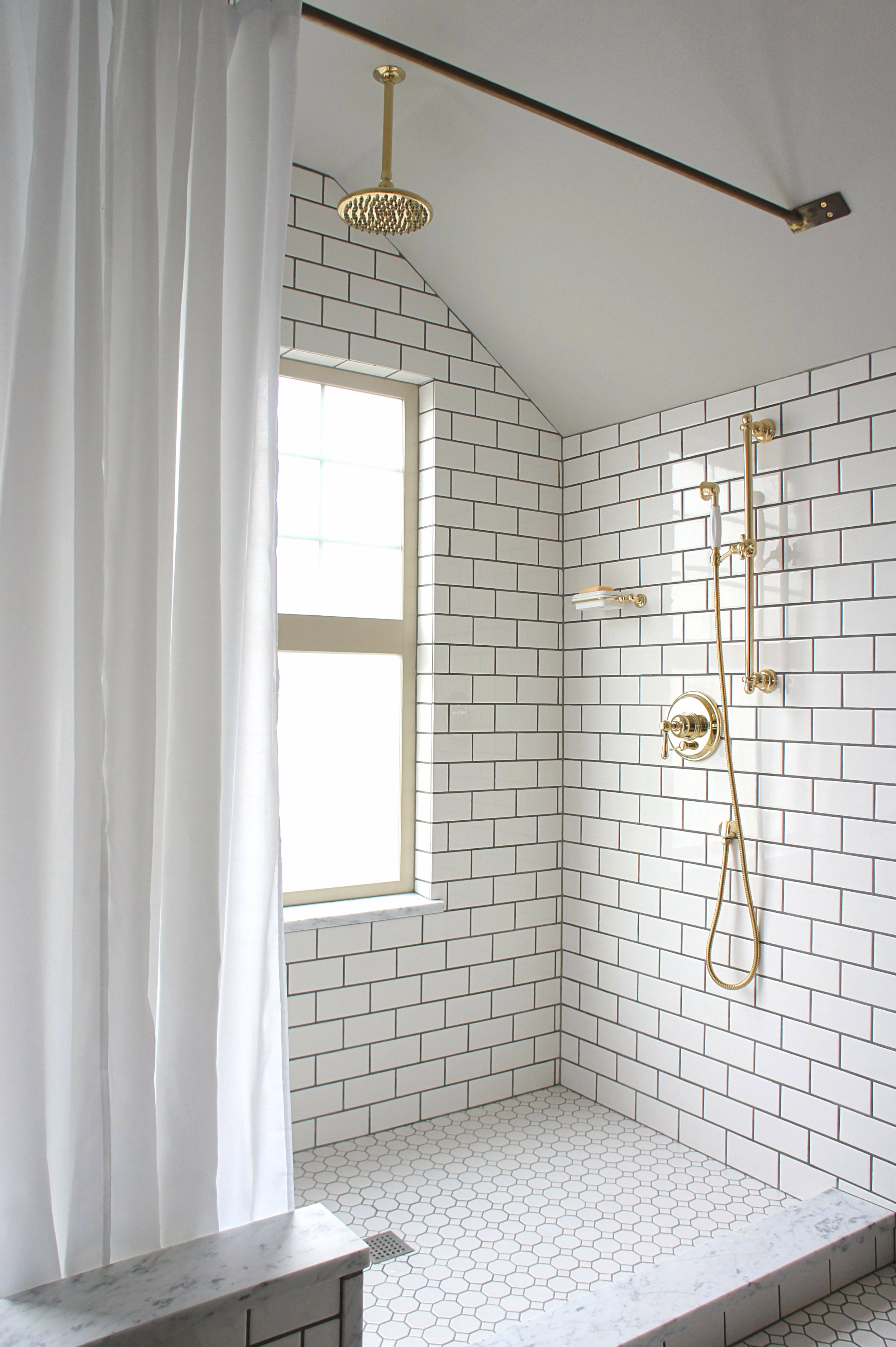
We  are constantly receiving feedback and questions regarding the shower curtains we have used in our past designs.  We are huge fans of curtains and in most cases, prefer them over other options.  Here is a look into our thought process on why...

Design: AD Office

Design: AD Office

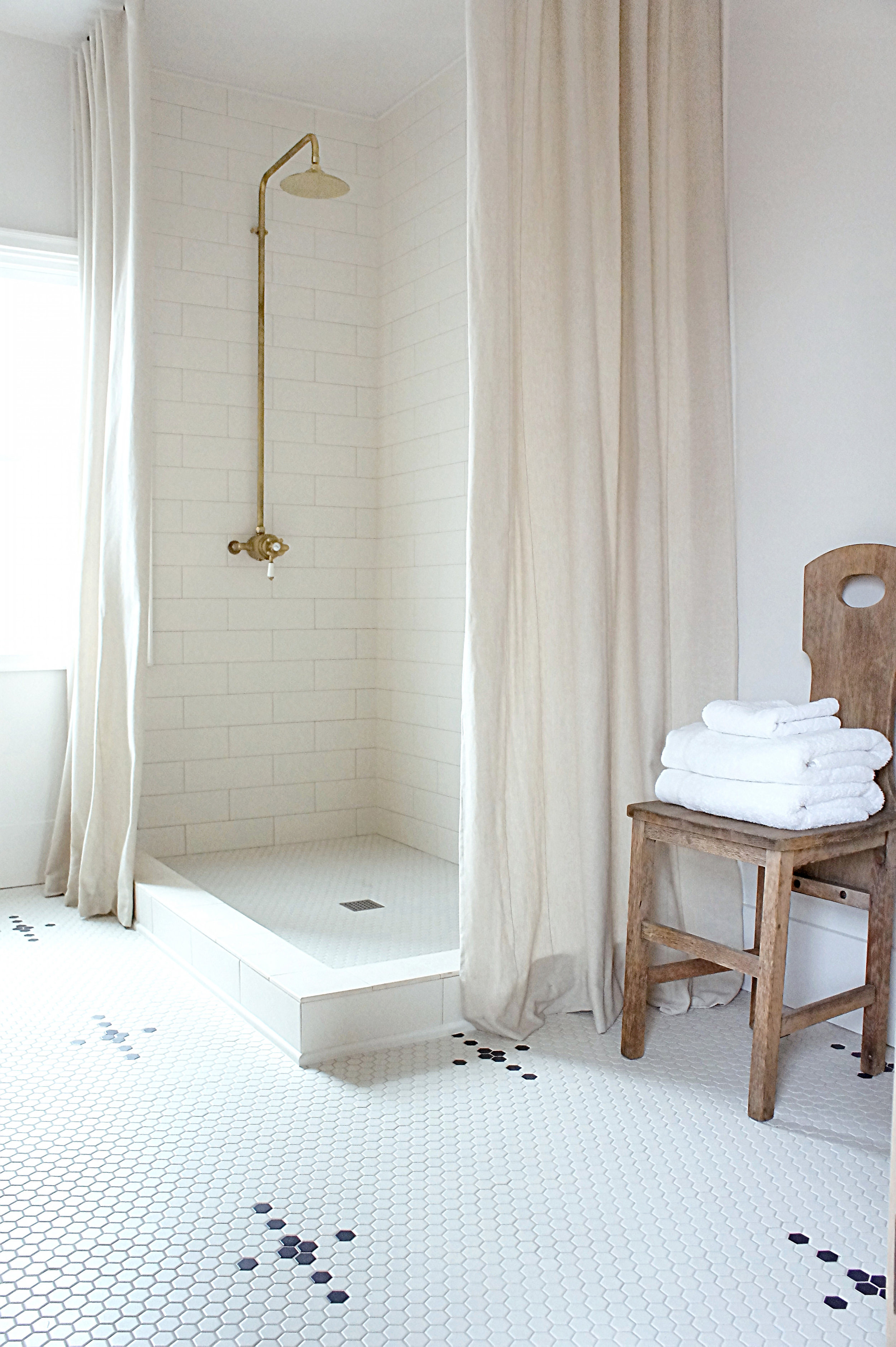
The number one reason we choose curtains over doors is they are super versatile.  Depending on the space or one's mood, they can be pulled all the way open, left partially or completely shut---all evoking different vibes for the bathroom.  If the room is on the smaller side, being able to pull the drapes open and out of the way can make the space feel larger, where glass doors can create an invisible barrier and virtually close the space in.  Plus, curtains are easy to switch in and out as styles change.  For our curtains, we tend to pick fabrics that are classic, neutral and authentic so they stand the test of time and don't need to be changed out often.

Design: Kaemingk Design

Design: Kaemingk Design

This leads us into our next reason behind choosing curtains.  They are completely customizable.  Yes, doors are customizable too...but hear us out first.  We love customizing our curtains and rods and will do it every time we use a curtain.  Let's start with the curtain rod.  Rods are often neglected and rarely thought of as a design feature for a shower, but we beg to differ.  It all starts with the rod for us.  Don't blame us, we are hardware junkies!  There are various materials to make rods from and so many ways at customizing them for each particular shower that the possibilities are endless when it comes to the finished product.  Our thoughts are this, when someone is spending time in their bathroom or in their shower, we want them to look up, notice and love those details instead of them being "just there".  It makes a huge difference.  The same goes for curtains, they can literally be made from thousands of different fabrics, customized through texture, weight and print...endless possibilities that completely change the vibe in a bathroom.

Design: Atheorem

Design: Atheorem

Our final reason on why we typically choose curtains for our bathrooms is the extra "layer" they add to the design.  Bathrooms are covered in hard materials, it's no secret but when a curtain is added to the mix, it softens the whole room considerably.  Adding something soft to a rather, hard atmosphere let's the space breathe...it adds that "lived in" dimension while remaining stylish.  We believe that in some cases adding a luxurious curtain to a shower can make all the difference in transforming a bathroom.

~C&B
 

Kaemingk Design

As some of you may have noticed over on Instagram, a few small changes have been taking place. For one, we have changed our business to Kaemingk Design.  We love it.  It's simple, straightforward, classic and it's who we are because hey, it's our name!  Anyway, we felt there would be less confusion moving forward and after some advice from a great friend and fellow genius entrepreneur Alyssa Rosenheck, we took the leap.  So we are now Kaemingk Design, and we're sticking to it!

Secondly, and the more exciting news of the two, is that we are now offering our design and architectural services to clientele.  Many of you know that over the past several years, we have primarily stuck to our own projects since they took up the vast majority of our time.  Well, we have now restructured our business and are excited to meet awesome like-minded people and design more amazing spaces.  

Additionally, there will be more changes in the coming months so stay tuned.  Like we mentioned before, we post regularly on our Instagram so make sure to follow us!  For those of you who already do follow along, thank you for your support, we love you all!

 -C&B

Jarrett is Done

Nine months ago, we broke ground on our largest project to date.  The time between then and now has been a whirlwind of progress, with more than a few bumps in between.  We made it though, and we are happy to announce that The Jarrett House is done!  We were able to incorporate so many design ideas that we love and underneath that beautiful facade, is a home built like a bomb shelter.  We promise, we will get more into this later but for now, we are happy with the way this home turned out.  There is nothing like it and we LOVE that.  Check it out!

Jarrett


We are officially three months into our next project and still have not updated it here.  We're the worst, we know.  Let's go back a few months and get everyone up to speed.  We bought the Jarrett house back in March and it has been slow going getting started.  The house is the biggest project we have tackled to date and needed a lot of preparation and planning to just get started working.  With that in mind, we received our permits a little over a week ago and now the real work can begin.  After The Emerson House sold, we were prepared for the long process of finding another project house, but just a few days in we found Jarrett.  To add to the excitement (and stress) of finding our biggest project ever, we also found a house for ourselves as well.  We don't mess around.  It's been a pretty eventful spring to say the least, and can imagine summer won't disappoint either.  Enough of that, let's tell you about this house!

IMG_1319.JPG

Although these are not the real "before" pics, you get the idea!  This is right after the asbestos siding was removed.  The house needs everything, no surface will be left untouched which excites us because we really have the chance to change things up a bit with the exterior and interior.   We plan to modernize the facade but add back that traditional character we love so much.  Window layout and style will change and although we haven't chosen a color yet, we plan to paint the exterior in a bold, masculine tone...more on that later.  The exterior of this house will be unrecognizable when we are done. 

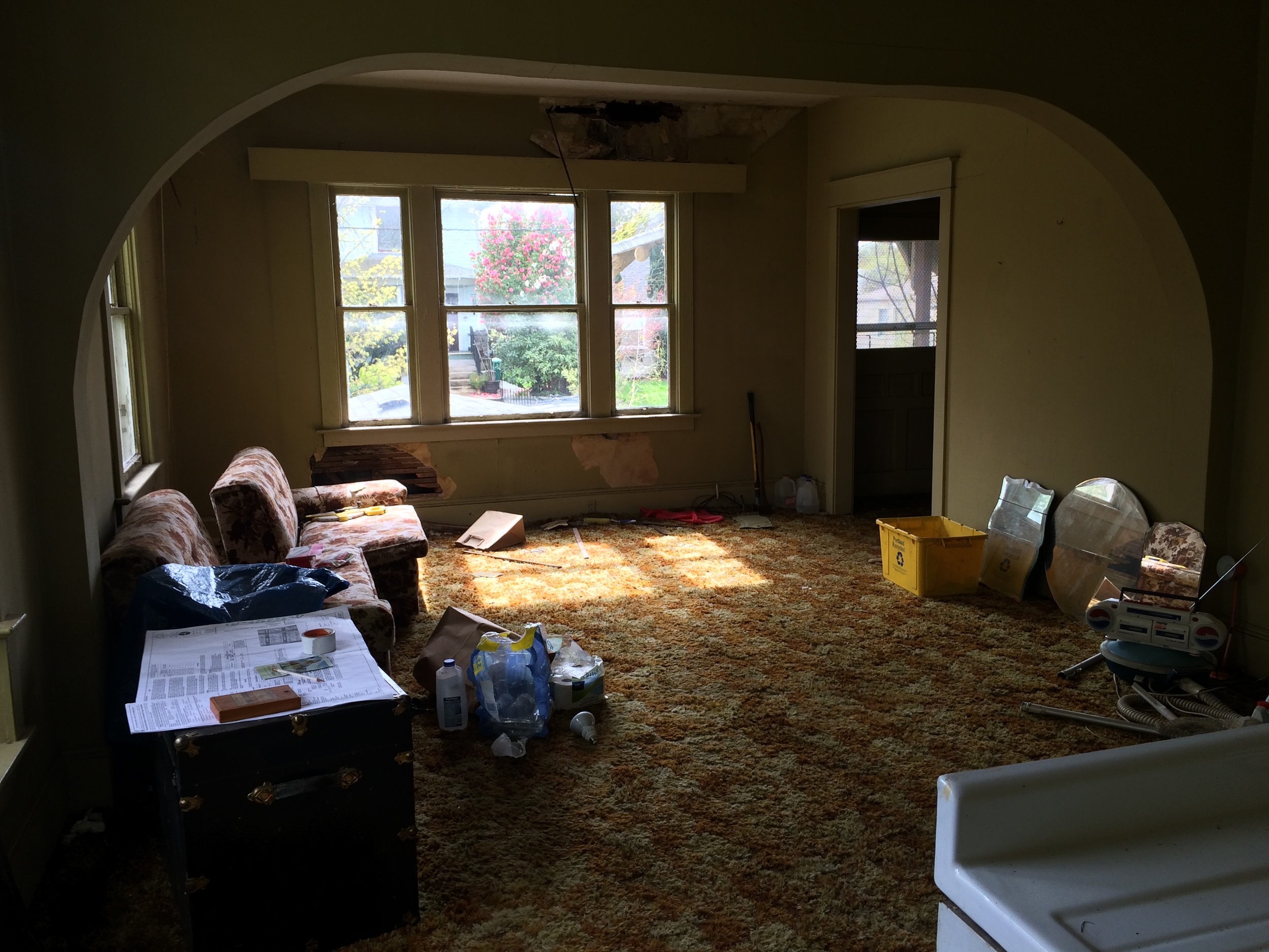
Upon our first walk through of Jarrett, it was obvious the place had been empty for some time.  There's this smell that is synonymous with old, vacant houses that can't really be described until you experience it.  We always take that smell as a good sign that this place is for us...it's in our nature.  After getting over the smell, it was evident this house had a lot of potential.  One thing stood out...space!  The house was huge.  Our past projects have been on the smaller to medium size regarding square footage but this house was big, so much room for us to play with!  The original layout offered some decent sized rooms but it was not ideal.  We would describe the original layout as a typical Bungalow layout.  Large living and dining opening into each other with a closed off kitchen at the back of the house, then all the bedrooms and only bathroom lining the other wall from front to back.  Our plan includes combining the living and dining into one large living area and creating a unique eat-in kitchen which we are super excited about and that is all we are saying for now!

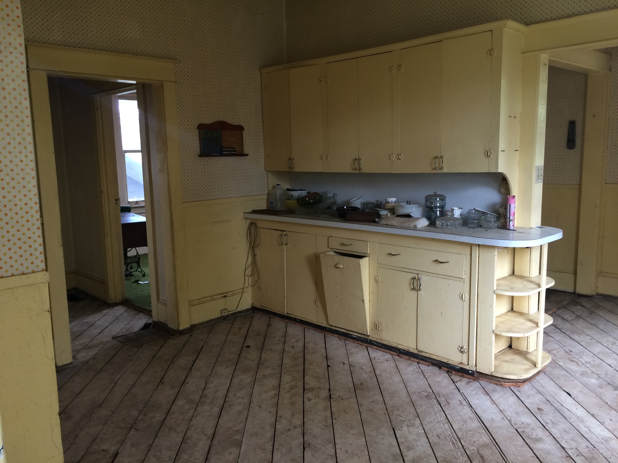
The original kitchen was a great size and quite charming so our plans will open and modernize this space while bringing some of that traditional feel back.

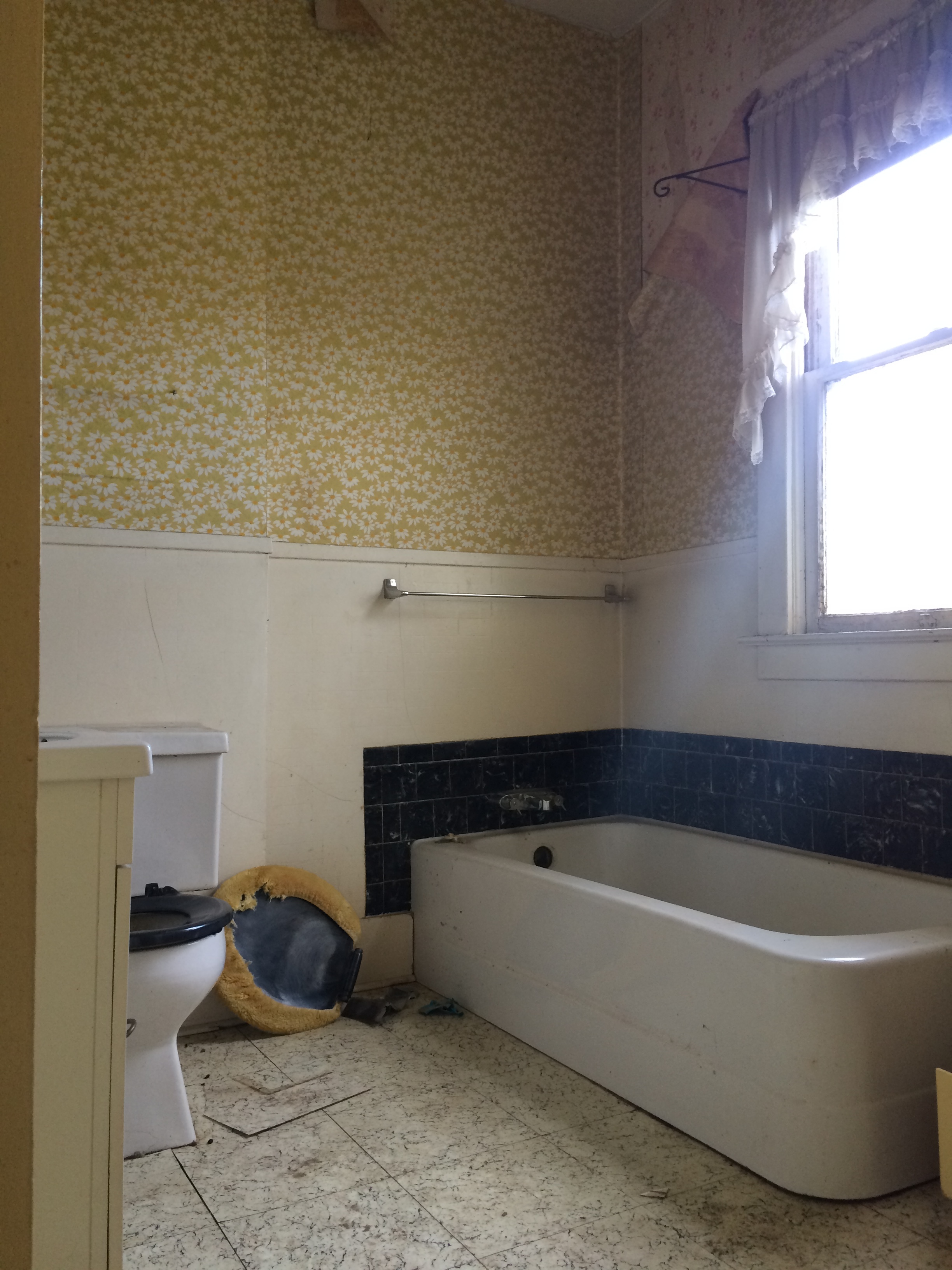
The original two bedrooms and only bath in the house were decent sized so we decided to keep one bedroom and the bathroom in (mostly) their original state when it came to the layout.  The second bedroom will now become a space for a grand set of stairs that will be one of the main focal points for the house.  The original set of stairs will be removed and made into a long hallway.  These changes have already taken place and the main floor flows perfectly!  Can't wait to share more!  

Now this area is where we fell in love.  The pictures don't show it well but the upstairs was massive and in it's original state.  It kinda took our breath away.  It felt like an old barn up there, it was incredible!  Since there was so much space, our plan involves adding two bedrooms and two full bathrooms to the area, one being a master suite.  Like I mentioned before, this area is already framed and we are in love with the changes.  

Somehow we didn't get any pics of the basement or the landscape but huge changes in those areas as well!  Probably the biggest changes out of anything in the house since the original foundation was in bad shape and a whole new foundation needed to be added.  Along with that, the ceiling height down there was incredibly low so our plan involved digging out the existing slab and down two feet for eight foot ceilings.  Like I said, huge project.

For now, that is the general idea of what lies ahead.  So much needs to be done and on a large scale too.  The next month we will see huge transformations with the new roof, windows, siding, basement foundation and slab, etc.  It's looking like a busy month but it will be gratifying!  More to come, but until then, keep up with us on our Instagrams for more day to day action.  


Emerson: On the Market


Like with every previous project, the last few months have been very busy to say the least.  Last night, we were able to put the Emerson House on the market and we are so happy with the way this project has turned out.  Although this house has been a lot of work for us (aren't they all?) our vision for it remained strong until the end.  This is a special home and we are proud to call it ours for the time being!  Over the next couple of weeks, we will get our own pictures up on the website plus a little more in depth look at the renovation process and inspiration for this home.  More to come.  Until then, take a look at the listing below!

Staging by:  Kaemingk Design