As some of you know, we are no strangers to the most dilapidated, nasty houses out there. In fact, we are drawn to them. We can't help it, it is in our blood to walk down the street, stop in our tracks and gawk at the ugliest house; dreaming up solutions to make it dreamy. So we thought it would be appropriate to share our most dramatic transformations over the years. Take a look at the magic!
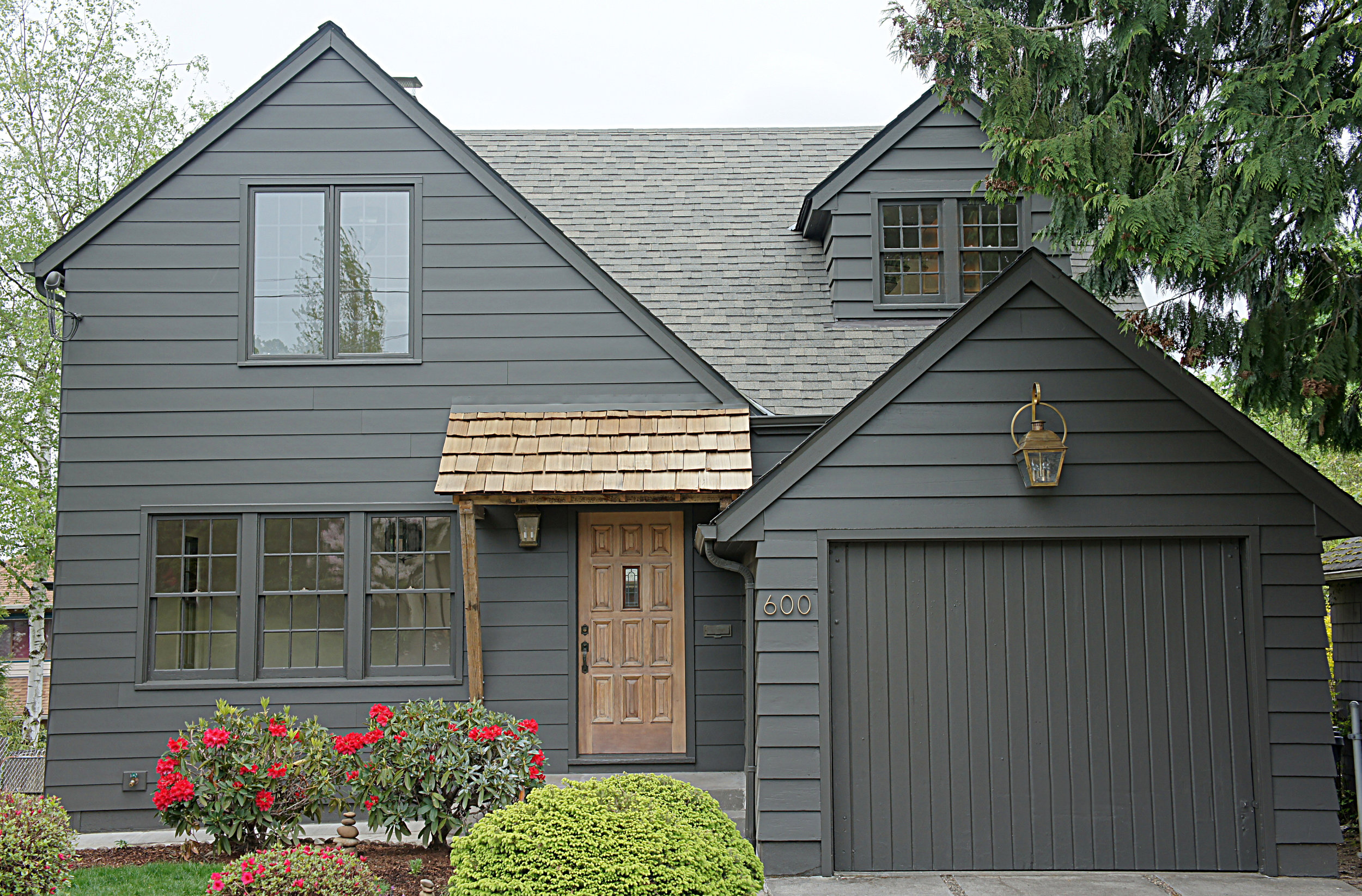
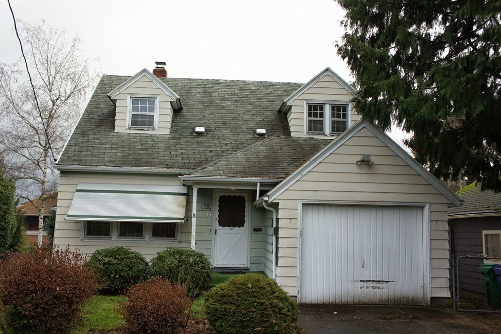
One of our most popular houses, the exterior transformation of Tabor takes the cake. This house sat on the market for months before we decided to set foot inside. I know. Even we didn't want to look at it! It was ugly and forgettable. Once we had the chance to tour Tabor, our opinions changed. The inside was charming and we couldn't beat the location. So we got to work. First things first, take off all the cheap awnings. We then proceeded to simplify the roofline and give the house some much needed street presence. We deliberated on color and decided on this moody, edgy charcoal brown...it was the perfect choice. The final touch was to add a little character back with the reclaimed wood entry awning and aged brass lanterns. It is now our version of a modernized Tudor/Storybook home and we still adore it!
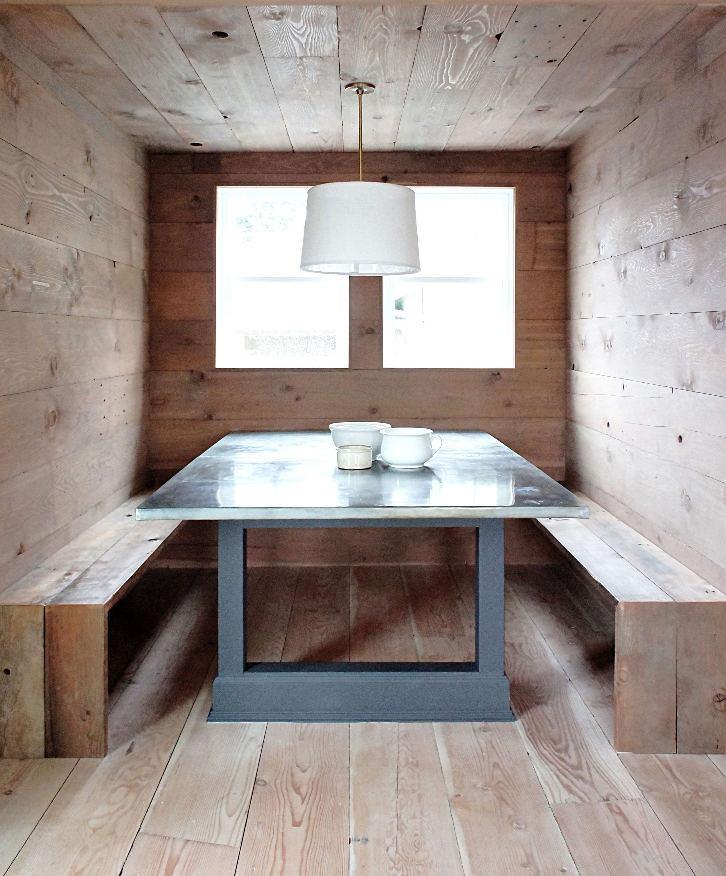
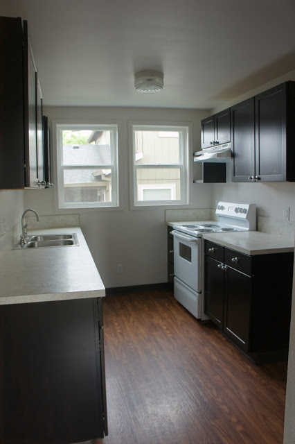
While not as dilapidated as the rest of the homes we have worked on, Emerson's transformation was dramatic in a different way. The previous owner had done a quick clean up and reno of the house before putting it on the market and although it was clean and relatively new, there was a lot of room for improvement. Case in point, the kitchen that we turned into a built-in dining room. The original layout of Emerson was...interesting, so in order to improve it we swapped the locations of the original kitchen and dining room with each other. The space for the original dining room was large, so why not make that the kitchen and utilize the space the original kitchen was crammed into to make a cozy built-in dining area? No brainer to us! Since the space was around 7X10 we knew we had to get creative. We had the idea to completely customize the space and build it into the existing room, creating an oversized built-in dining nook. Don't let the pictures fool you...the space is larger than it looks and can seat up to 10 if two chairs were pulled to the head of the table. To create that cozy nook vibe, we had the room clad in reclaimed fir, which was also used for the built-in benches. A custom hand made zinc table completed the look and infused the space with the warmth and character is was lacking originally. This is one of our all time favorite rooms we have created.
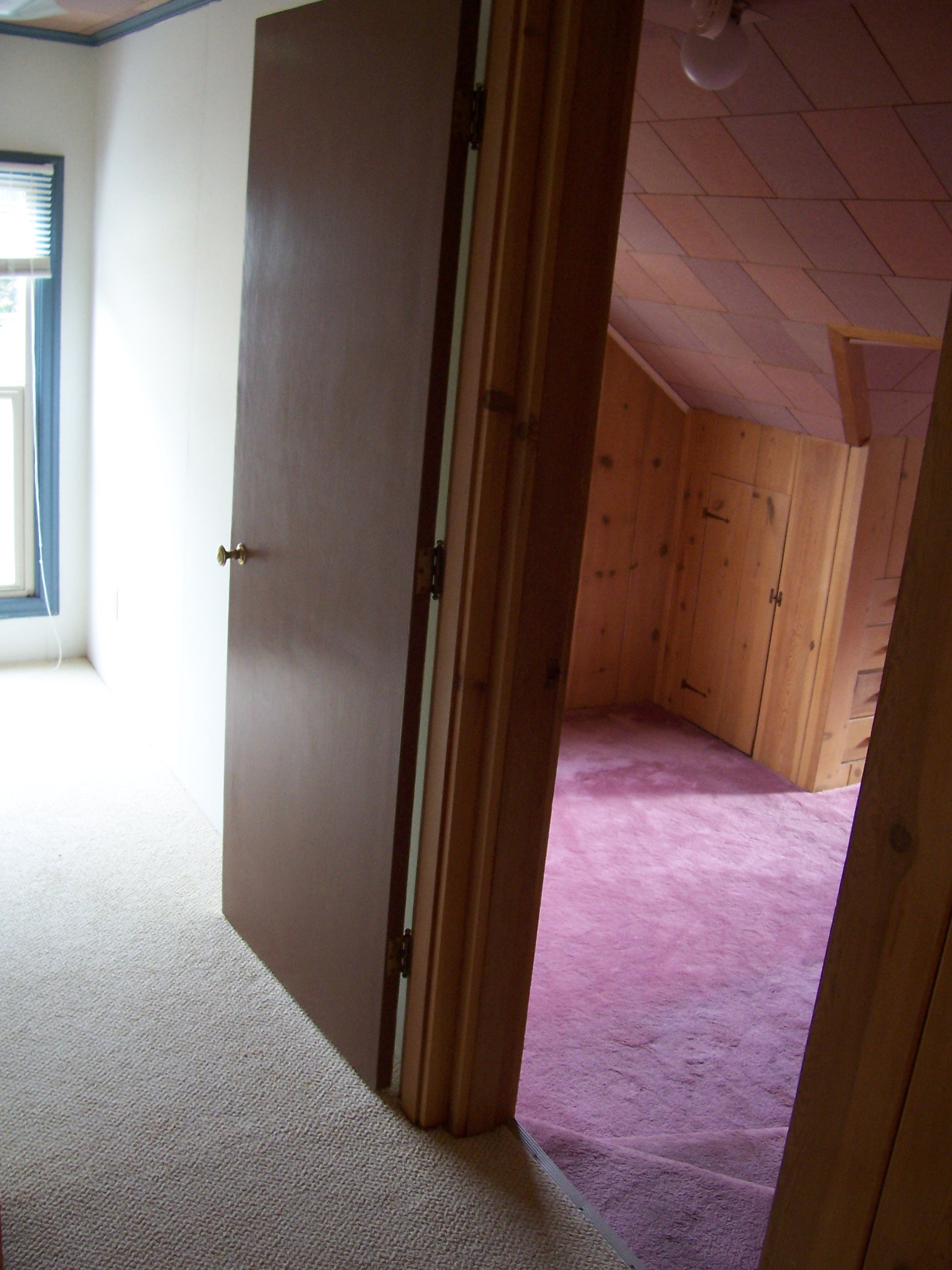
Yes, those photos are taken from the same location. The upper floor in this particular home was extremely chopped up and not functional. The two rooms before posed and interesting problem, they were both tiny, interestingly shaped and on separate levels! This home was built by a ship Capitan so those original spaces and layouts make a little more sense? Who knows? Anyway, the potential of these two odd rooms excited us and we decided to incorporate their oddness into our design concept. Our thoughts: simplify the two spaces by taking out that wall in the middle and combine them into one. However, we did not want to over simplify the space. We chose to keep the connected rooms on separate levels by adding a set of stairs. Since the upstairs desperately needed a bathroom, a bathroom it became. Since we wanted to keep the space more traditional, we opted for classic white subway tile with the octagon and square tile as the flooring. Brass hardware and a salvaged antique skirted tub also contributed to the traditional aesthetic. We opted for darker walls and grout to add a little drama to the space and dramatic it is!
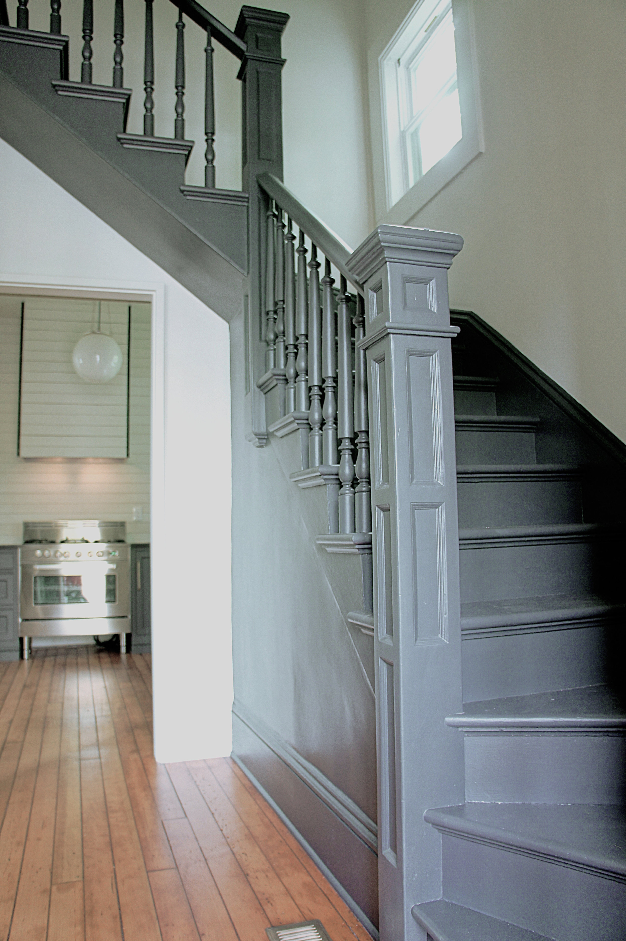
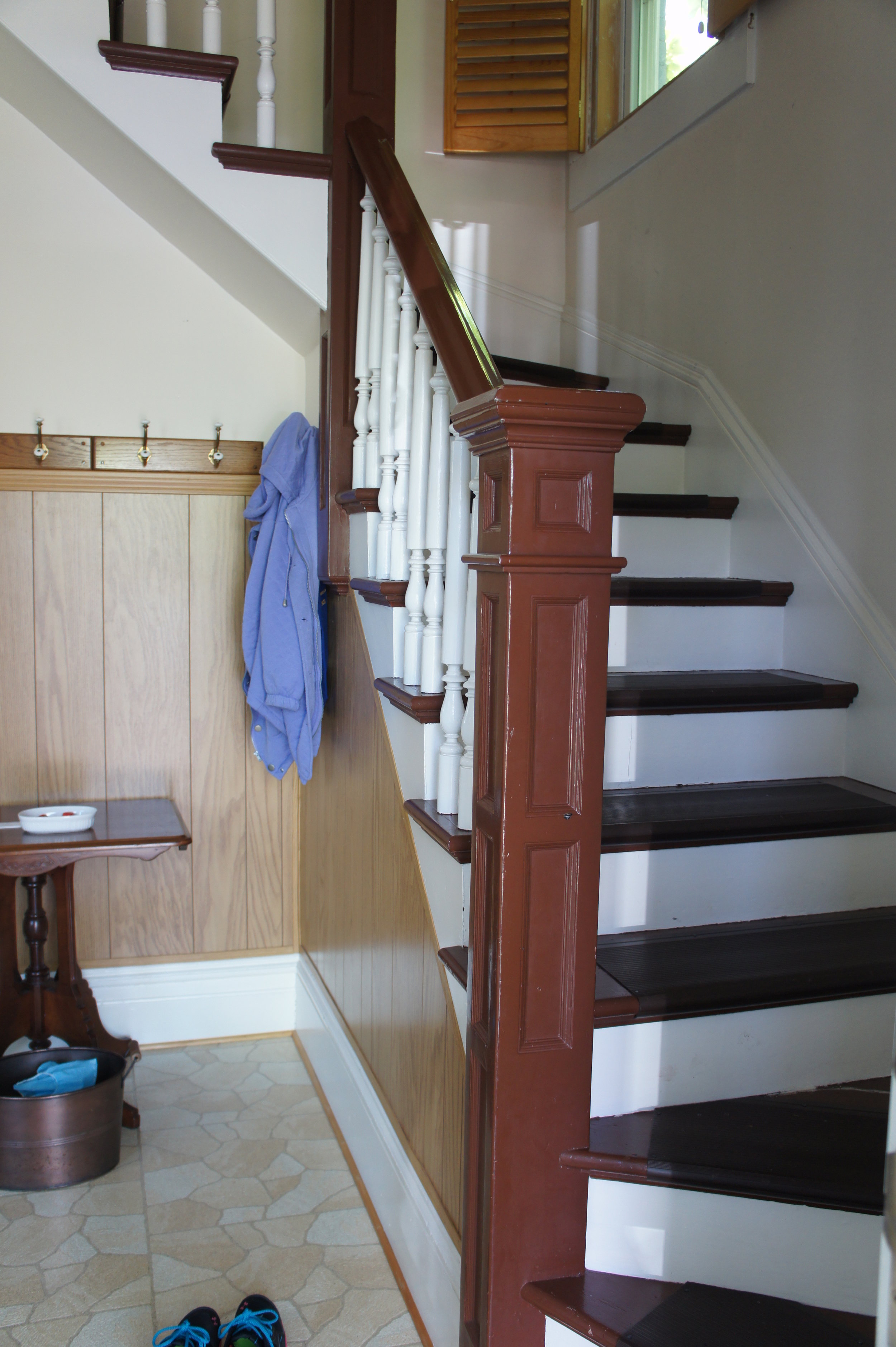
One of our all time favorite houses, Morrison wasn't the ugliest or the most dilapidated of the bunch...it was simply out-dated. Although we spent a good amount of time time fixing the bad renos it had endured over the years, the house was an amazing project in need of some smart design decisions to bring it back to life. From the beginning, we spent a large amount of time researching Victorian homes since there were a lot of layout changes that needed to be made. One obvious change that immediately went into effect was opening the wall underneath the stairway...true to an original Victorian layout. From there, we had to relocate the kitchen back to it's original spot which had been moved elsewhere sometime in the past. However, one of the most simple, but dramatic transformations this house endured was giving that staircase a new coat of paint. We chose a charcoal color to modernize the look of the stairs, painting them all one color...something we have been known to do a time or two! The before/afters are simply stunning and proof that a simple coat of paint can completely change a space.
There you have it! A handful of our most dramatic transformations over the years. Since there is a whole lot more where that came from, we decided to make this a multiple part series. Transformations...they are kinda our thing! More to come!
~C&B
