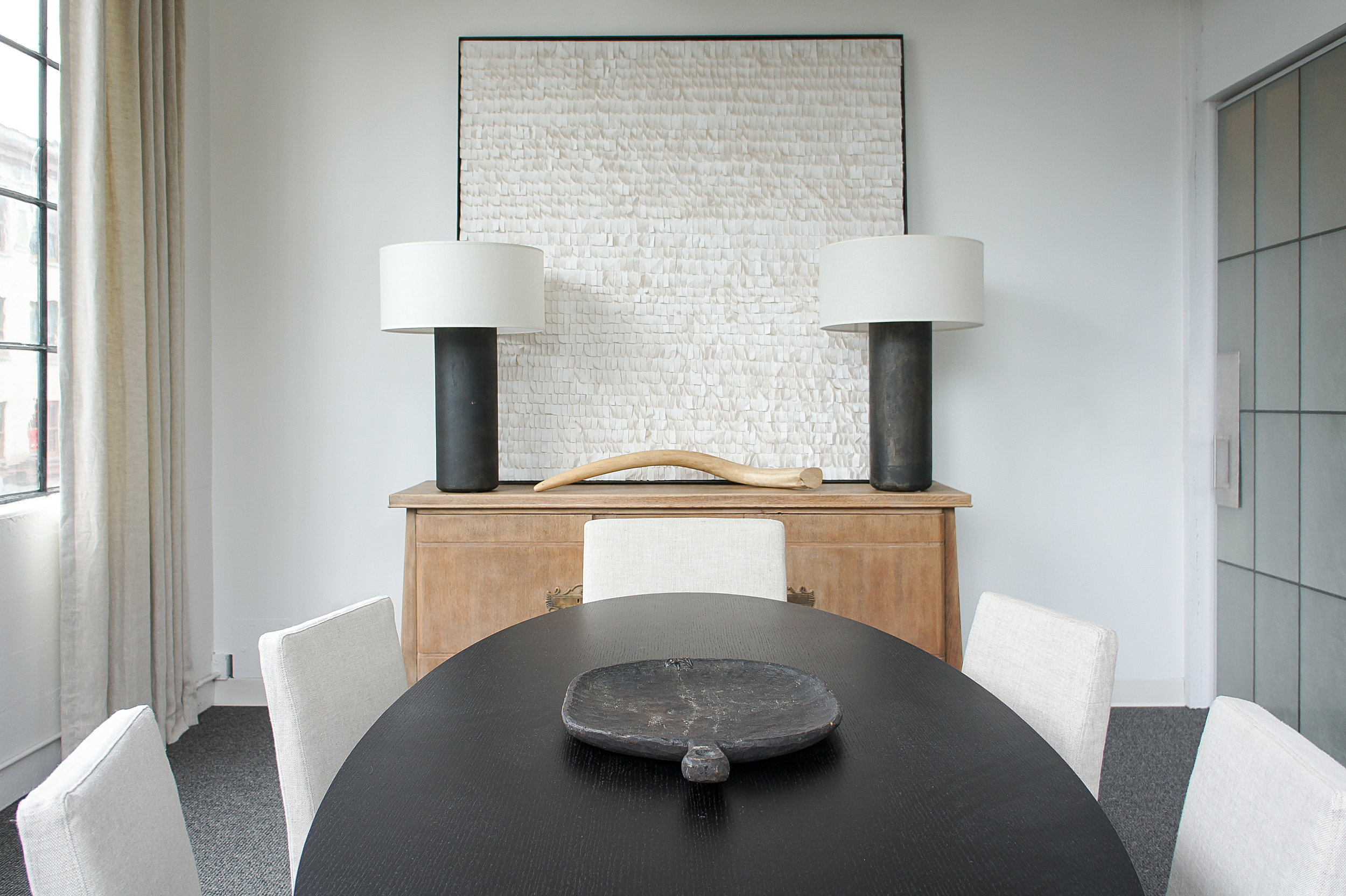
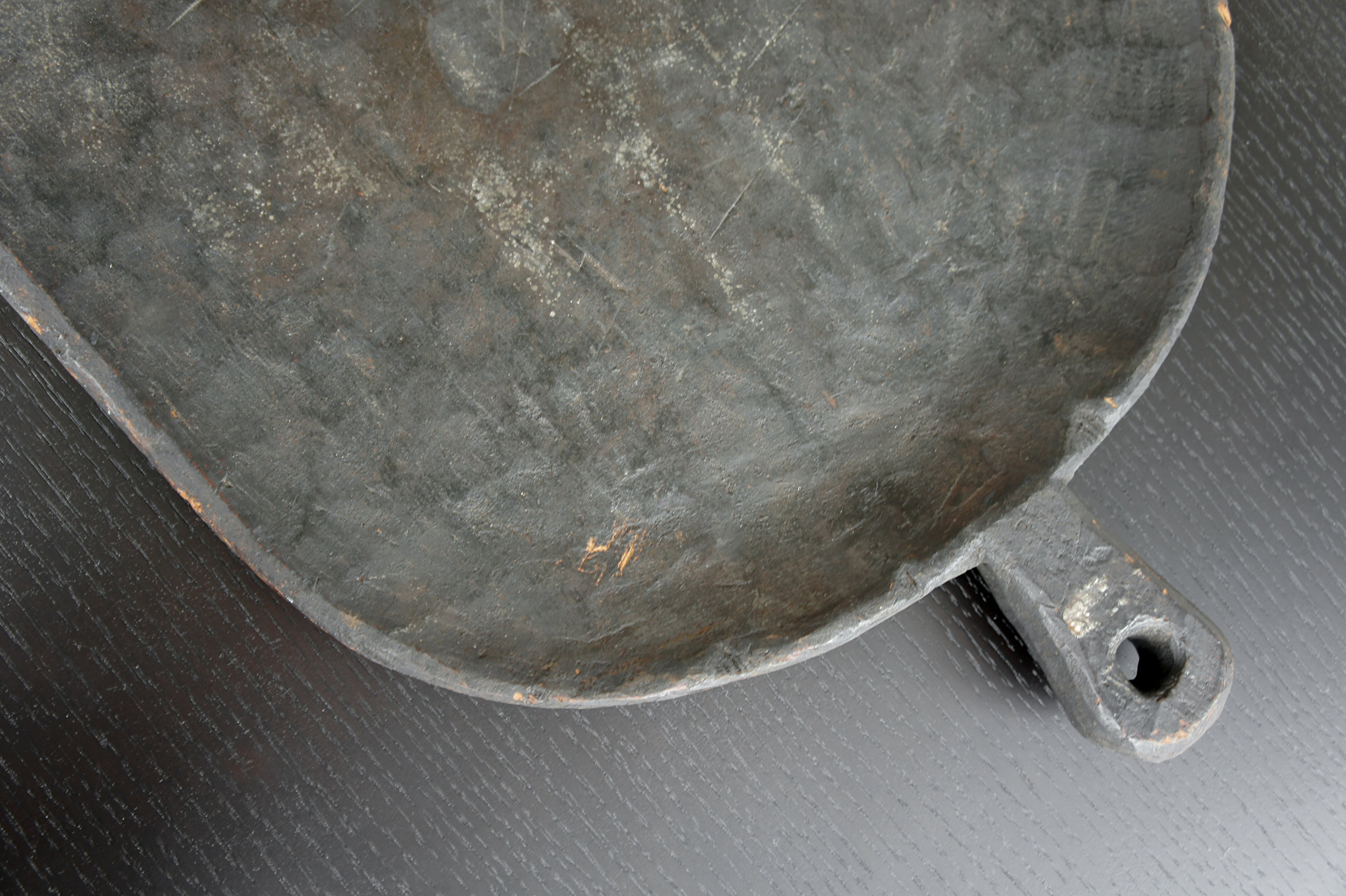
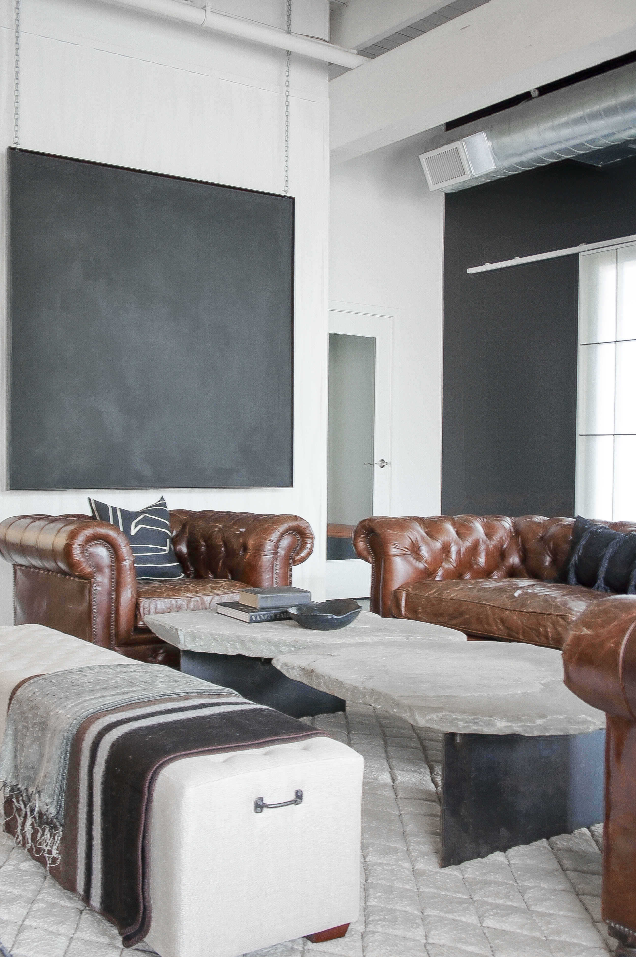
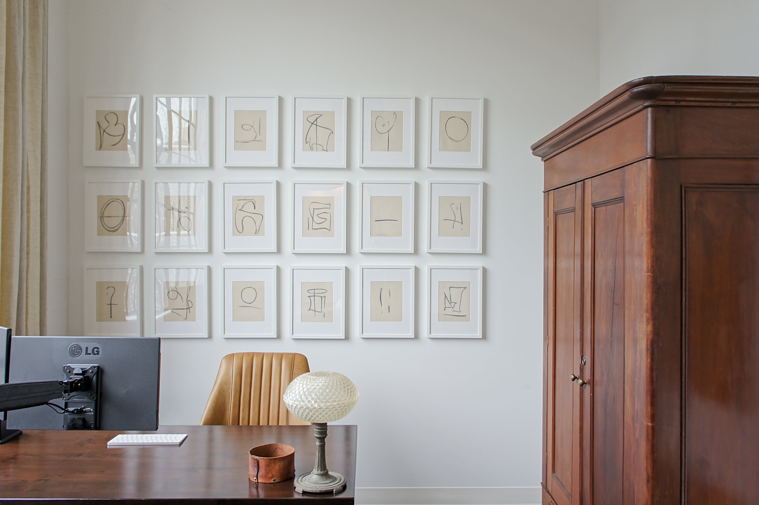
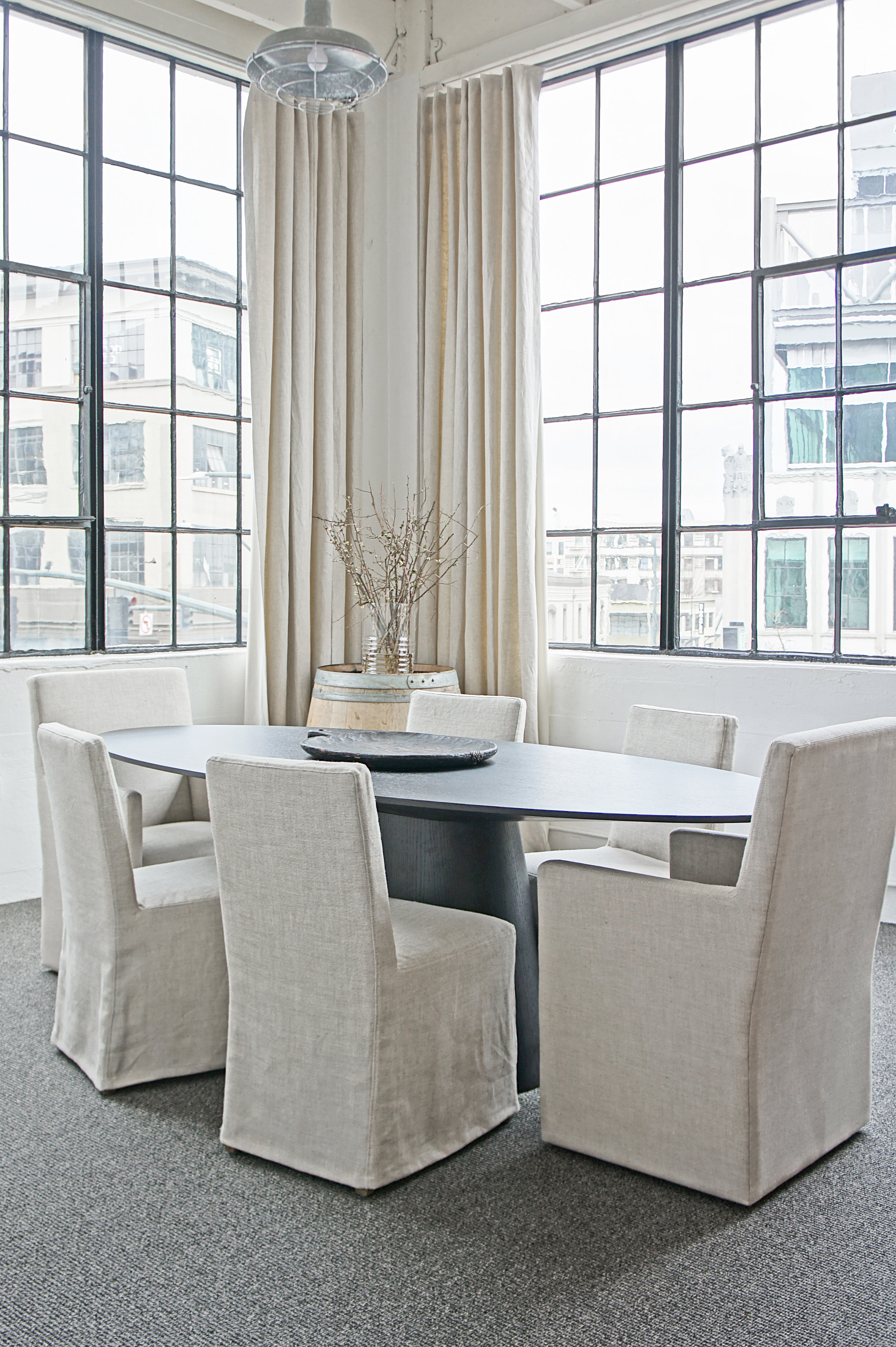
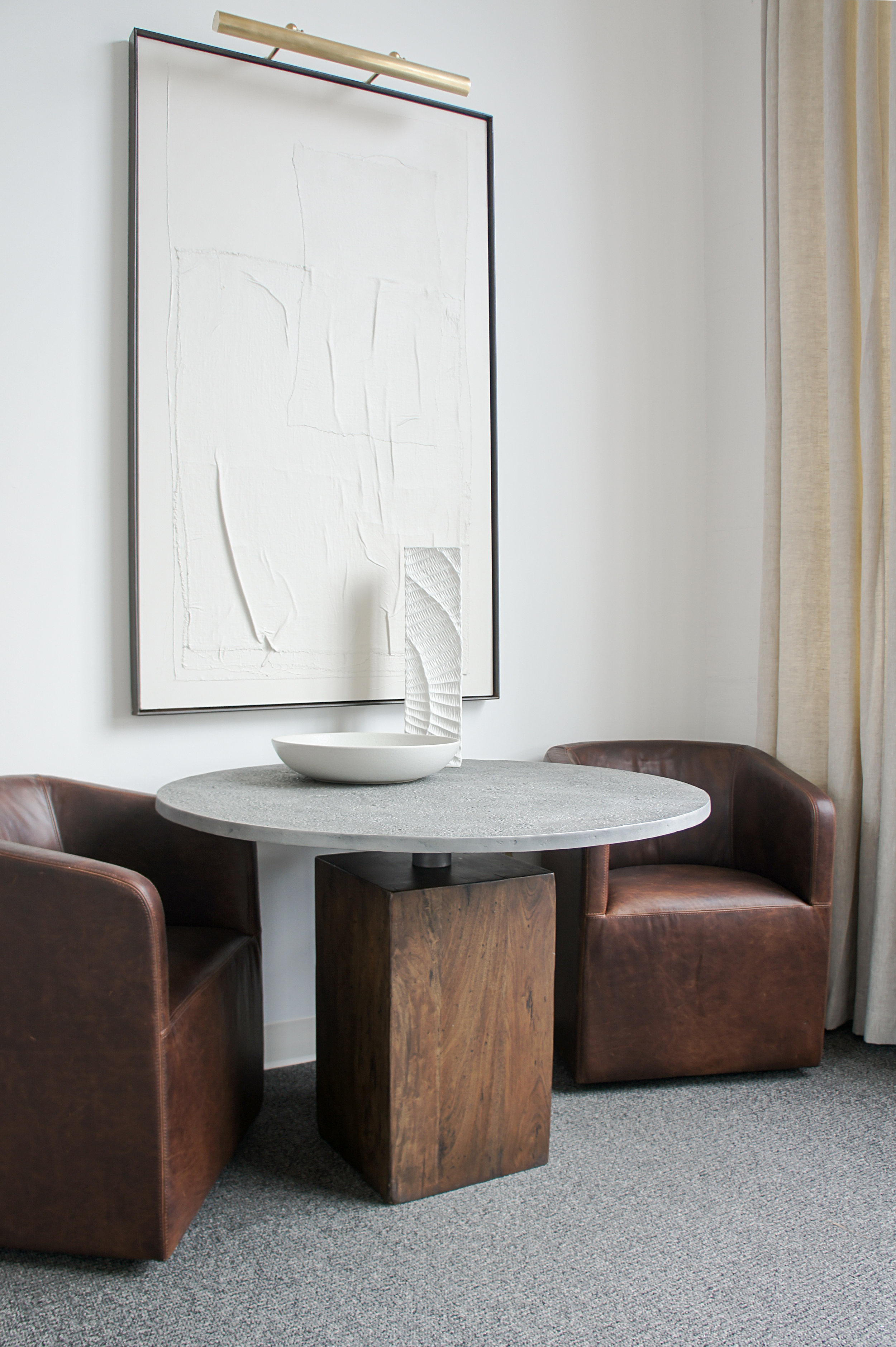
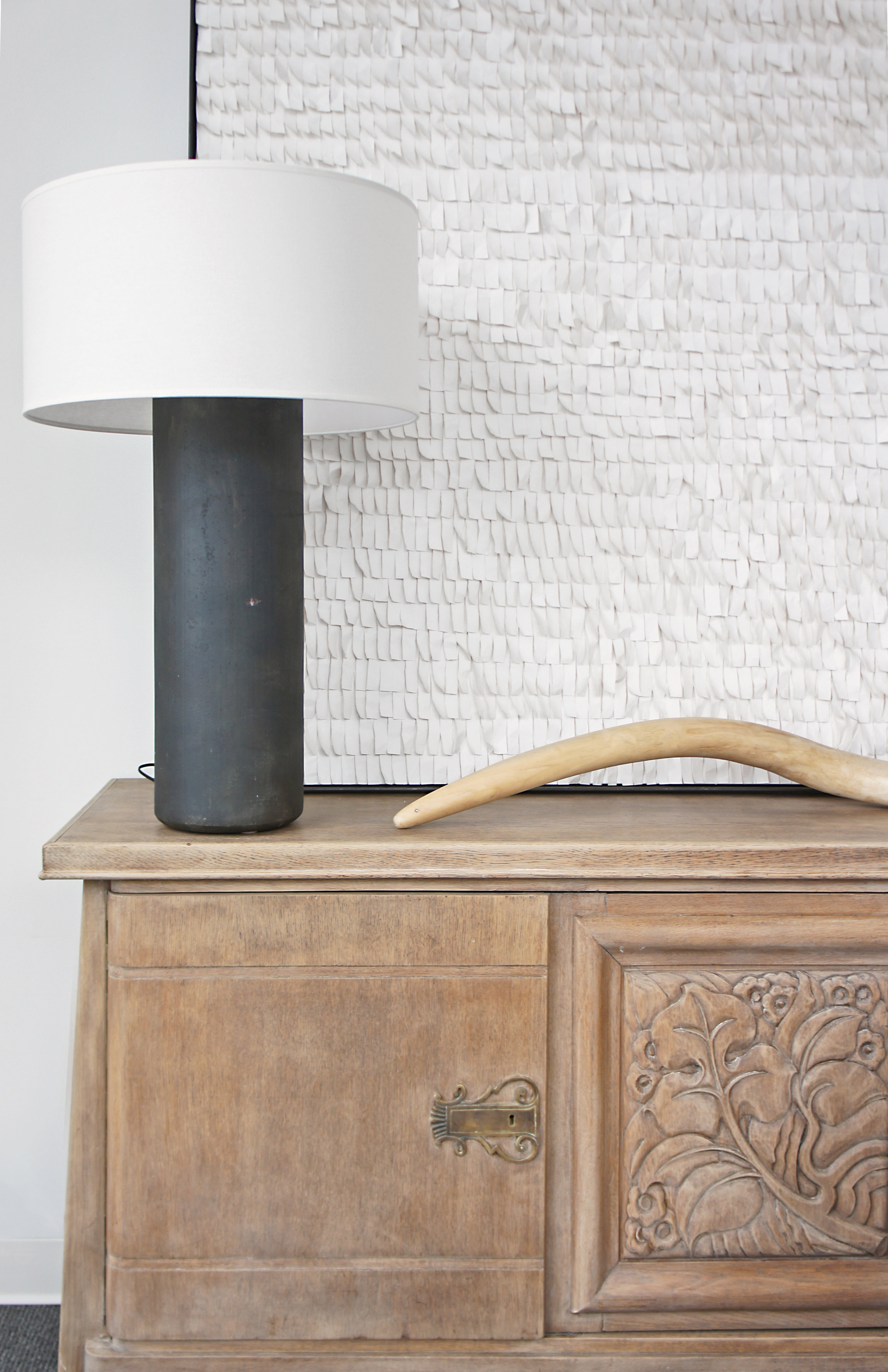
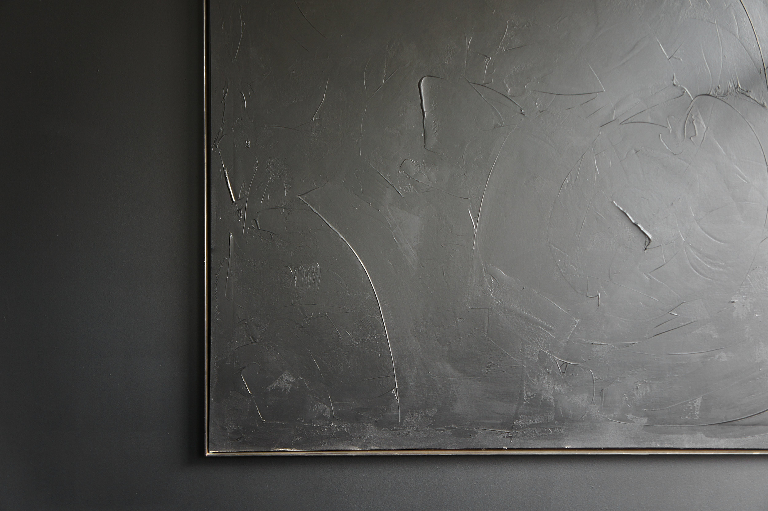
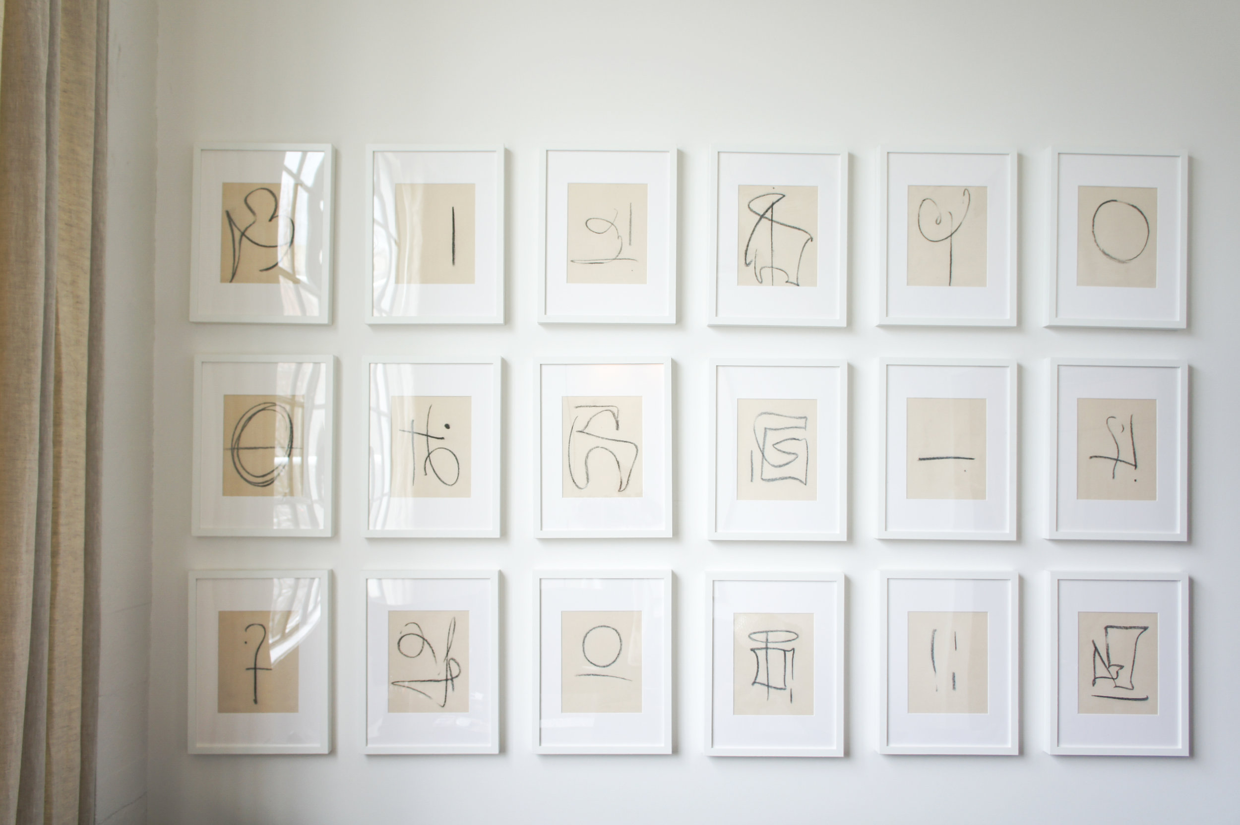
A few weeks ago, we wrapped up one of our most recent projects, a commercial office revamp in downtown Portland for our clients at Commercial Integrity NW. With every project, it presented itself with some challenges but the potential was completely evident from the beginning. For the later part of 2017, we spent some time developing a new layout for this special space, sourcing new furnishings, as well as creating custom pieces and art to create a cohesive and refined look that better represented our clients and their business. The result: A warm and inviting office space that exudes the old world/modern vibe our clients desired. We are in love.
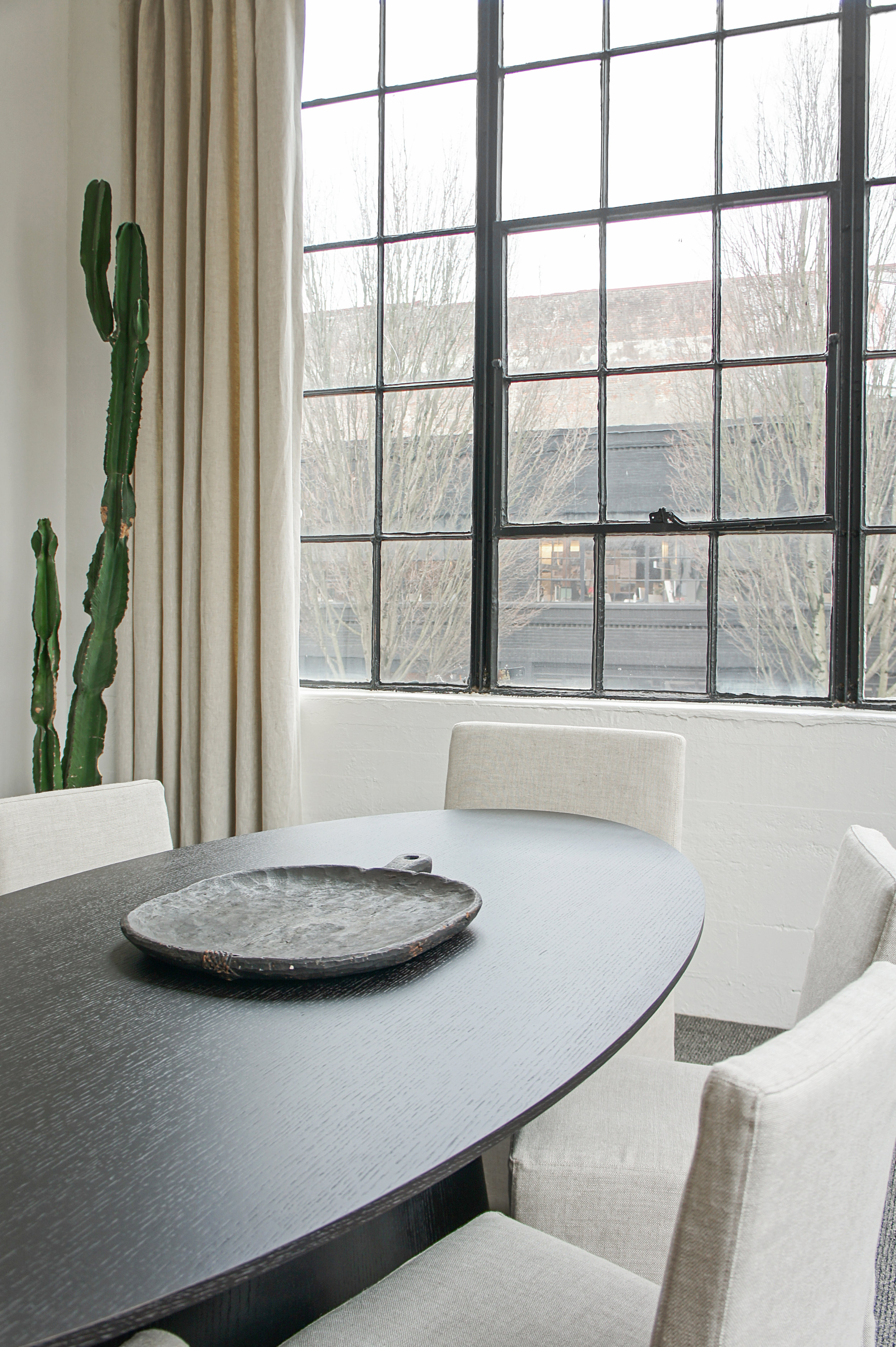
The office space is located within an older industrial building in downtown Portland. The existing bones and character of the building were a great starting point to work off of with the design. We loved the industrial vibe of the space, with the original steel windows, high (beamed) ceilings and elements of concrete throughout but we wanted to make the space feel more inviting...almost like walking into a fabulous hotel. With that in mind, our plan was to soften the industrial a bit, bring in more natural and rustic character and add some amazing large scale art (because this space could definitely handle it)!
We balanced black with white, new with old, soft with hard. To us, that tension is what makes a space interesting and it worked perfectly for this project.
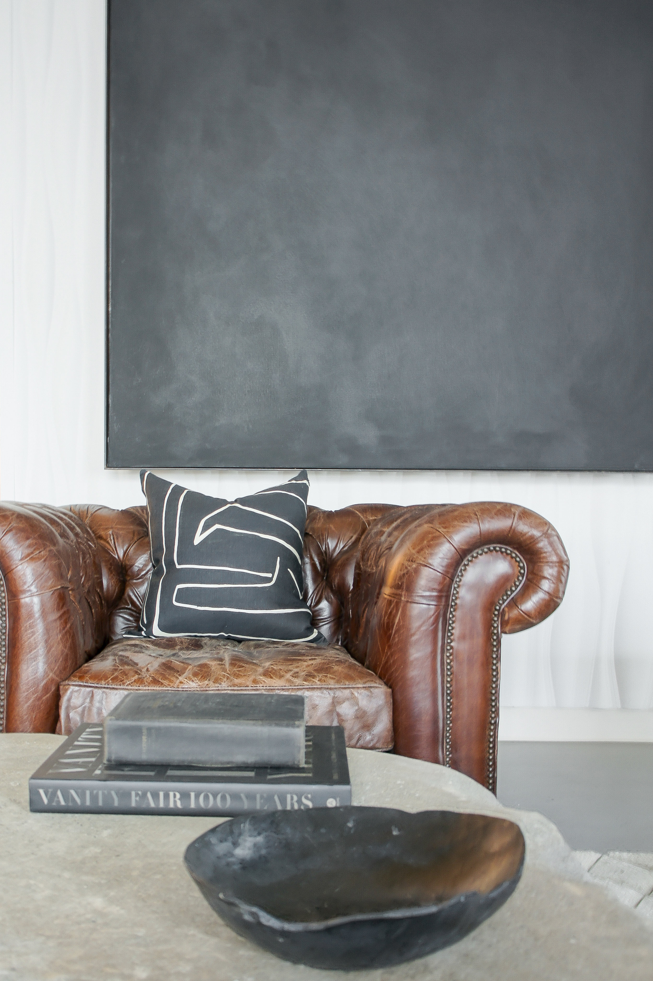
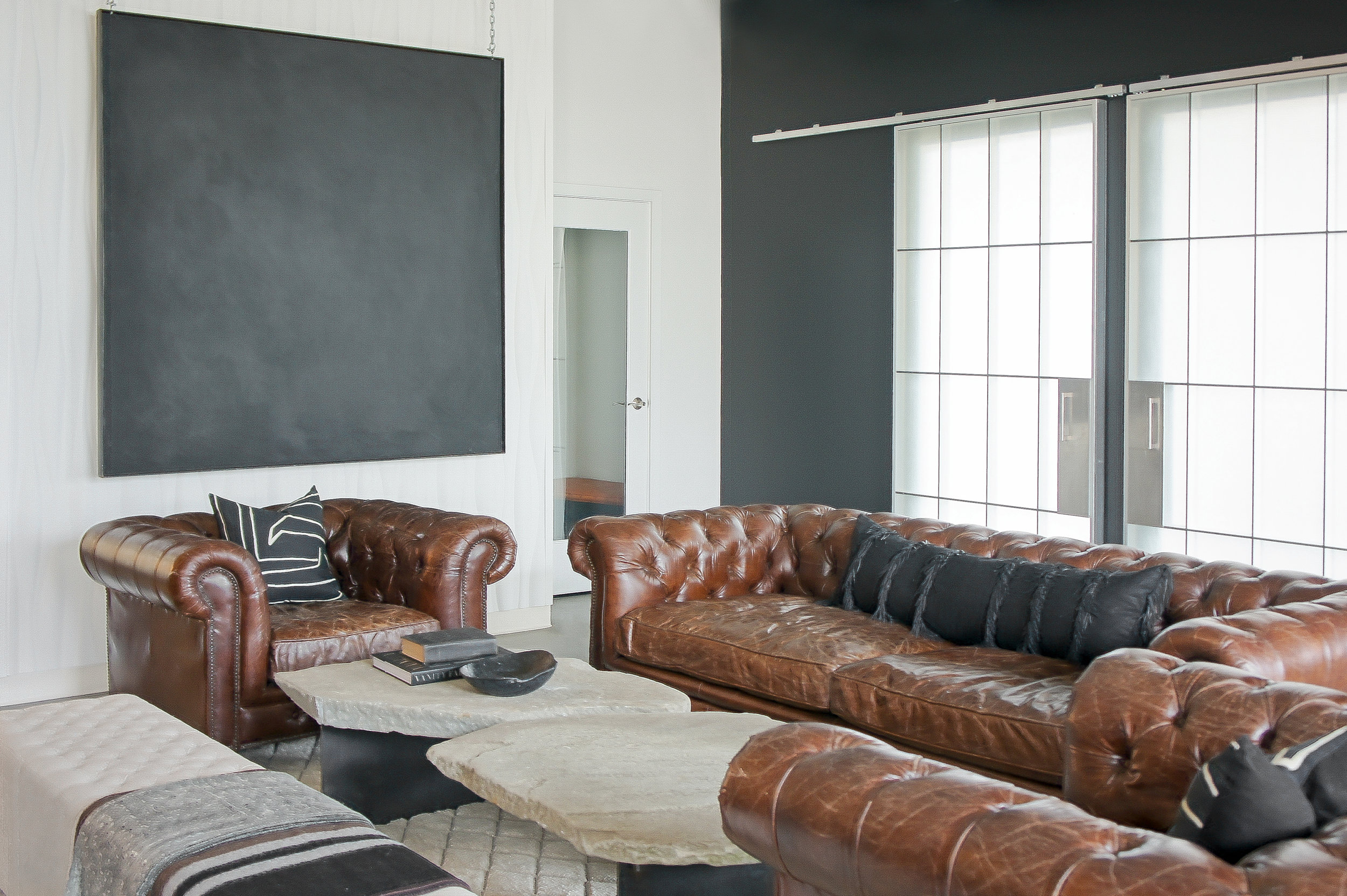
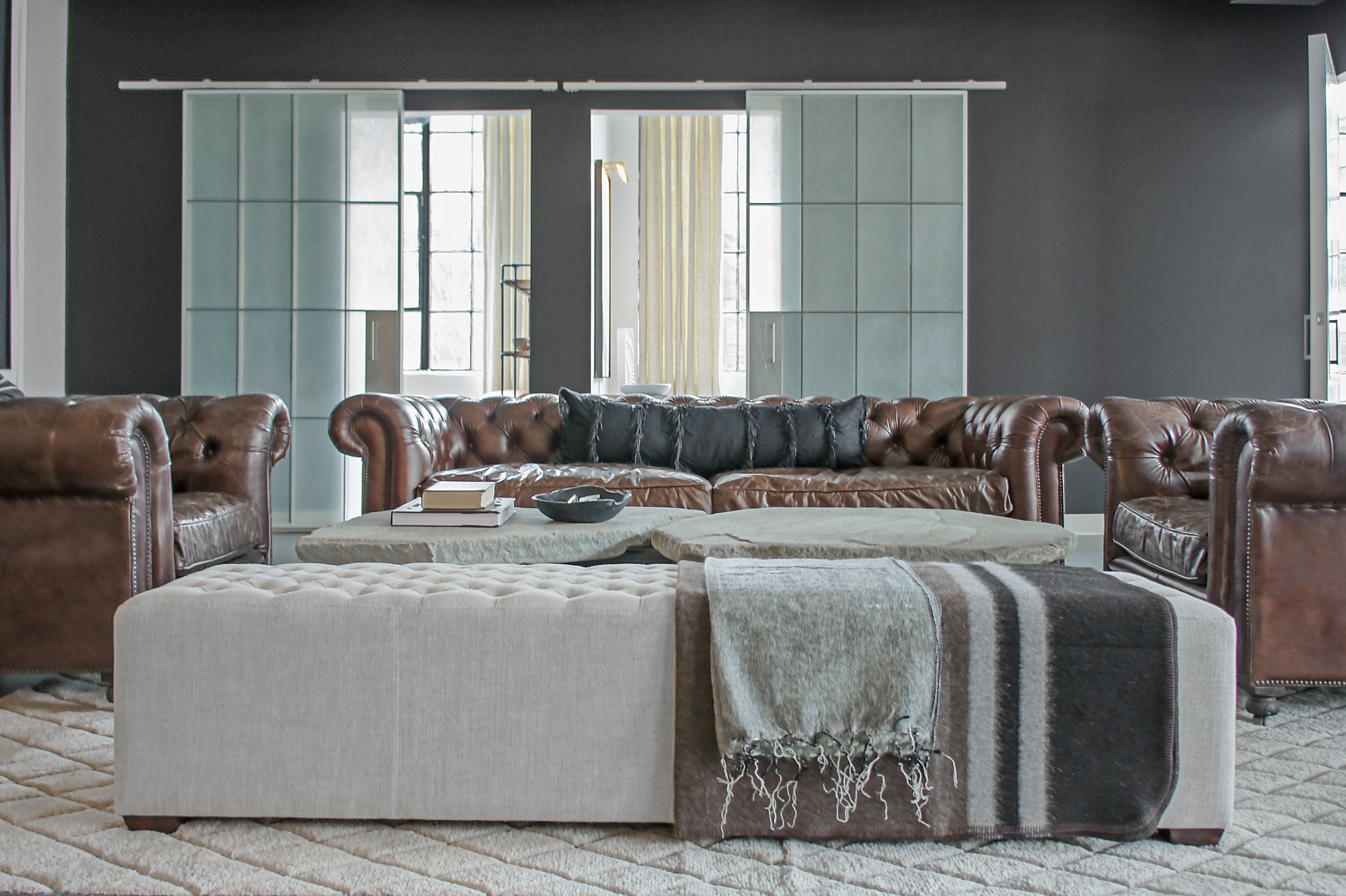
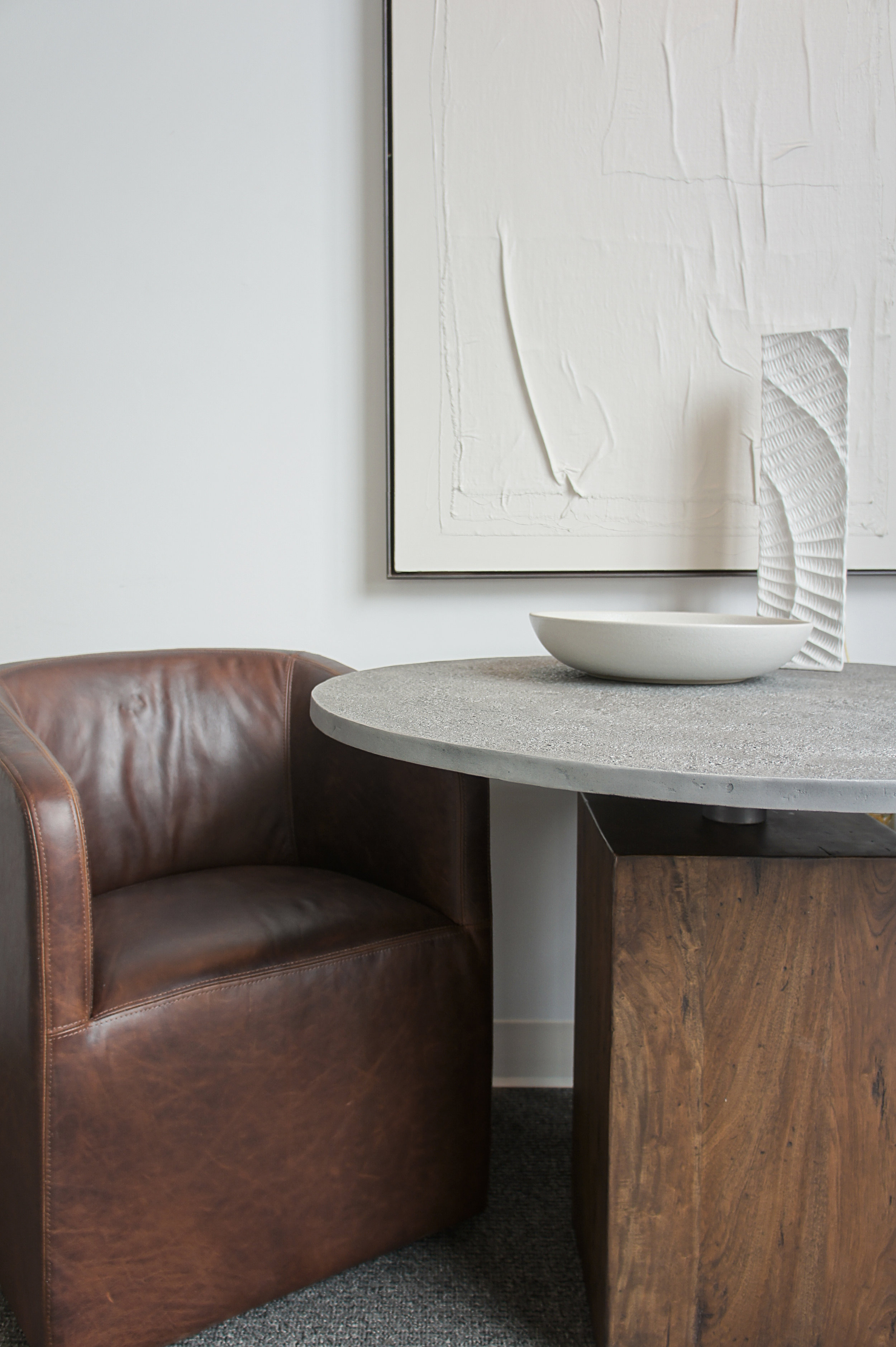
We were able to incorporate some of the client's existing pieces into the design (i.e., the leather chesterfields) and balanced them with a custom, rustic but modern coffee table and modern art. Keeping that old world/modern aesthetic in mind, the ultimate goal for the design was to create an uplifting and inspiring vibe for the office. The bright spaces were kept bright and the areas that lended more to the moody vibe, got that exact treatment. The result creates a beautiful balance and much intrigue when walking the spaces.
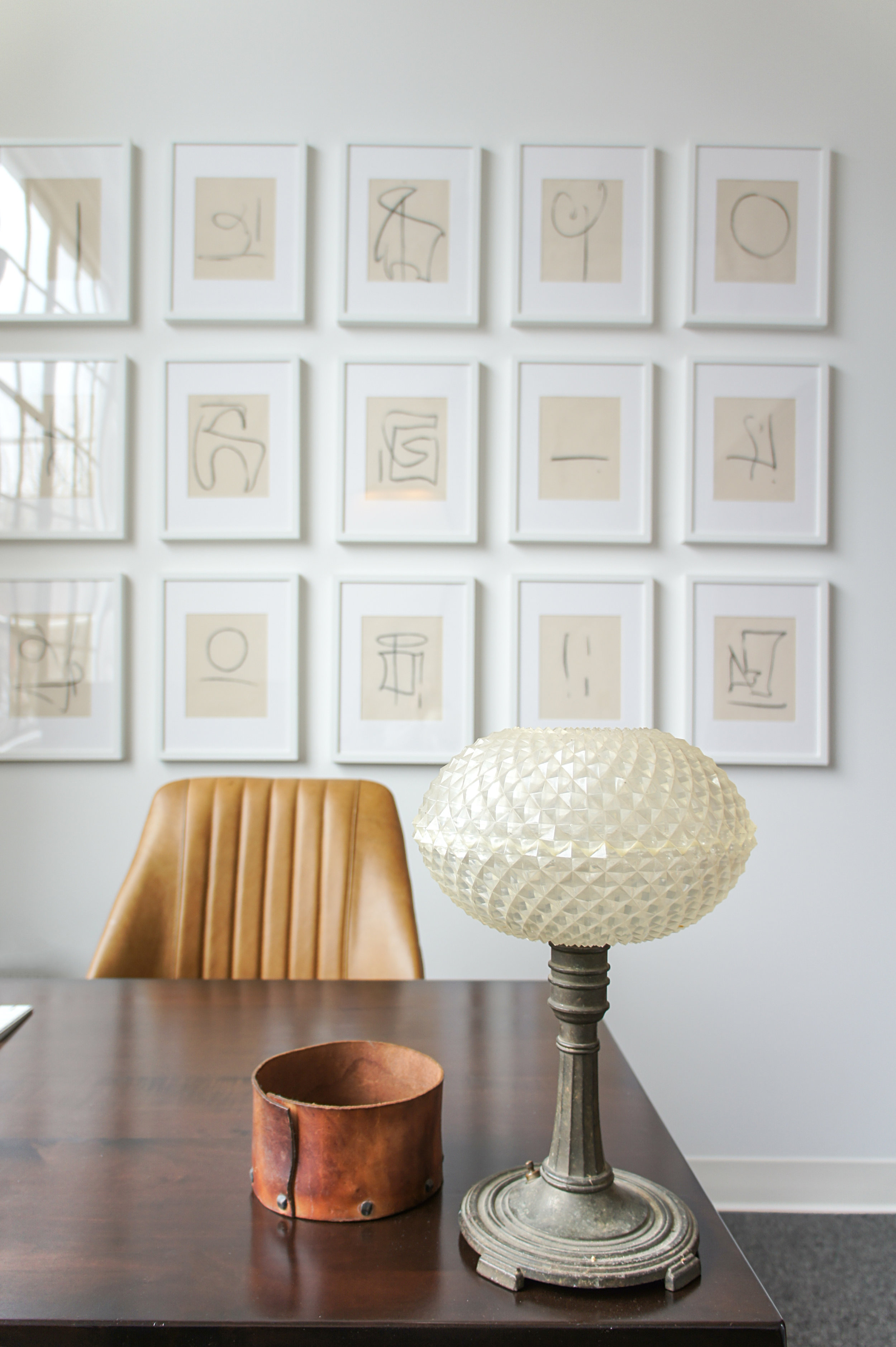
Since this is a commercial office space, we kept the styling and accessories to a minimum. We didn't want our clients or the people they bring into the space to feel overwhelmed with visual clutter. First and foremost, this is a place of business and we wanted to respect that. However, a commercial space does not have to feel "commercial" and that is where we chose to change things up a bit.
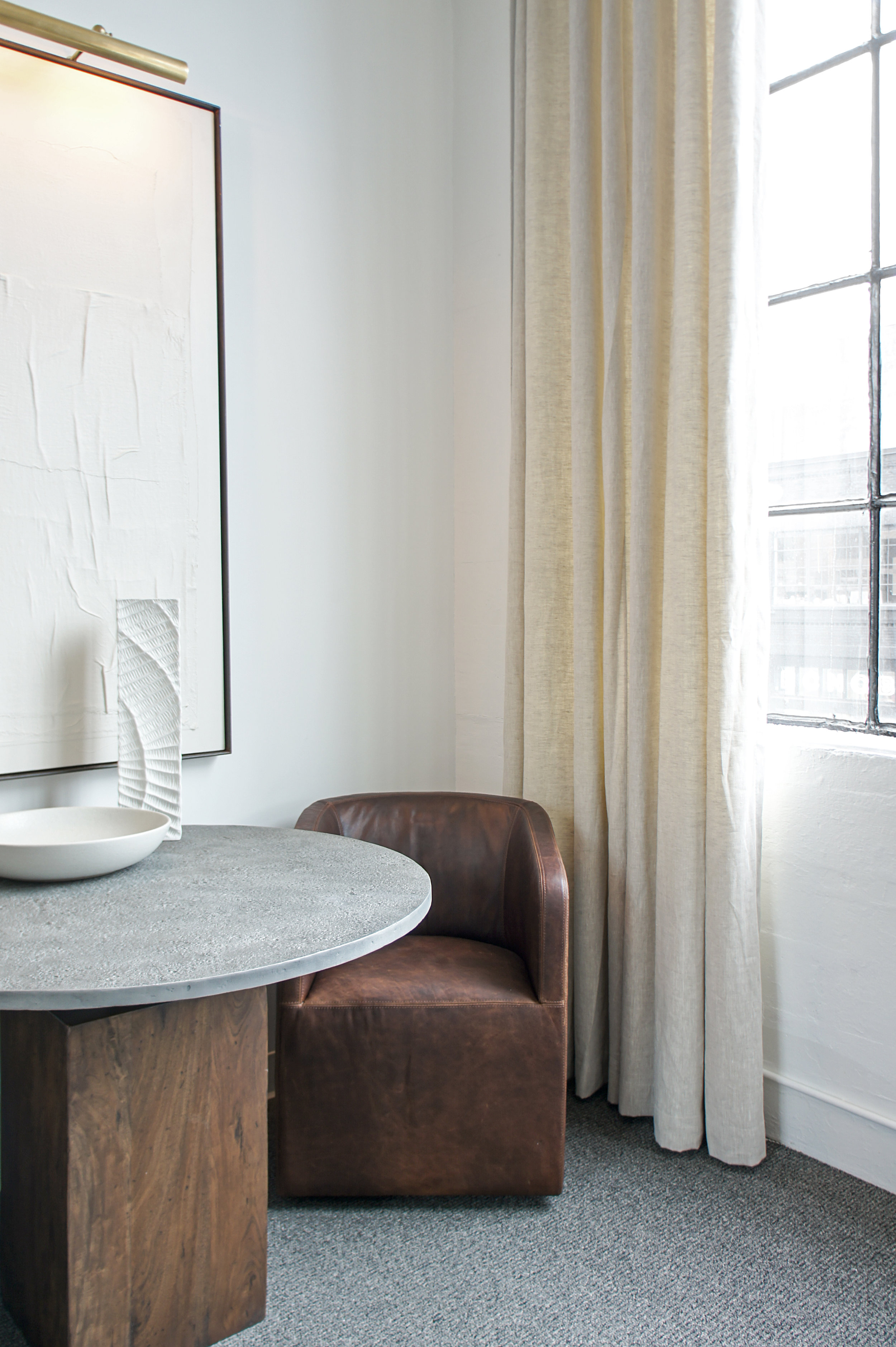
We opted for a more neutral color palette with this design and instead, played with tones, texture and natural materials. You know us, we love a space that begs to be touched!
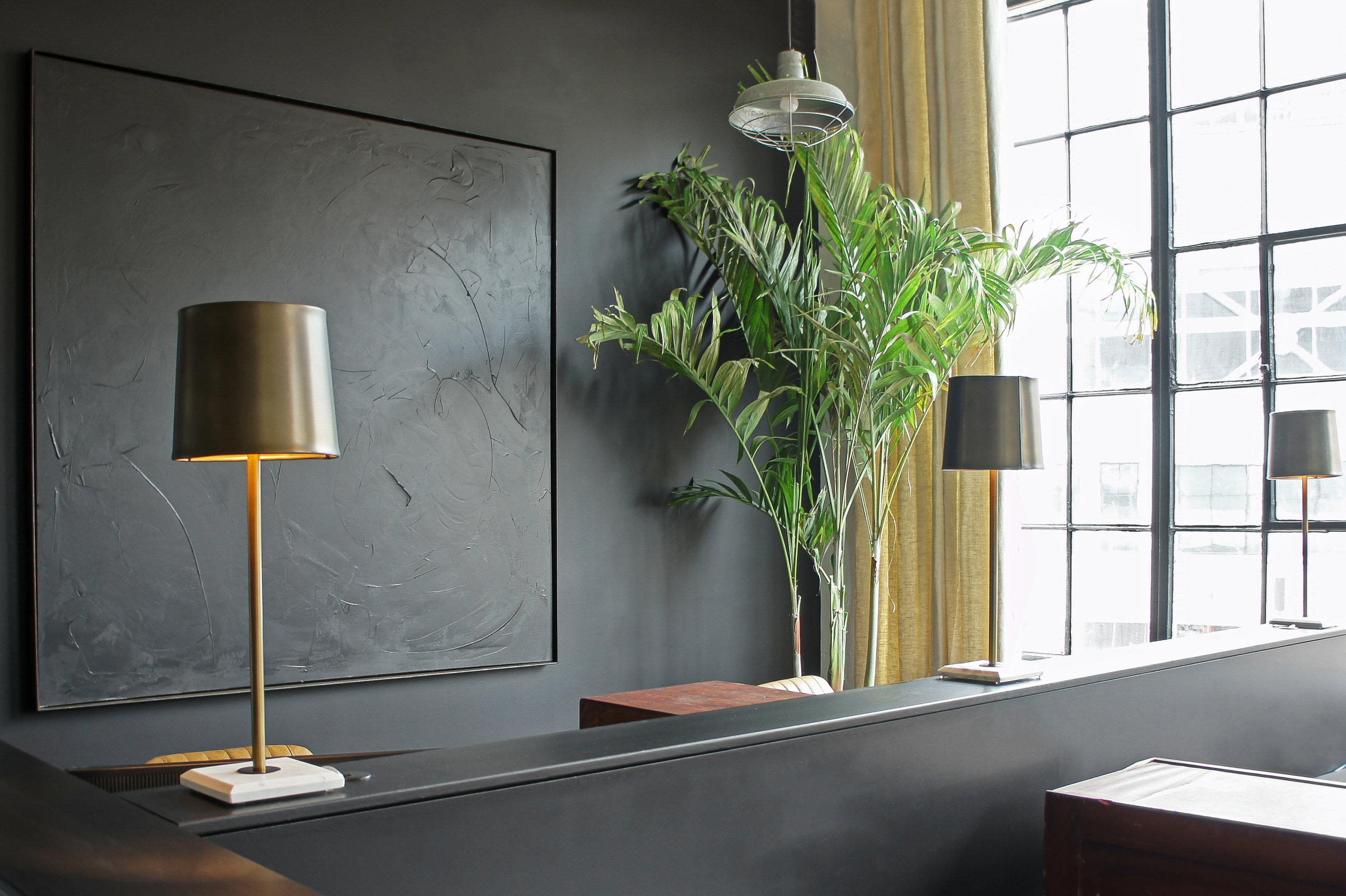
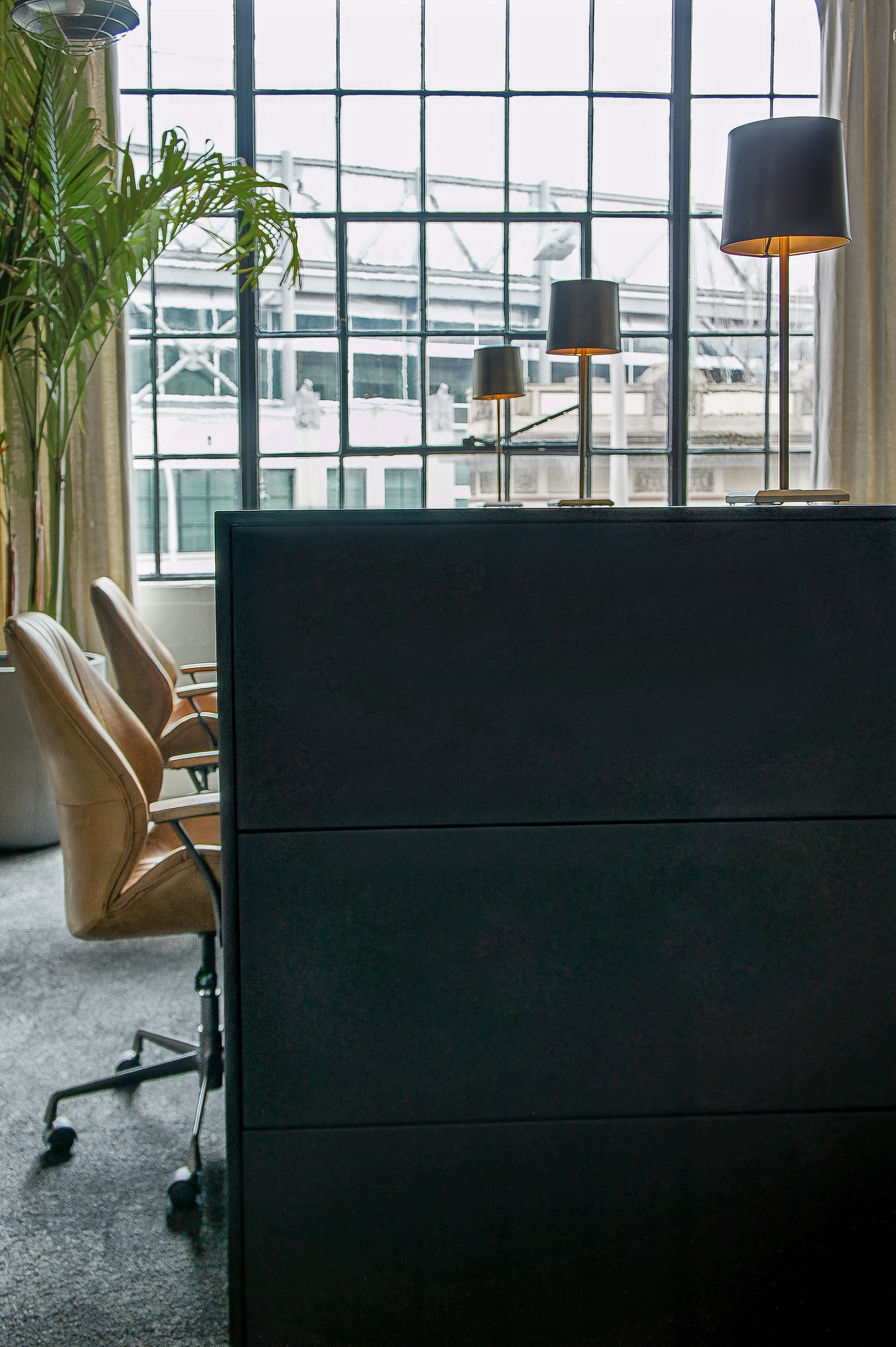
One of our favorite additions to this project was designing and building this large modern wall that sectioned off the public desk spaces from the lounge area. Being a slightly open concept office, we didn't want to divide this space completely off but we did want to give it a little privacy. We also wanted to clean up the look of the previous layout and thought hiding the desks and their contents was of utmost importance. Fitting in with the old world/modern look, we created a streamlined modern wall but balanced it with aged brass library style lamps. We then separated the desks on each side of the wall with antique filing cabinets for privacy and of course, juxtaposition! The office chairs finished off the look being the perfect combination of all the elements.
Again, so ecstatic to see this vision come to life. The clients, the space, the results, we couldn't have asked for more. Cheers to your new space Commercial Integrity NW and thank you for choosing us to be part of it!
~C&B
