So it's been a while...but a lot has happened in these past few months! Where do we start? Well let's just say this house has surprised us. Big time. As we searched for our next project last fall, the Tabor House just sat there, for days, weeks, waiting for us. We overlooked it a few times during our search, it just wasn't...right. One day we had looked at another house in the neighborhood so we thought, let's just take a walk through. Well, we weren't floored by our tour but the house had potential. So we decided to give it a go. That was the beginning. Everyday after that, the house grew on us. We pulled up the carpets to pristine oak floors. We cleaned her out and reworked the layout. Then we built the dormer...the house immediately changed. This was going to be a good one. Once the exterior paint went on, we were in love! After that, inside changes started taking place. We found and incorporated unique design and materials into each of the rooms and our love grew. Well, now we are done and the house is gorgeous. We were able to do things we have never done before on this house and it makes us want to push even more on the next project. One thing is for sure, this house has shown us that even the most plain and ugliest house on the block can become the one of the best, that potential does not have a limit and that even we can surprise ourselves every once in a while!
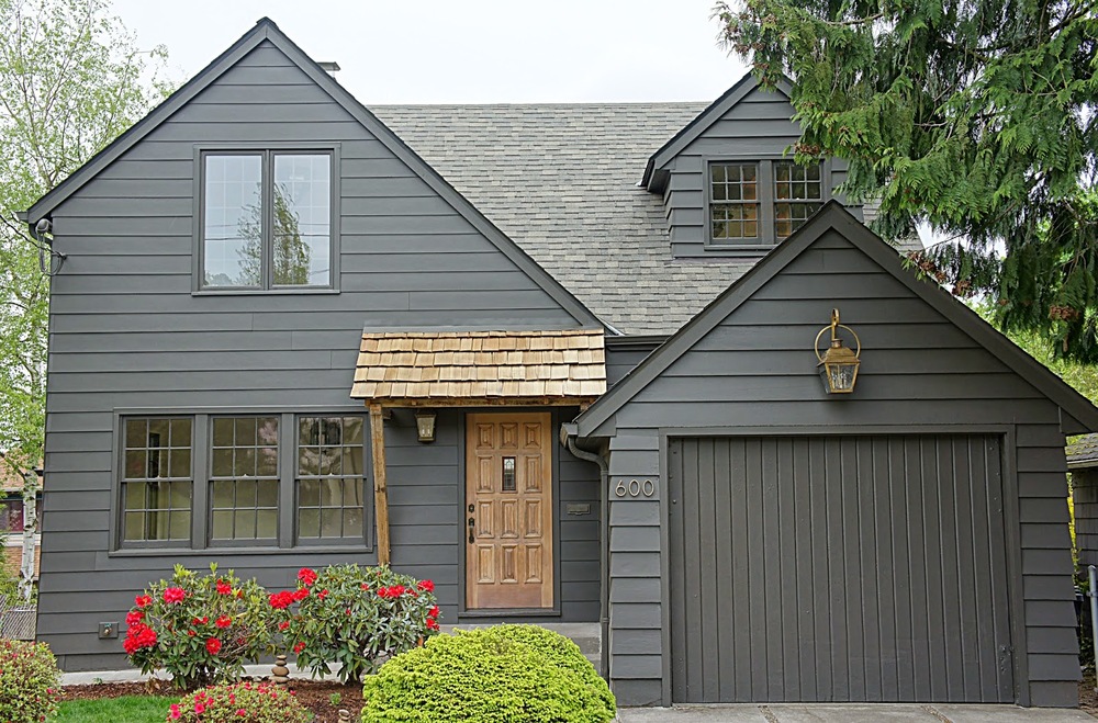
We felt like we picked the perfect color for the exterior of this house. A custom color that is actually a very dark brown with charcoal undertones really modernized the outside. We balanced the modern with more traditional wood tones and brass accents.


We like our interiors to be light and bright so everything went white...again! We did however, keep the living room windows the original dark wood while painting the rest of the windows throughout the house the same color as the exterior.


The whole house only had three major colors throughout with the addition of the unlacquered brass as an accent. Whites, dark charcoal browns (also the exterior color) and medium grey/brown tones add contrast to each other while still remaining neutral and somewhat monochromatic. This scheme makes the home feel bright and airy but also inviting and warm.


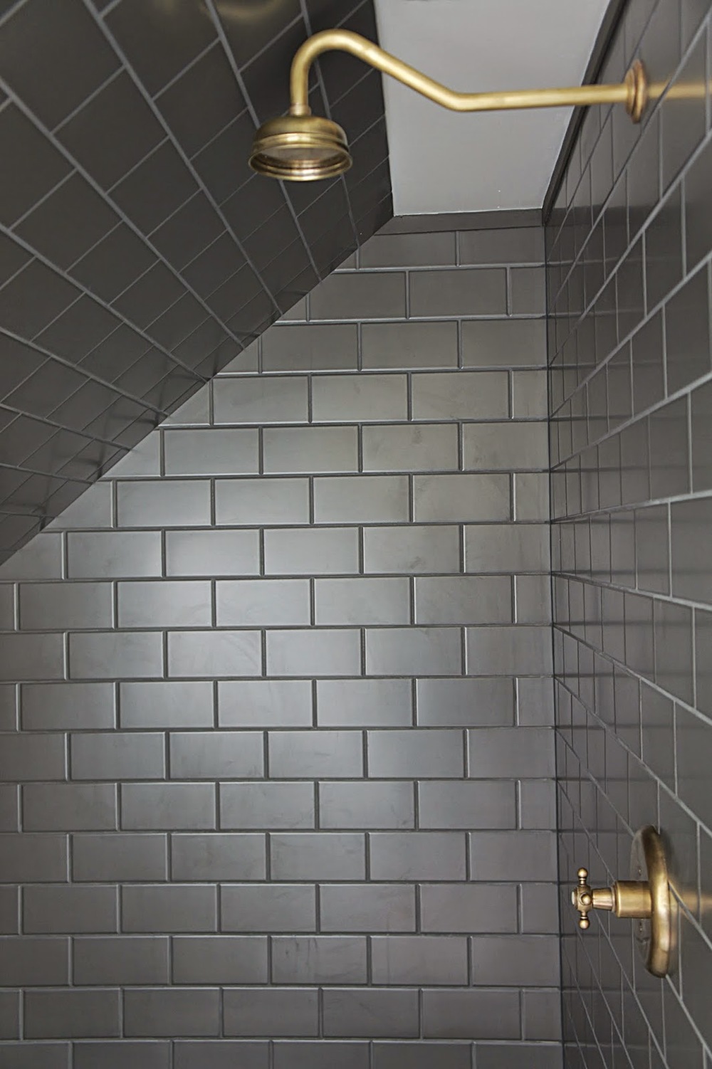
The tile in this bathroom was the main design inspiration for the whole house. We felt it had a Navajo/Southwestern vibe...but more modern. We love this tile!!!


We used a variety of different materials throughout the house. Though very dramatic and eye catching, each room is still a blank slate to add as much or as little as the future owner wants!

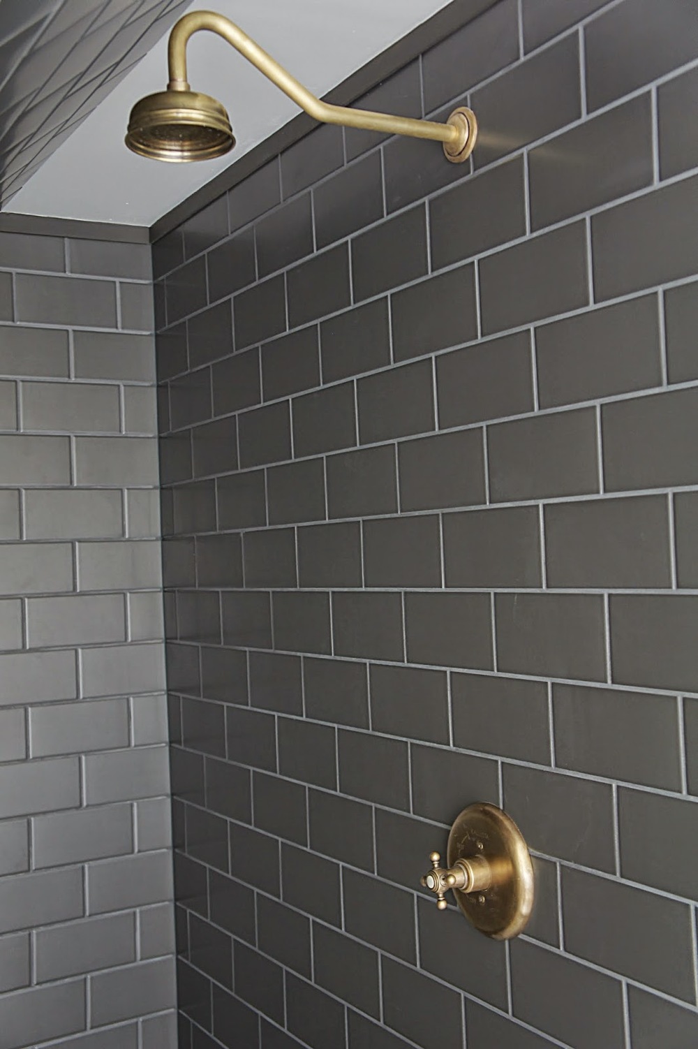
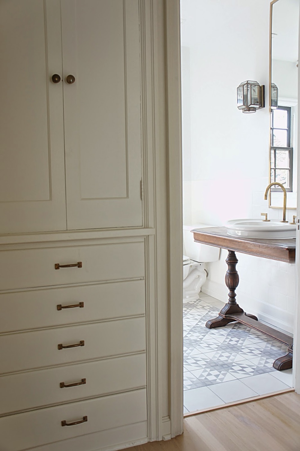
All of the brass and fixtures throughout the Tabor House were custom finished by us. The process was very time consuming but now all of the fixtures and hardware look like they have aged a hundred years and will continue to do so with normal use.


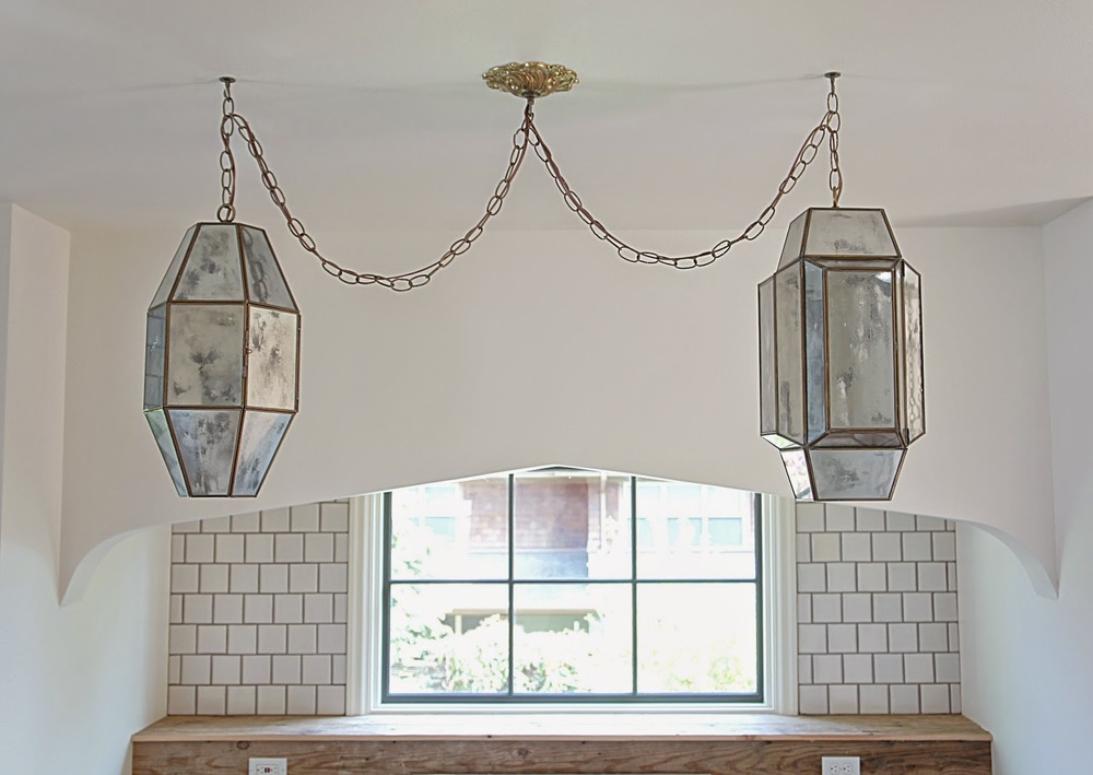
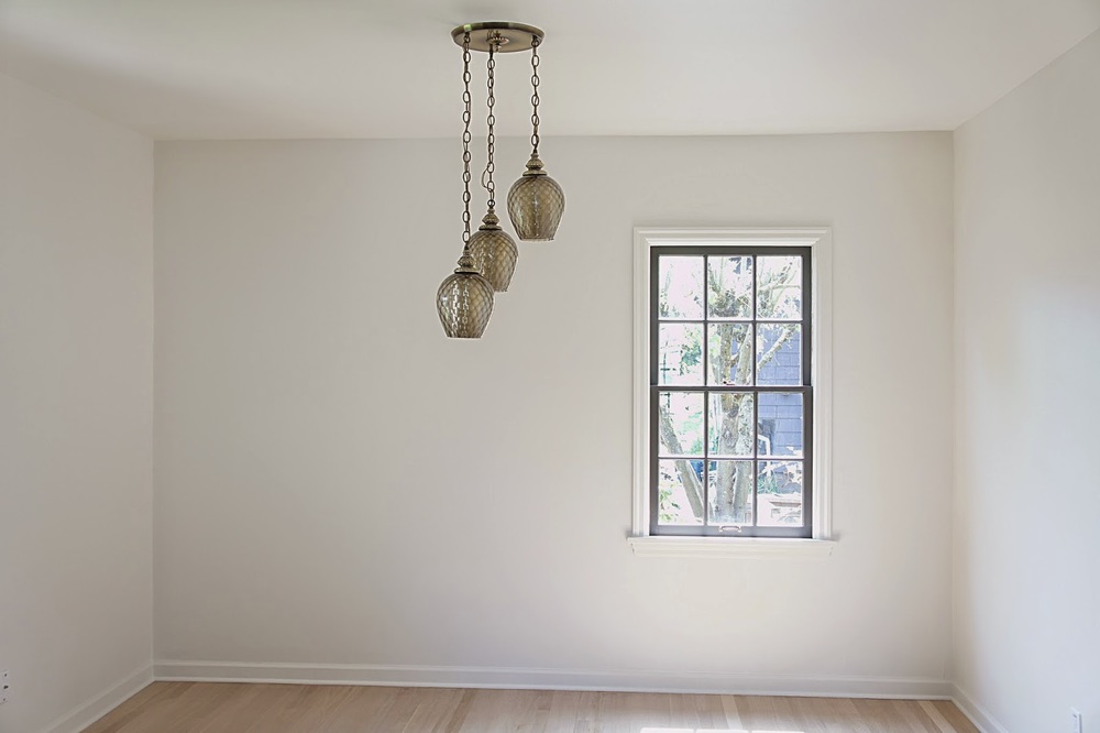
We custom made most of the lighting throughout the house. It was a huge project, but well worth it in the end! We wanted a Moroccan or worldly vibe with the lighting so we ended up creating this mercury glass effect on these amazing vintage shades we found. The result is a beautiful reflective shade during the day and almost a prismatic light at night.


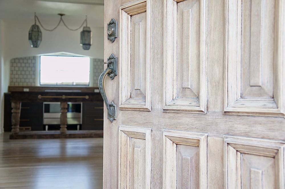
We kept the original (and gorgeous) front door. It needed some work, so we stripped it down and applied a light white wash to the exterior to preserve the original color. The door now looks perfectly aged and full of character...and that's a good thing!


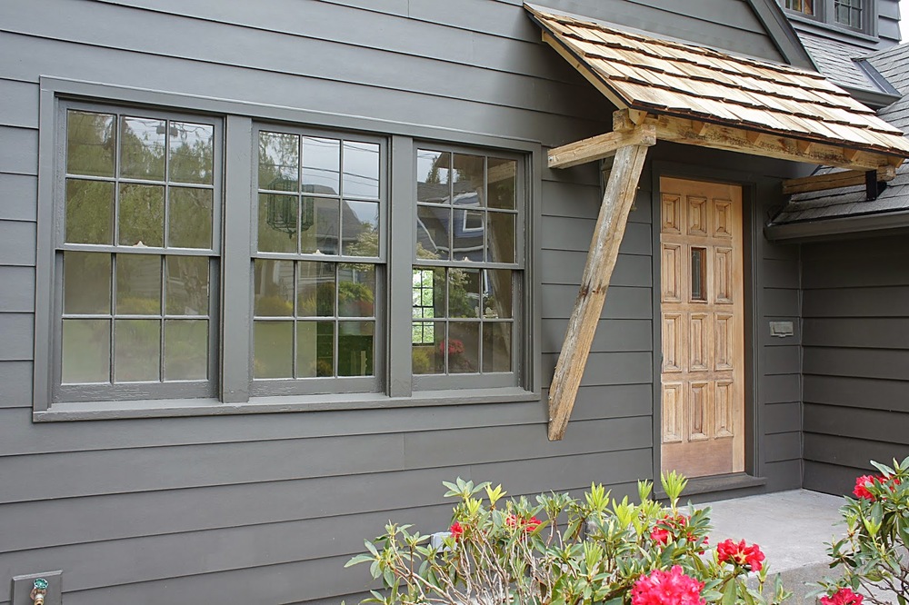
The front door needed an awning. Once painted, the front of the house was very stylish but a little serious. We originally planned to build an awning from the beginning but the materials and the actual design of the awning changed as the house progressed. We felt we wanted a welcoming house with a modern vibe but didn't want stray from it's traditional roots. We decided on a natural awning to match the front door made from wood we salvaged from the Japanese tsunami that washed ashore while we were still living in Lincoln City. Now the house feels modern and classic and now has a great story!


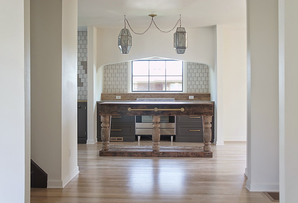
A lot of thought, inspiration and work went into creating this particular space in the kitchen. Basically the first thing you see when you walk through the front door, this area is the main focal point of the whole house. We created a "nook" that houses the range and framed that nook with a dramatic but slightly subtle arch that frames the area and houses the range hood. To finish the look, we custom designed and built the island almost completely from salvaged materials. We were very pleased with the result.


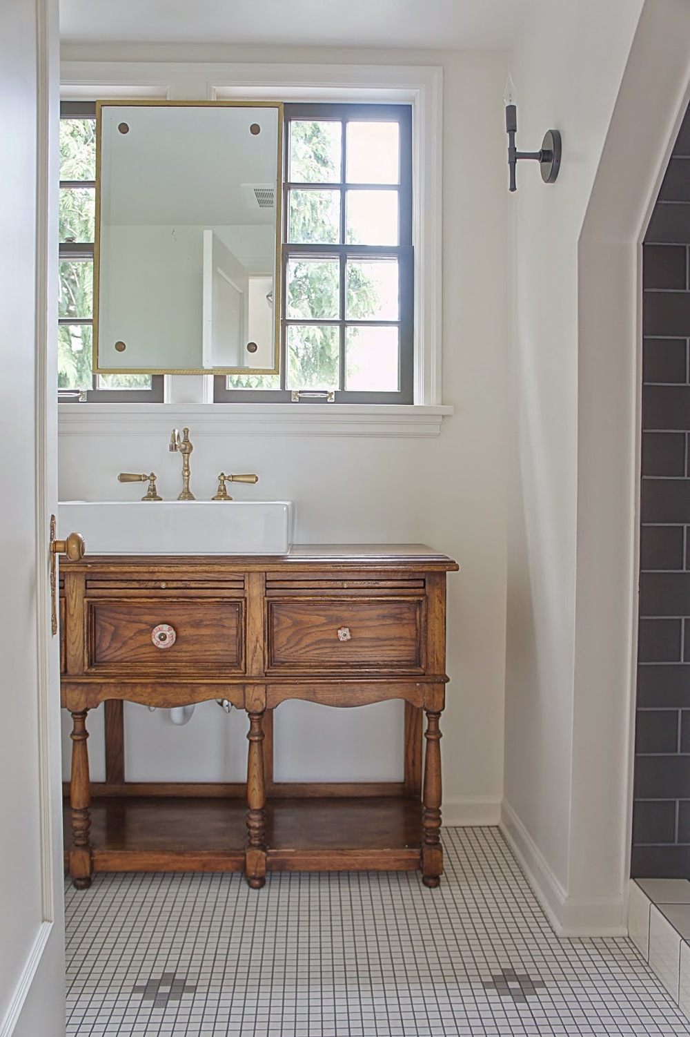
Now that the Tabor House is done, it's fun to look back and see how much this since the beginning of the year. The transformation of this house changed our hearts. We feel we pushed ourselves (and the house) aesthetically to create a truly unique and custom home that is unlike any other in Portland. It excites us to take the journey and lessons from this house and look onward toward our future projects. We only wish we could have staged this one like we did the Morrison House...but...we sold her early! Surprise! Oh well, we'll have that opportunity on the next one! Can't wait!