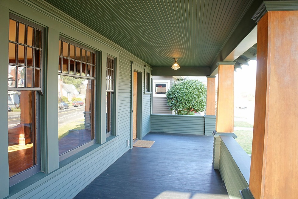
Old Portland Foursquare...A New Life.

Where to start with this one?  Our time this last five months has been consumed melding the characteristics of a hundred year old craftsman with the everyday conveniences of the modern world...not to mention our aesthetic!  The result is something truly unique.  Large, historic, rooms that feel cozy and inviting.  Wood trims, floors and lighting with the original character of a 1910 home but with colors, finishes and design that can only be described as "now".  Bold choices were made with a discerning eye and we feel we gave an old foursquare a modern, new life.  We're thrilled!

PS:  We still used lots of salvage on this house, it's a way of life for us!

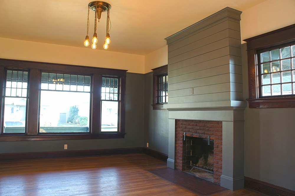
We gave the original fireplace a grand face lift.  The old trims and mantle did not do the fireplace justice.  The living room is grand and it needed a grand fireplace to match.  The solution was to build out and surround the fireplace with a modern look but to keep in mind the traditional style of the home.
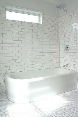
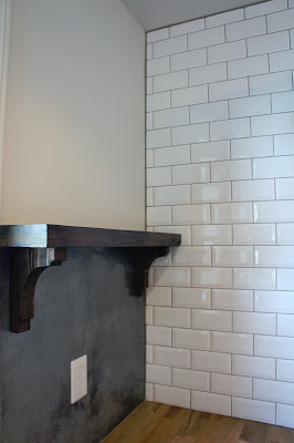
The upstairs shower was the most unique project we undertook with this house.  We found a piece of chalkboard slate at a salvage yard and thought it would be perfect for a shower.  We thought the chalkboard would play well with the classic subway tile.  We gold leafed the border to match the brass fixtures and to add a little punch to the slate. 

One of our favorite shots.  It was a foggy day in Portland and it showcased the house perfectly.

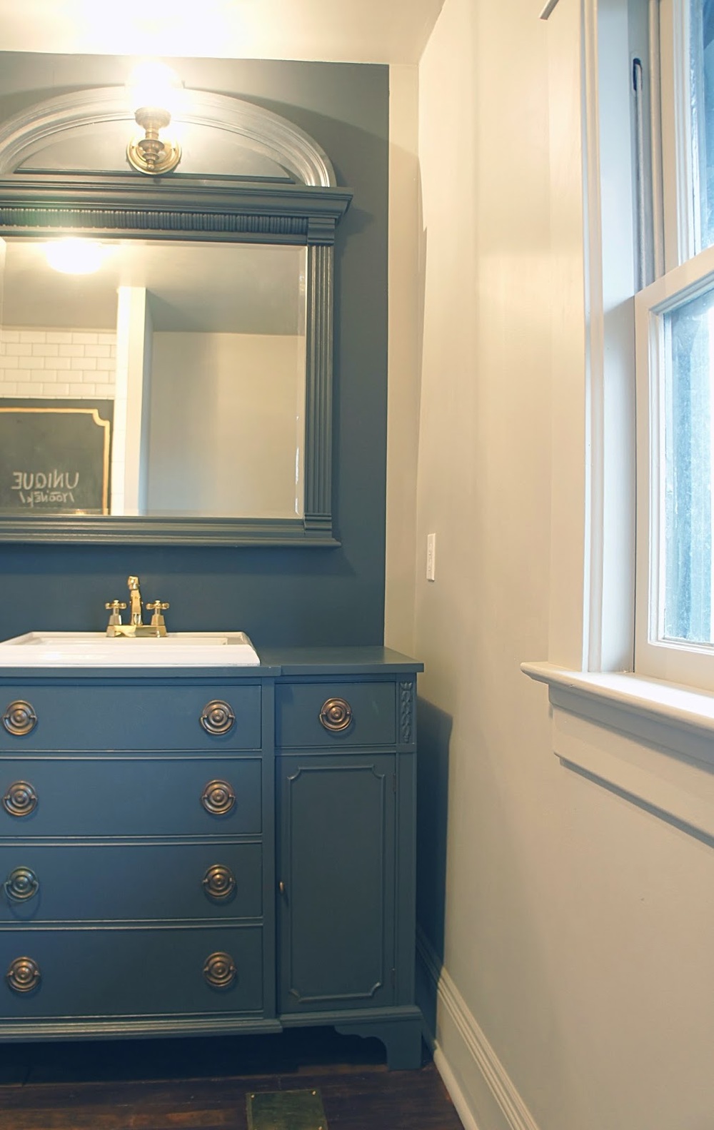
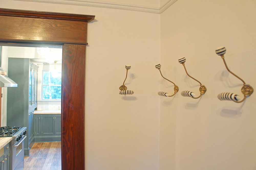
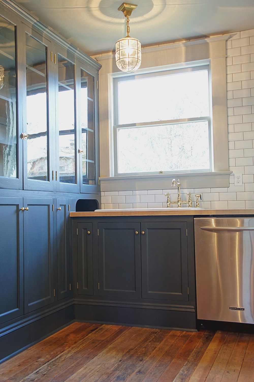
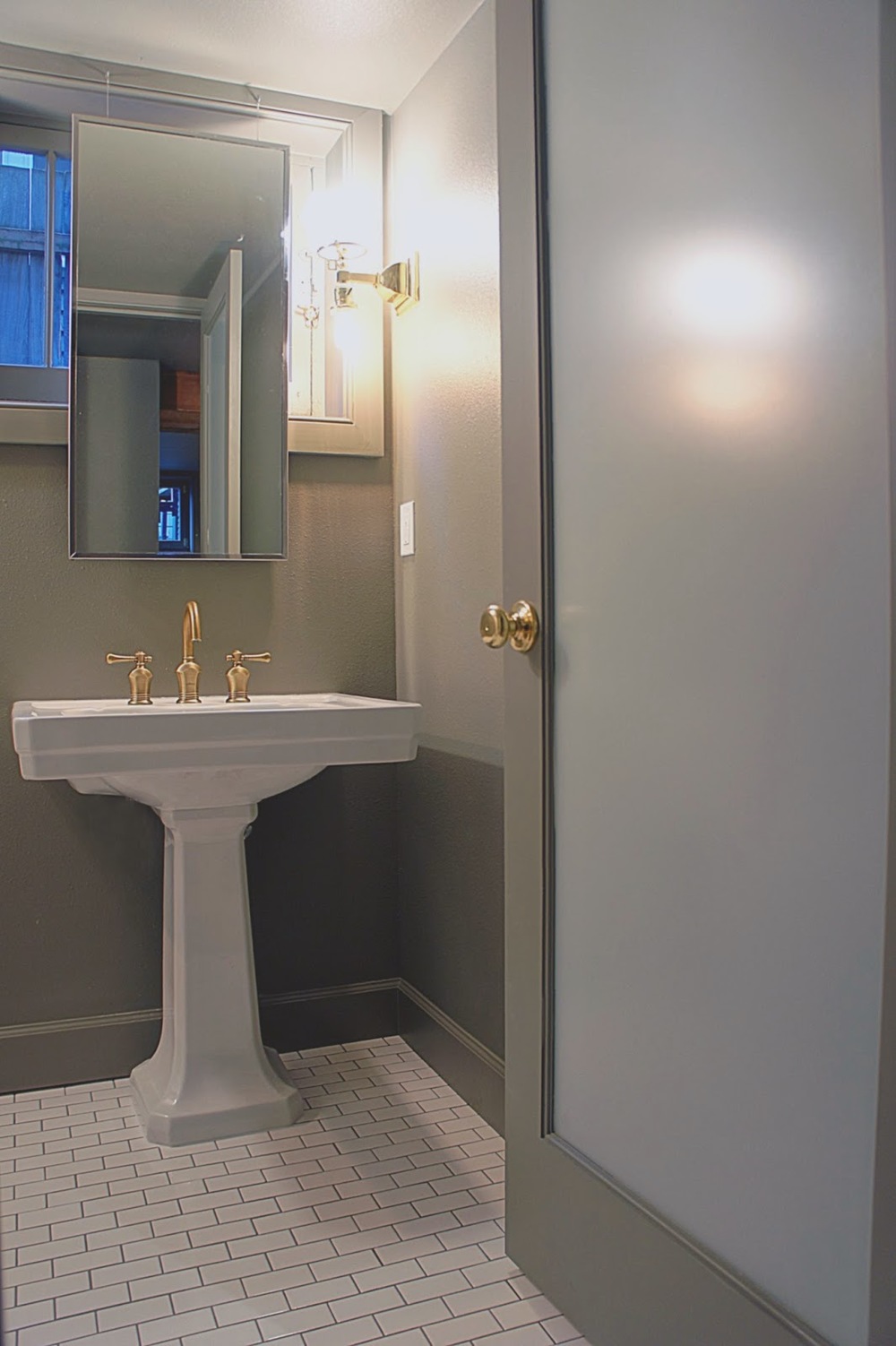
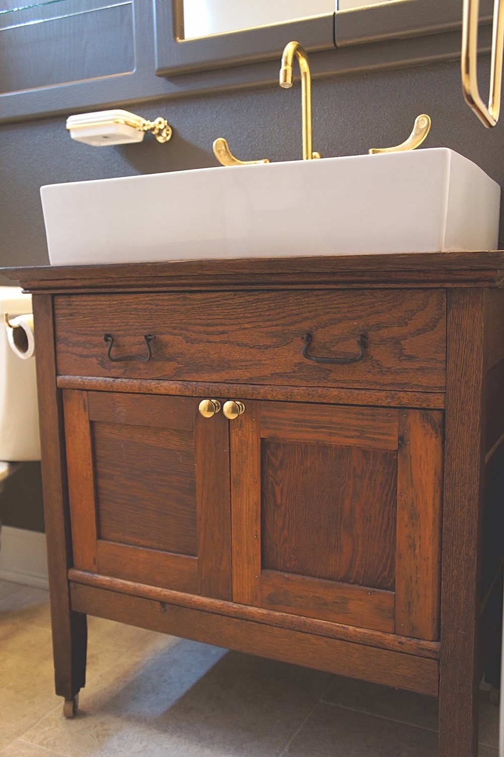
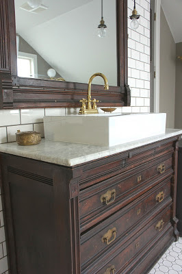
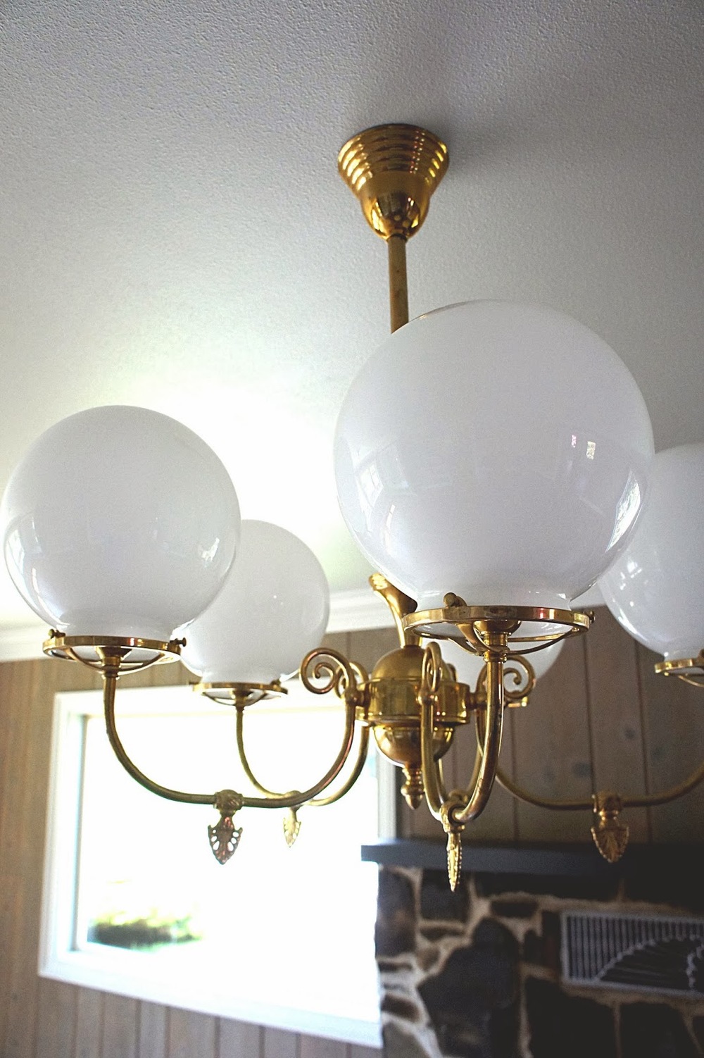
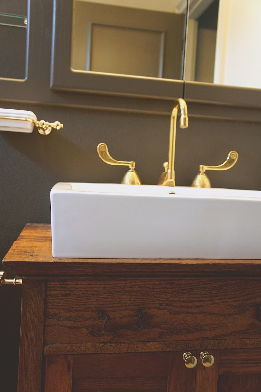
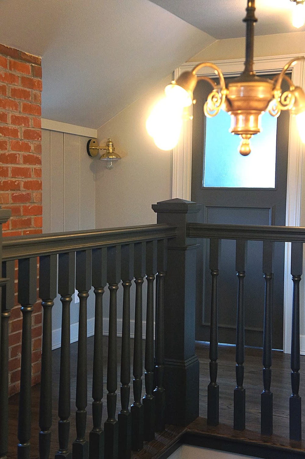
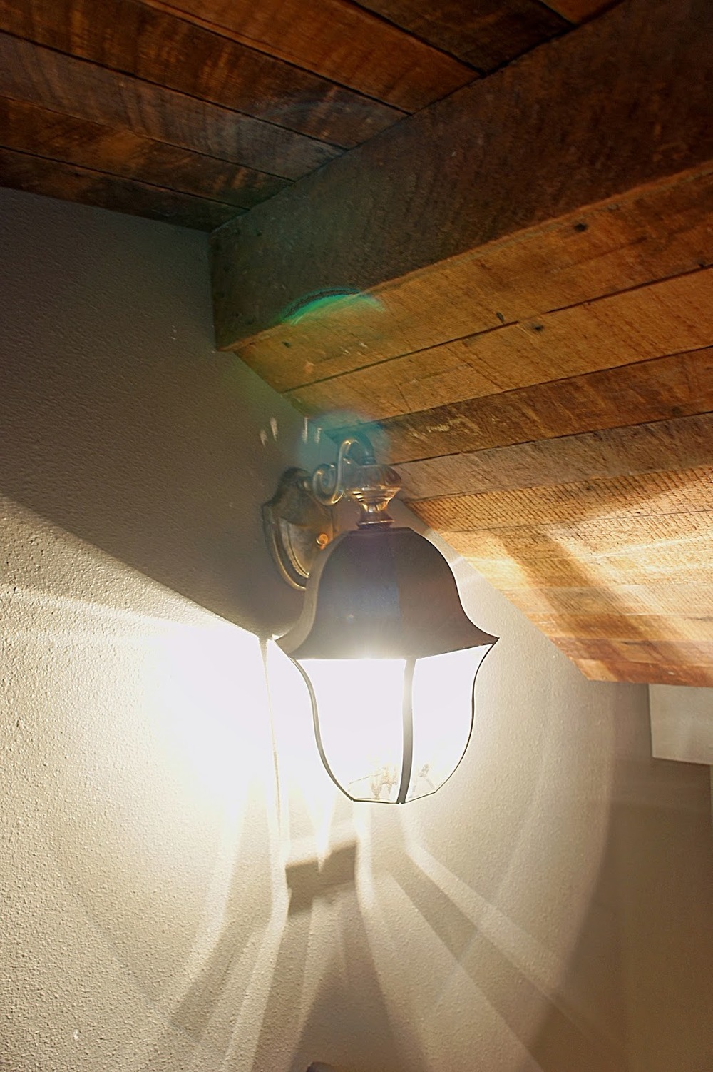
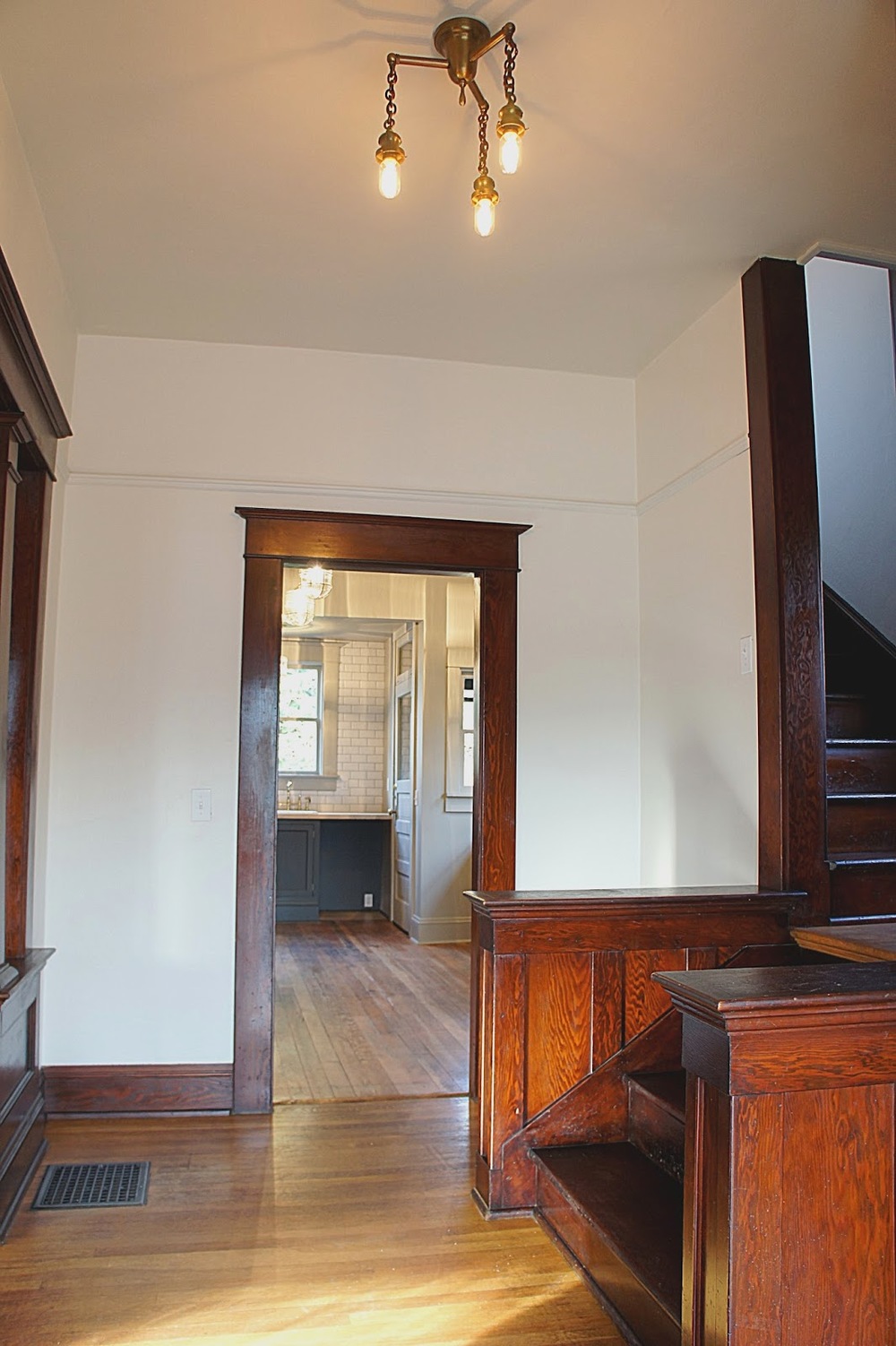
Brass fixtures and hardware finished the house off.  We love the way brass plays against modern day colors like blacks, greys and whites.  So elegant!

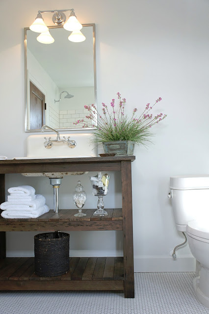
We patched holes in the upstairs bathroom wood floor with brass sheet metal.  The result is truly eye catching and unique.  Will definitely be doing this again!
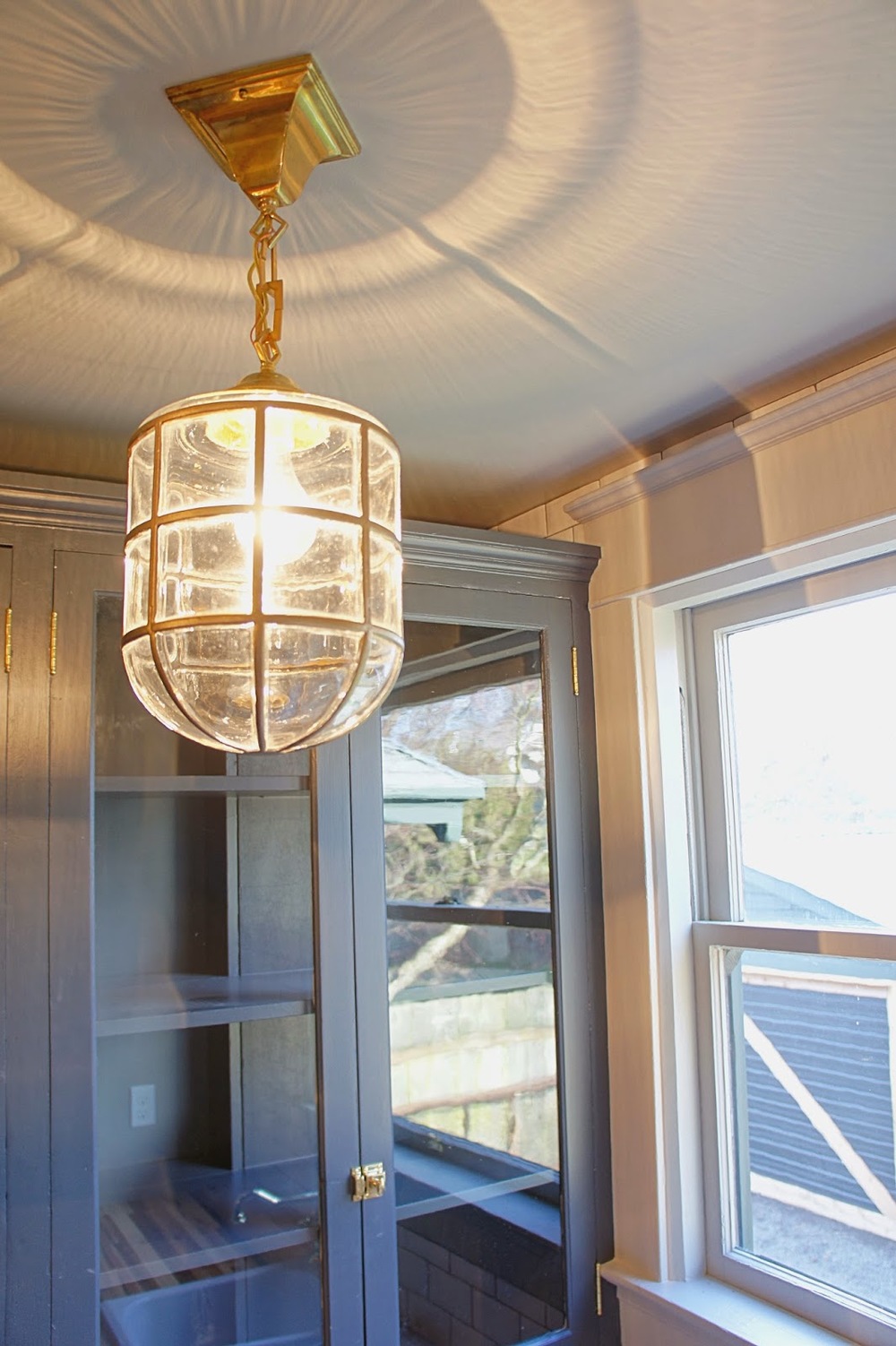
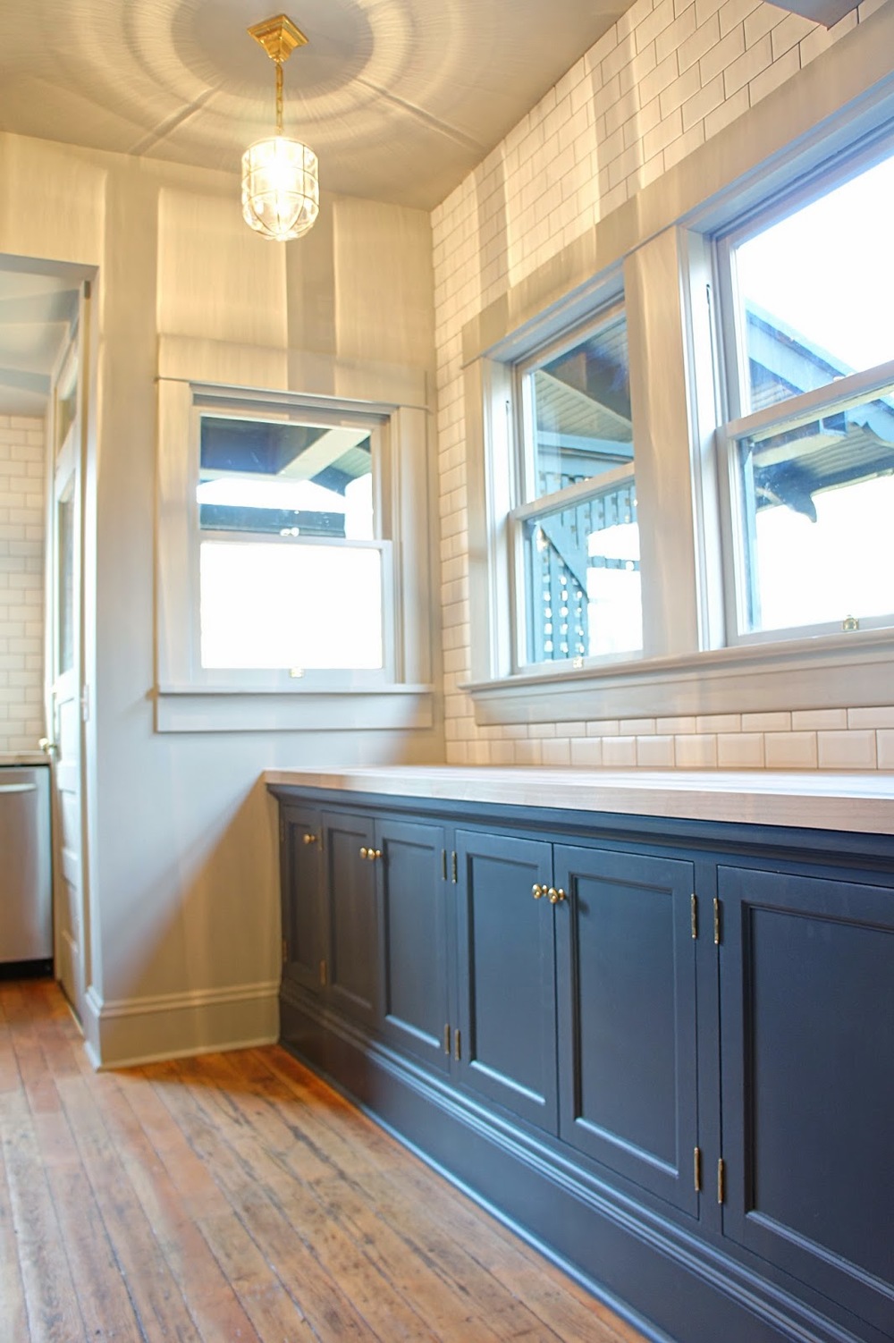
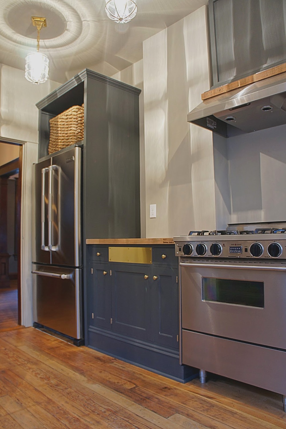
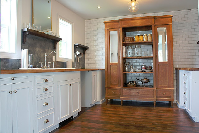
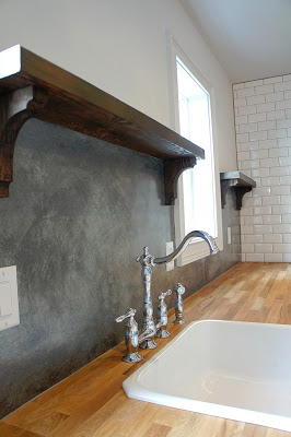
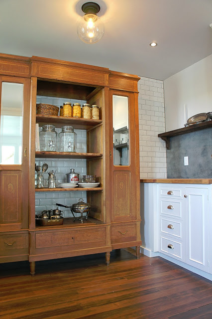
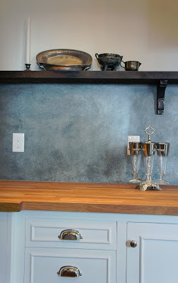
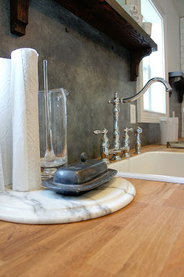
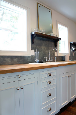
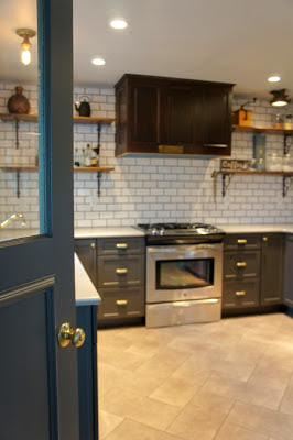
This has got to be our favorite kitchen we have done so far.  The classic elements play well with the modern colors and  rustic wood.  Not only does this kitchen meet modern day standards as far as aesthetic and space design, it also feels like a kitchen that would have existed during the time the house was built.  Success!

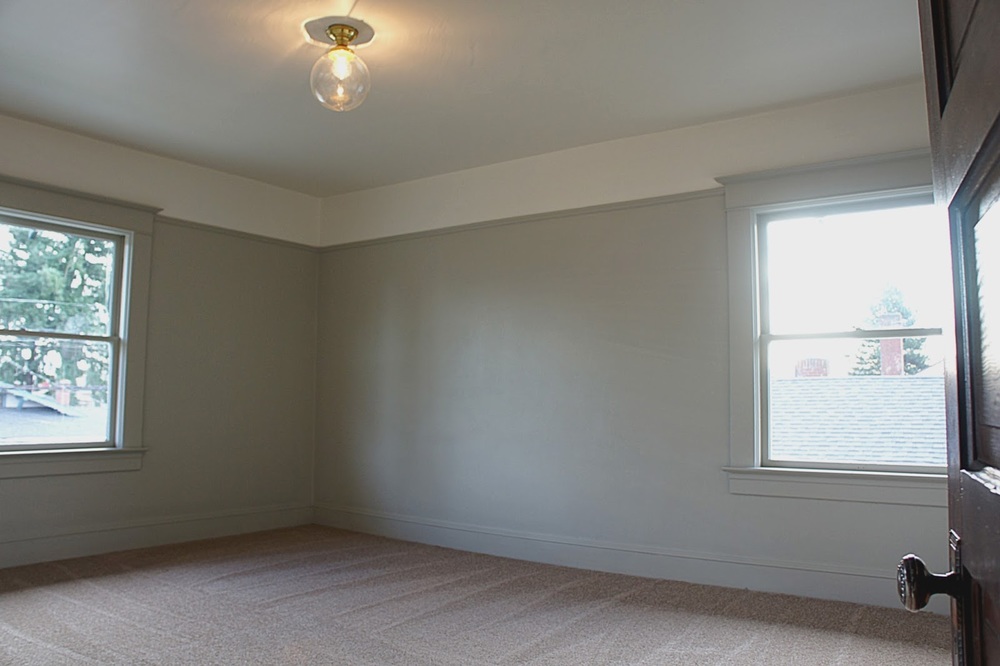
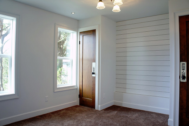
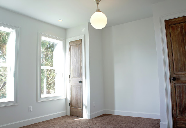
All rooms received modern paint colors and treatment.  We painted everything from the baseboard to the picture molding one color to simplify and modernize the rooms.  The result was simply stunning.

We are LOVING the modern color scheme on this house.  The colors may not be so modern, but it was how they were applied that gives the house that modern characteristic.

The character in this house was and is incredible.  Along with saving much of the original character we feel we added some modern (and unique) character too!

There she is.  It's hard to imagine what this house looked like before and it only excites us more to continue saving these amazing old homes no matter how small or grand they are!   This project taught us how to incorporate a slightly modern aesthetic while leaving the original character intact and blending them so they work together.  It was the perfect house to start our work in Portland on and we hope it lasts another 100+ years too!  Here's to the love of old homes!  Cheers!

Link to the Real Estate listing:

http://www.redfin.com/OR/Portland/3007-NE-57th-Ave-97213/home/26328817
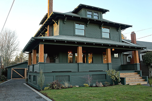
We Hit the Portland Market!


First of all, it has been way too long since our last update.  There is good reason.  From late fall into winter we have been working like crazy to get the house done and on the market.  Our original deadlines passed us by...a couple of times...but we kept at it and FINALLY got it on the market last Tuesday.  She's quite the house and we are very happy with the finished result (and to finally get a day off).  This project has taught us a lot but one thing is certain, we love old houses and we are in this for the long haul.  We are still getting more pictures of the beauty but until then, here is a preview of her all finished up!  I have included a link to the listing as well.  More updates real soon!

http://www.redfin.com/OR/Portland/3007-NE-57th-Ave-97213/home/26328817
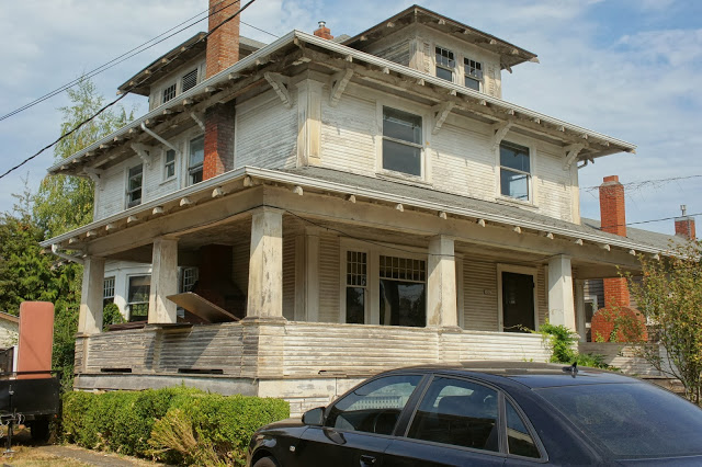
 

Old Portland Foursquare


It has been a whirlwind of a summer.  We made the big move to Portland after eight years living in Lincoln City.  It has been a long time goal of ours and we are proud to say that we made our dream a reality.  We spared no time and got into searching for a house right away.  Let's just say that it is a different world here then it was in Lincoln City!  The real estate market here is fast and there is a lot of competition for anything worth buying at a reasonable price.  We looked at countless homes.  We put in numerous offers.  It was unreal!  We kept at it, kept our heads up and reminded ourselves that with every house that fell through, there was just something better out there waiting for us.  Just as the search became even more difficult, everything basically fell into place within a of a couple of days.  We always believe that everything happens for a reason and the same can be said for the house we found.  We couldn't be happier with the outcome!   

It seems unreal that we were able to snag a house of this caliber for our first Portland house, but it also couldn't be more fitting.  This house is the most impressive house on the street and just walking around it you can tell it's not just a typical foursquare.  It is one-of-a-kind.

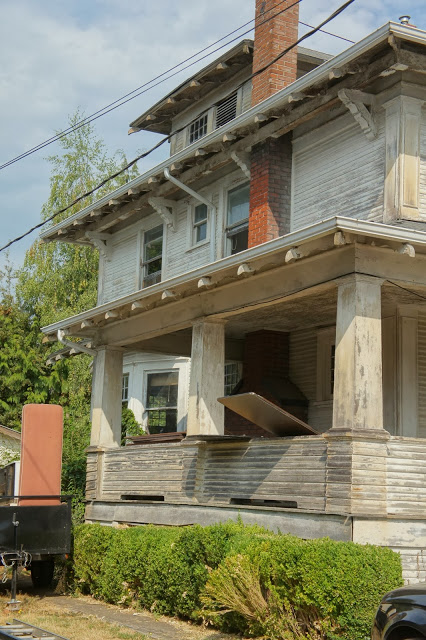
We have been reading up a bunch on foursquares since we bought the home and one unique aspect this house has is a wrap around porch, which is quite rare in a typical foursquare.  Although an impressive home, the porch definitely makes the street presence of this house far more grand then a typical foursquare with only a front porch.

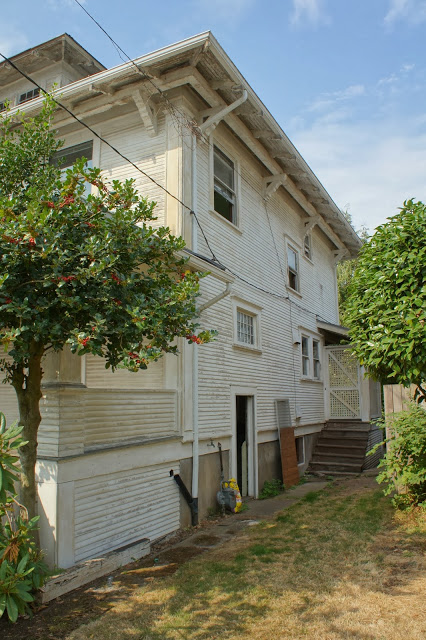
The house was built in 1908 and although it has hardly been touched since then (which is an excellent thing), it also means there is quite a bit of differed maintenance.  We honestly believe that the house hasn't been painted in 30+ years.  We have been talking colors on this one, and are actually surprising ourselves at the choices we have made.  Think historical colors painted in a modern way.  So excited for this one!

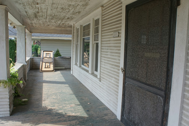
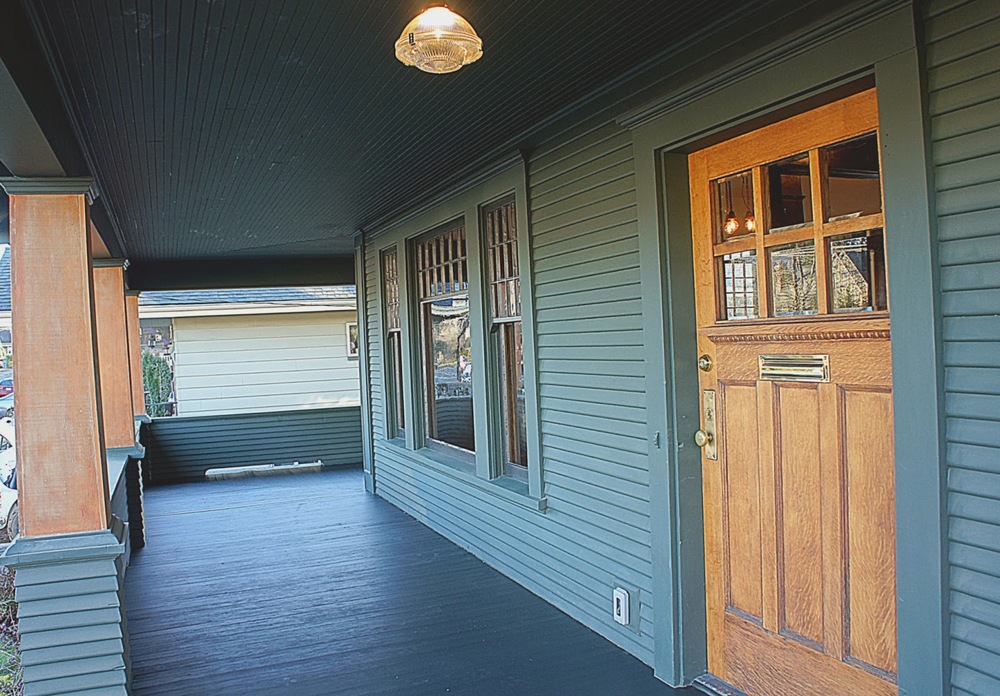
The porch is massive.  We love that original screen door, which is definitely going to be cleaned up and put back to use!

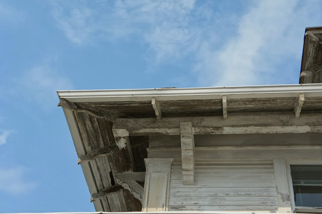
Our favorite detail of the house is under the eaves.  Beautiful corbels holding exposed beams that encircle the house and the ornate rafters are an extremely unique feature.  Although Craftsman homes are known for their simplicity, this one seems different.  The extravagant detailing makes it stand out...and we like that! 

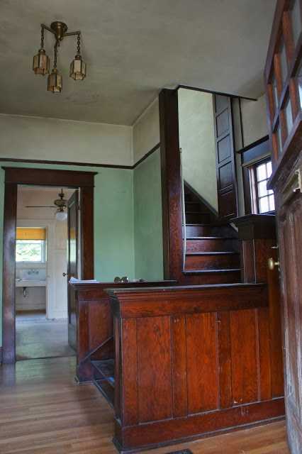
Now the inside is equally as impressive or even more so then the exterior.  All original wood work, plaster that is still in tact, original lighting, even the floors are in decent shape!

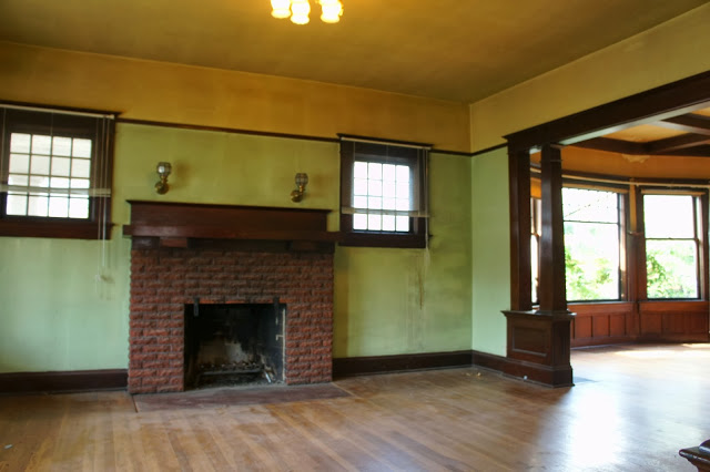
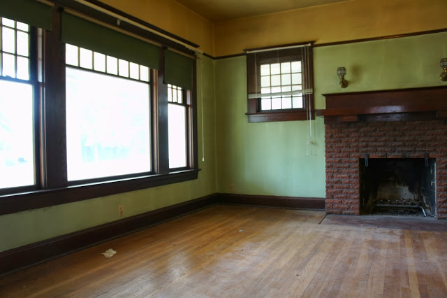
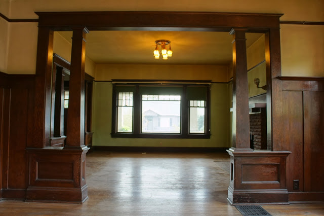
Like everything else, the living room has basically been untouched since built.  There is a lot of work that needs to be done on the walls throughout the house and the trim needs a little elbow grease, but we are really excited to put some imagination into these old, historic spaces and give them new life without ruining their integrity.

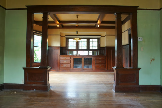
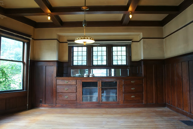
The dining room is one of the most impressive spaces in the house.  All the wood work is immaculate (for an old house that is).  We love the lights in the box beams, well...we love the box beams too!  We imagine a grand dining room with a historic feel but a modern twist in the future.

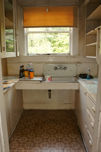
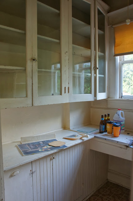
The kitchens in these old homes are charming.  They just don't live up to today's needs.  We are big fans of traditional kitchens but this one needs a little help with layout and space design.  

Those original upper cabinets will stay...but maybe get a little facelift?  Who could throw away flush faced cabinets with original wavy glass?  Unheard of!

We have already started opening up the space and plan on filling it with a lot of storage.  We are excited to see our visions come to life in this kitchen.

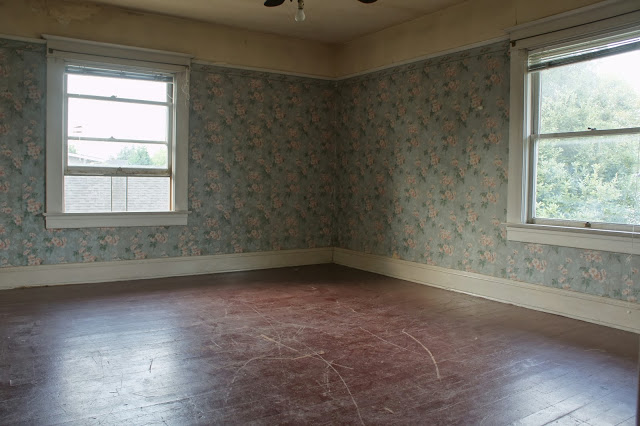
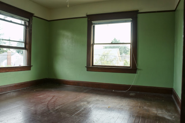
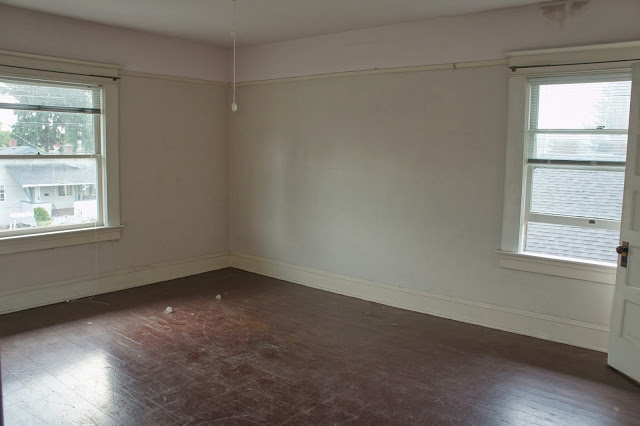
The three bedrooms are large and full of light.  Another unique feature all three have?  Large closets!!

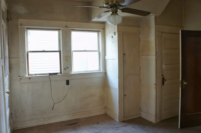
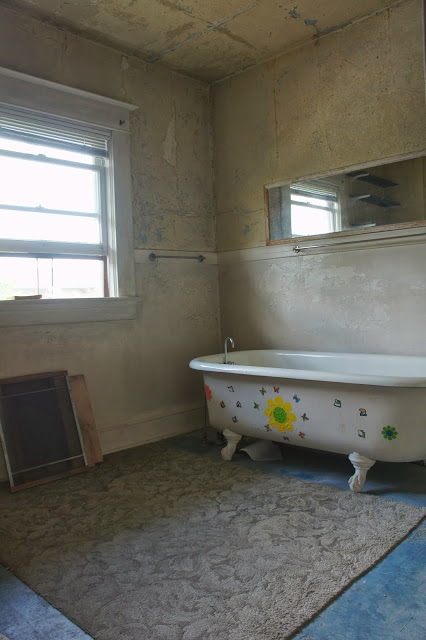
This bathroom is hilarious.  Almost like a time capsule.  The paint is peeling off every surface and although a large bathroom, the layout is not doing anything for it.  We plan on a full remodel for this space complete with a unique shower!

We love that old toilet.  Wish we could reuse it but maybe we will be able to give it life in another way.  It is beautiful.

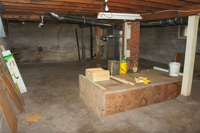
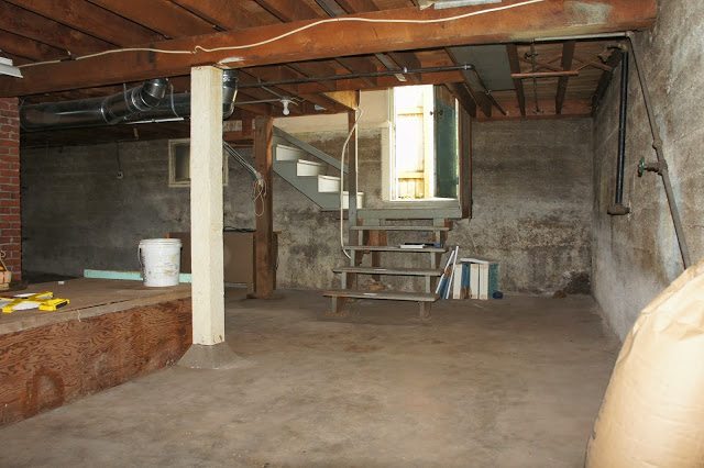
Basements in the city = additional square footage!  This basement is large and perfect for finishing.  Ideas include a media room, laundry, bathroom and office space.  It will be the perfect retreat.

We started work a couple of weeks ago on the house an it already looks drastically different.  We feel extremely blessed to be working on a home with such integrity and history in it's bones.  We cannot wait to see and show the transformation of this home as the next couple of months pass.  Stay tuned!


Port House


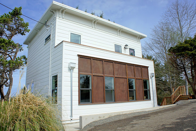
Our latest project "The Port House" just wrapped up.  We have been working all fall and winter long to get this home done in time for spring.  It was a challenging project, but we feel, worth it in the end.  We were able to be completely creative with this project and it shows.  This may be our best work yet!

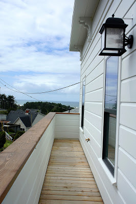
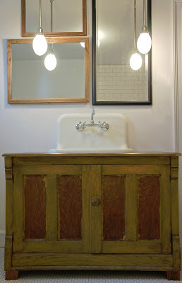
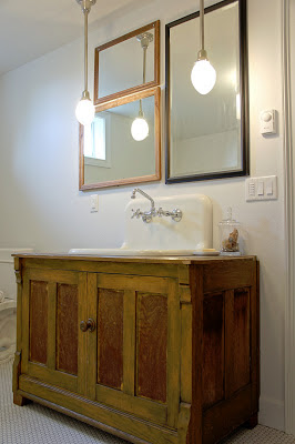
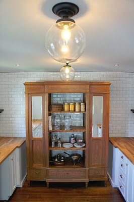
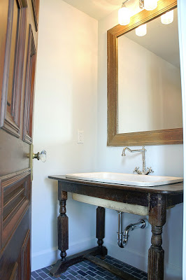
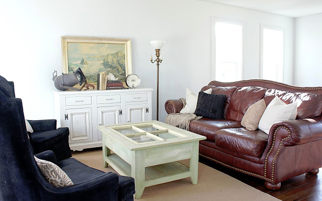
This house was mostly a newly built home so we had to create character where there was none.  We were able to resource a large amount of salvaged materials for this house and every room shows it.

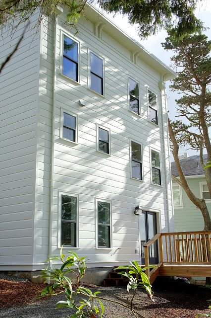
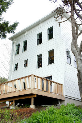
Victorian architecture was the inspiration for the exterior of the house.  Although not a true Victorian, we decided to put our little twist on the exterior facade.  The traditional Victorian became a little more modern, funky and unique.

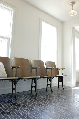
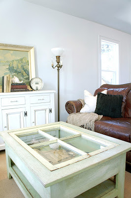
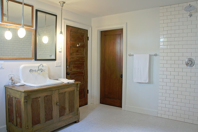
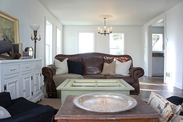
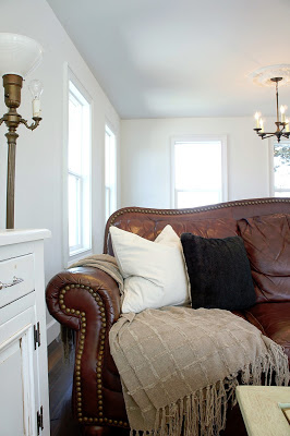
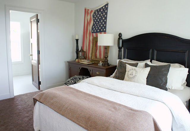
On the inside of the house, we went with a country feel.  Lots of wood, character, salvage and pristine, white walls.  We felt with all the interest going on with the materials we used throughout the house, the white walls and elegant trim would ground everything and pull it all together.

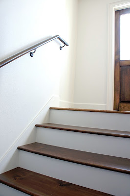
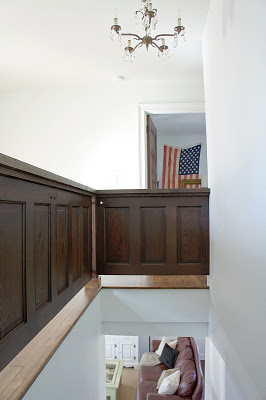
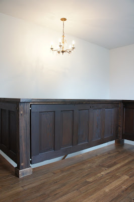
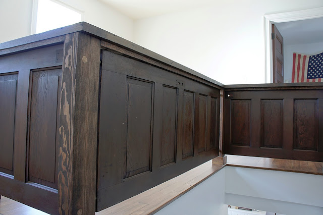
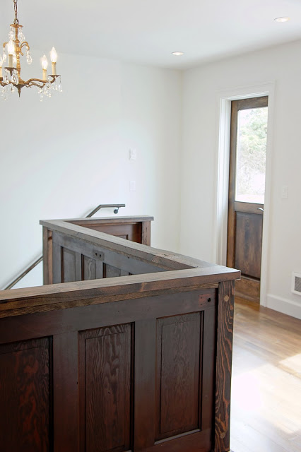
We salvaged some old five panel doors to create this new railing for the landing above the stairs.  We feel it really has a presence and a masculine feel.  To top it off, this railing was made from 100% salvaged materials including the barn wood posts and caps that were hand milled especially for this project.

The goal was to keep everything looking classic and traditional just like you would find in a country home.  It was the perfect mixture between crisp, clean and white and a little bit of rustic.

Although we are happy to be done, this project really pushed us to be creative, thrifty and smart.  We feel we conquered all three while undergoing this project.  Now onto the next one!


Bold European Design


This project was completed in the spring of 2012.  We were blessed and honored to have the best clients that gave us complete control over the design and remodel of their beach house.  We pulled out all the stops.

We went bold with the design on this house, so we relied heavily on classic materials to neutralize the look a little bit.  A lot of subway tile, wood and ceramic tile in neutral tones were used.  These choices grounded the look and kept it from being too in your face.

The whole layout of the house was changed to accommodate this stairway.  At six feet wide, we designed the stairs to represent a grand staircase found in historic homes.  We found large newel posts and classic balusters that were the perfect fit and scale for this size of stairway.  It all was painted a low luster black for that modern edge.

This bathroom was a pleasure to design.  Originally two separate rooms on two separate levels, we decided to open them up and create one large room with stairs connecting the two levels.  The room now exudes character and all original awkwardness is a thing 

of the past.

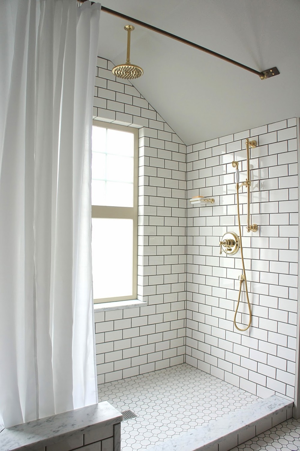
We chose to forgo the typical frame less shower doors on the shower.  We felt the look would be a little pretentious for the style and character of this home.  We left the shower open to the rest of the bathroom and hung curtains from a custom brass railing we designed.  The result turned out perfect.

The centerpiece of the kitchen includes this hood made from a salvaged five panel door.  In our designs, we try to bring in salvaged materials whenever possible.  Not only are they earth friendly and less expensive, they also add that needed character we strive so much to create.

The living room of this home was large.  Back in the day, the previous owners would use it as a dance hall!  Now this space is meant for living and relaxing.  Because there was so much room, we were able to create a whole wall of custom bookshelf built-ins.  Perfect for the homeowner's who are avid readers.

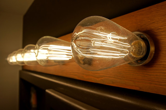
We were able to find all of the decorative lighting (as well as many other materials) for this house through salvage.  Have we mentioned how much we love to salvage?  :)

This project pushed us further to think outside the box.  Small awkward spaces were transformed into large, unique and livable rooms.  Before this remodel, the homeowners would never set foot upstairs.  With a six foot wide staircase, redesigned large master bedroom and one of the most unique bathrooms, now they have a reason to ascend!