The Morrison House: A Modern Victorian Farmhouse


The Morrison House is done.  We got her on the market last week...showings and open house through the weekend, and still didn't get a chance to take pictures until yesterday.  We can hardly keep up with ourselves these days!   One thing is for certain though, this house is very photogenic.  We want to live here.  Of course, our belief is to create homes that we would live in ourselves, but this house...is just different.  It was different from the beginning and it shows even more so now.  You just don't find a home like this in Portland and if you do, it's rare.  We knew this when we bought the place and our mission was to not only preserve the character it had left but to make it even more special than the house it was when we purchased it.  The results?  A modernized Victorian farmhouse that feels casual yet elegant.  We love this house.

Staging by:  

Kaemingk Design

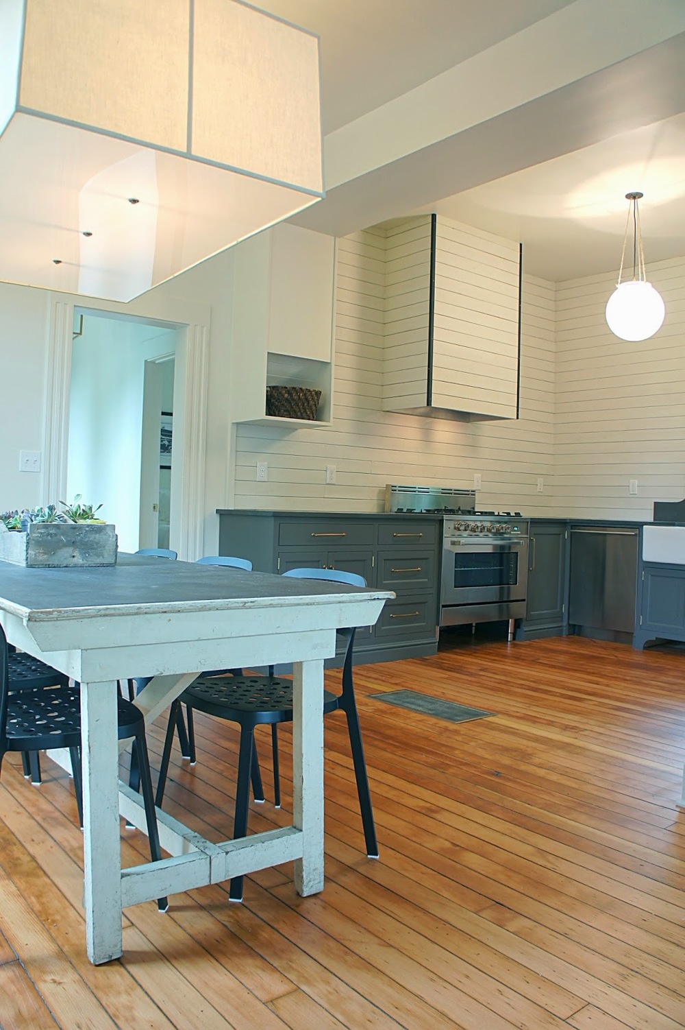
Our main objective of this house was to open the living, dining and kitchen to create large living and entertaining spaces for modern living...large enough for an eight foot farmhouse table!
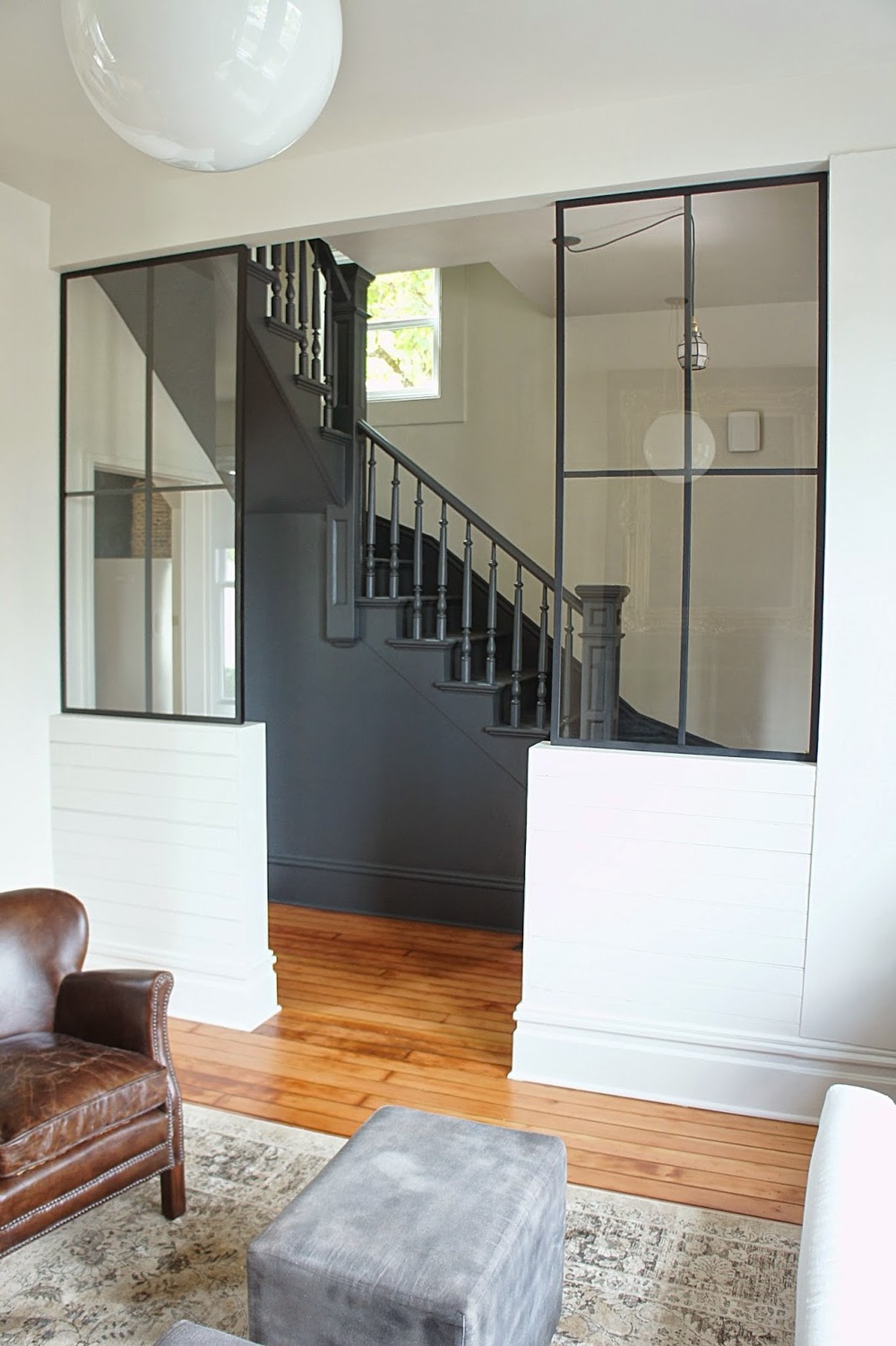
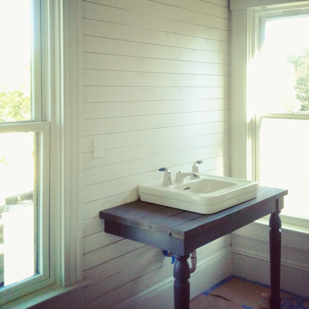
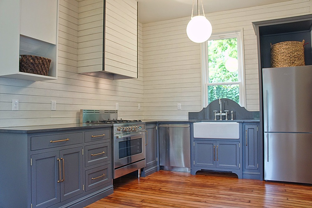
Like mentioned before, we wanted a modern farmhouse look for the house.  We clad the walls with wood to look like the tongue and groove walls you would find in an old farmhouse.  We kept the original wood floors looking rustic and added the modern element with minimal color.  The only color added was the charcoal seen throughout the inside and the outside of the home.

We were able to move the shed to a new location on the property and paint it in the same color scheme as the house.  We thought it would be perfect for a studio or guest quarters

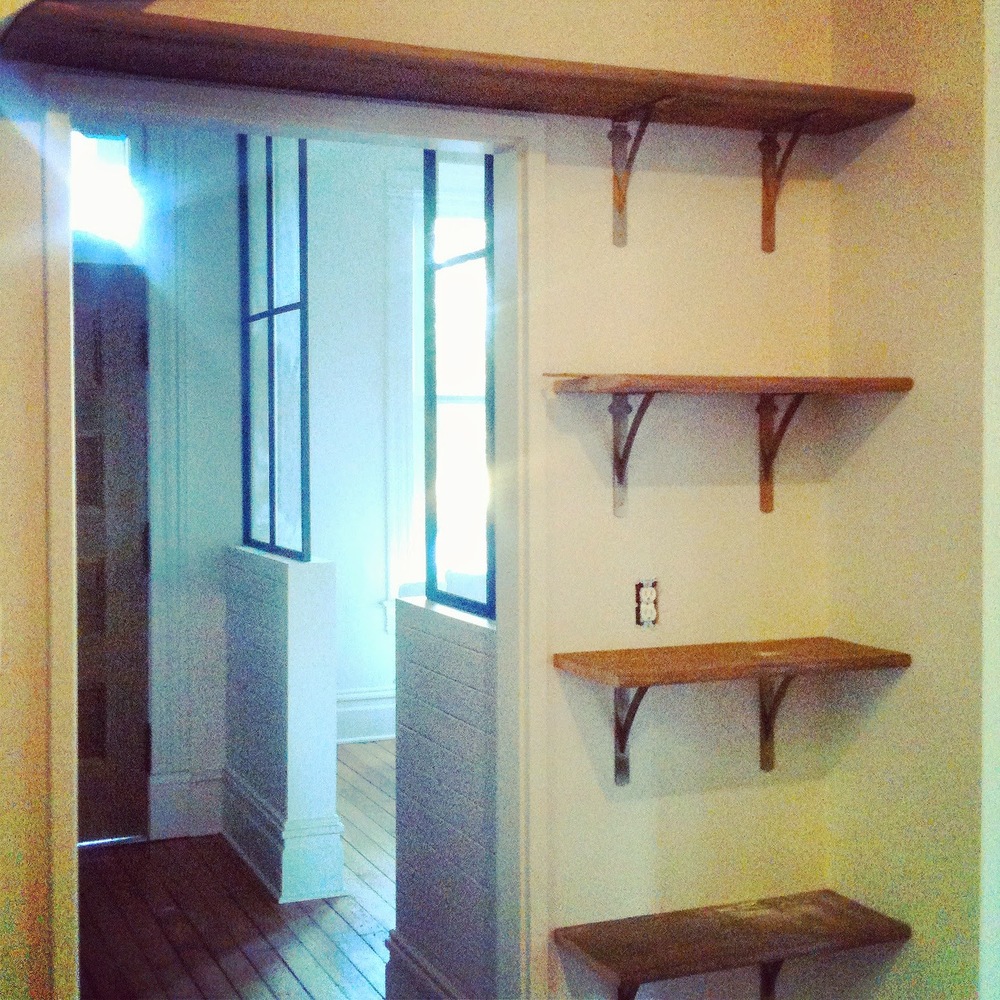
We installed these salvaged wood shelves from floor to ceiling inside a niche that was created by the underside of the staircase.  Not only do they fit perfectly in this space, they create much needed storage for the kitchen.  Plus, these shelves were salvaged from another old Victorian in town...the stair treads from the front porch!!

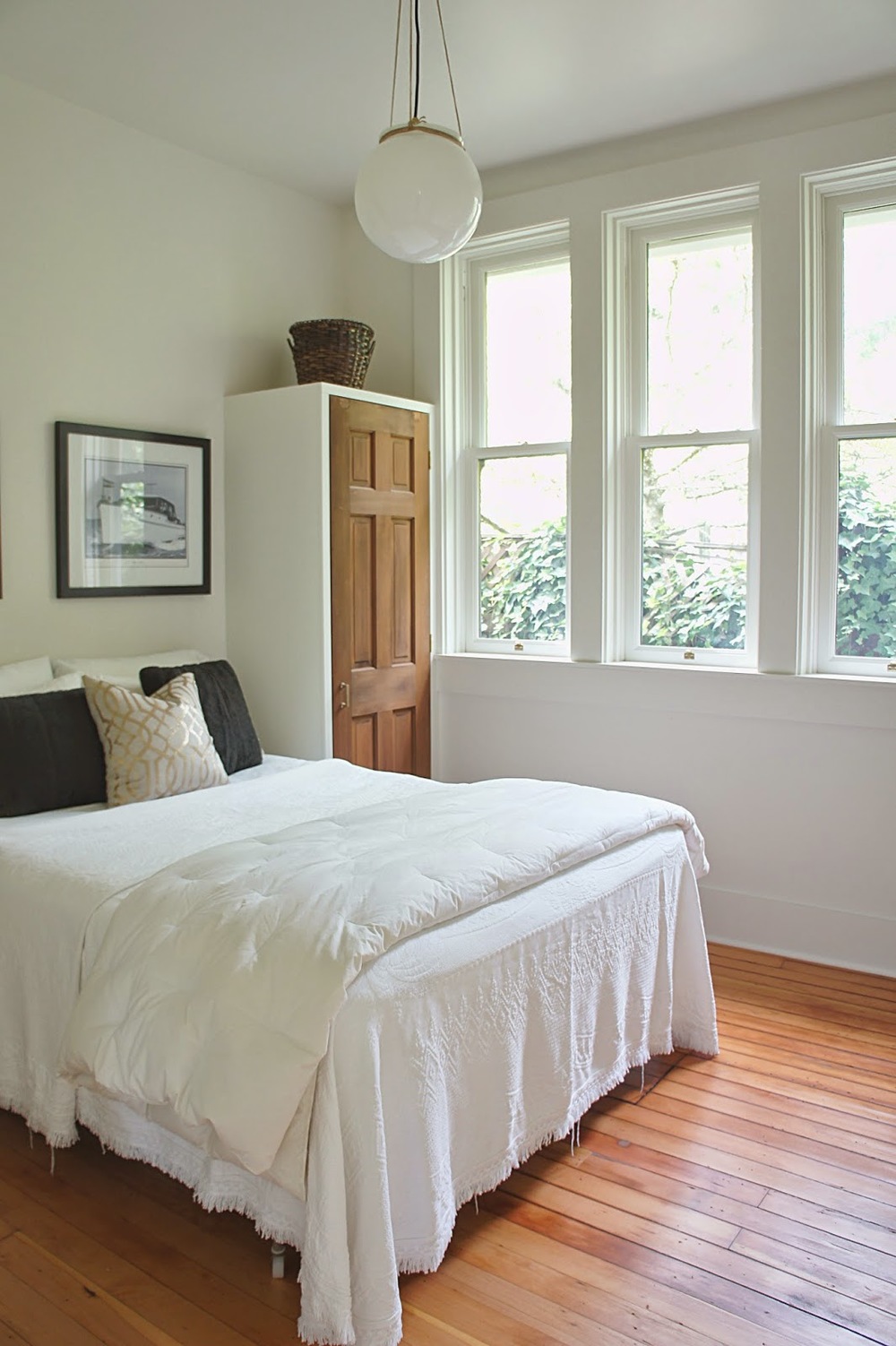
Like the Port House, we created these built-in closets to flank each side of the bed.  Instead of being a big bulky closet in the middle of the wall, we feel these are more of a feature and together create the same amount of storage space.

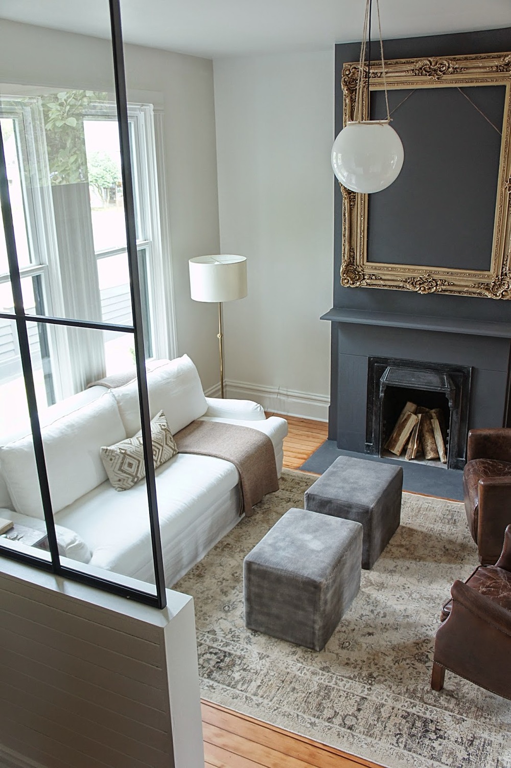
The fireplace was original to the house, so we just modernized it a bit with charcoal paint and a stucco hearth.  It now feels grounded and grand.
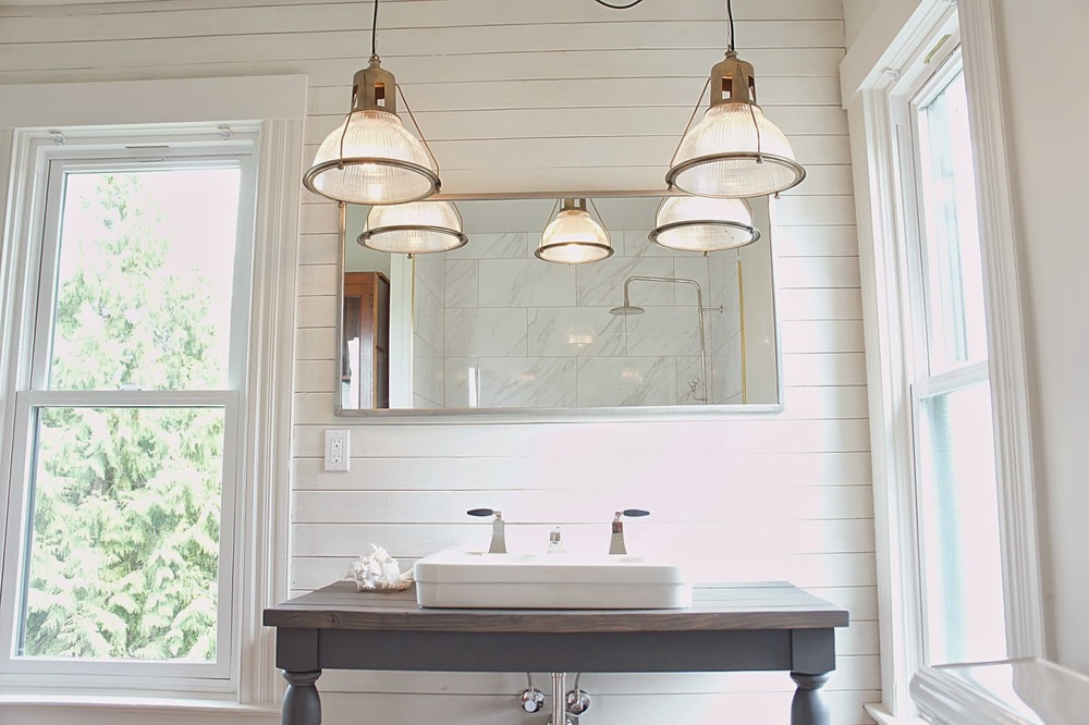
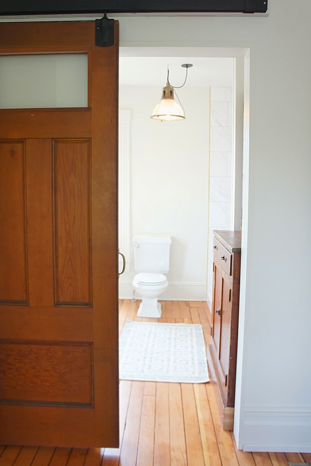
Like the lower bath, we kept the color minimal with the master bath and added interest with the tile in the shower and our industrial lighting.  The space is now large and bright and nothing less than a retreat.

The yard is one of the best features of this house.  A little larger than normal in Portland, the house sits in such a way we were able to create multiple large entertaining spaces.  Or favorite space would have to be this dining area surrounded by arborvitae. 

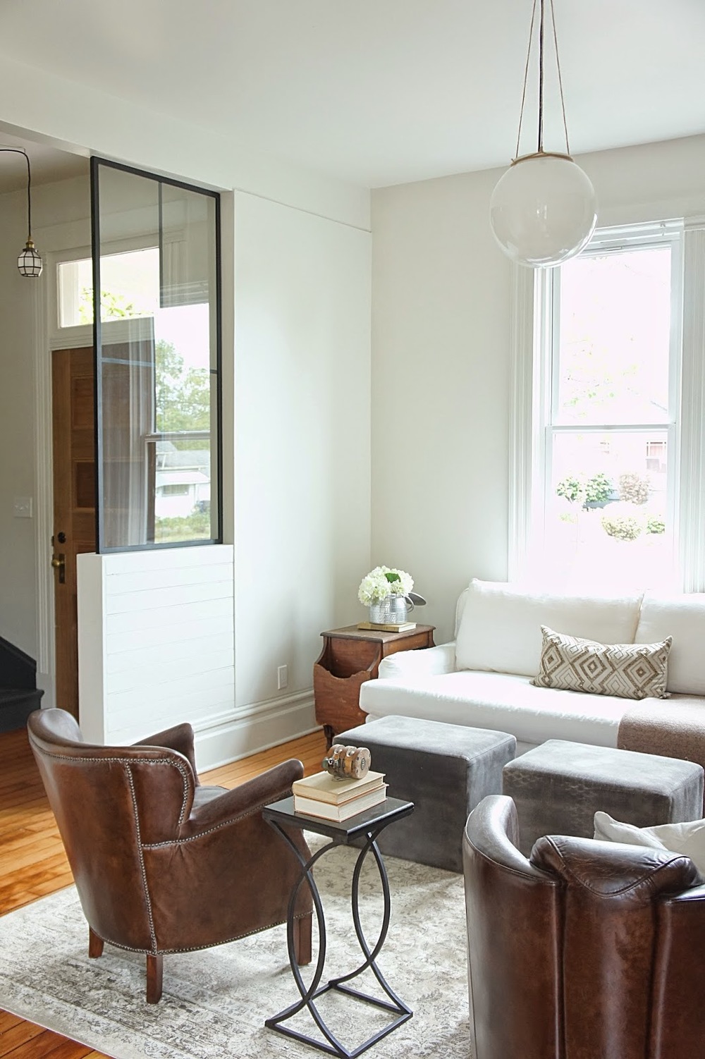
When we first bought the house, our first plan of action was to close off the entry from the living room to define each as separate spaces while making them feel more intimate.  We custom built the walls of glass, metal and wood to create that separation while the glass still let the light flow through.  The metal added the touch of modern we needed to complete the space.

We wanted both bathrooms to feel casually elegant so we went minimal on the color, used natural stone, salvaged fixtures and added a little elegance with high-end polished nickel faucets.

These built-ins were a part of the house when we bought it.  We loved everything about them so all we did was give them a coat of paint and new brass hardware.  They sing now!

We opened up the entry to the kitchen create better flow when entering the house.  After some research, we believe that the home originally flowed this way (the living room may have been more closed off originally) and we were right when we uncovered the original opening that led into the kitchen!

We are so happy with the way this house turned out.  The potential this house had to begin with was incredible and we feel blessed to have been able to work on such a rare home in Portland.  Now it's time for a small break!  For before pictures of this project click the link:  The Morrison House
 

All Done.


The last three weeks have been a mad rush to finish the Morrison House and get it on the market.  Hardly any updates, we know, but the transformation is something we are truly proud of and can test is probably our favorite home to date.  The house hits the market today (yeah!) and the link is posted at the bottom of the page.  Over the next week, we will be working on taking some after photos of the project and getting them posted.  We are excited!  Until then, here is a peek of what we have been up to the last month via Instagram.

To see the listing information and beautiful pictures of the home, take a look at the link below!

http://tours.capella-tours.com/virtual_tours/28443/mls/motion_picture


Reno Updates and Inspiration.


Well here we are mid July and the goal was to post on a regular basis and that didn't happen!  Oh well.  The Morrison House is coming right along.  Demo is pretty much done.  Electrical, HVAC and plumbing rough-ins all completed and drywall is up and in the process of being mudded.  This month is set to be a busy one!  We've been slacking on getting pictures of updates around the property but for now, here is a little inspiration for the project.

As mentioned before, a modern Victorian farmhouse is the main inspiration for the whole project.  Charcoal greys, white, and a Mediterranean landscape are where this design starts.  We are looking to go with a classic feel for the outside of the house and these colors and how they were applied are pretty much spot on with what we were envisioning.  Still on the hunt for the perfect Victorian front door...

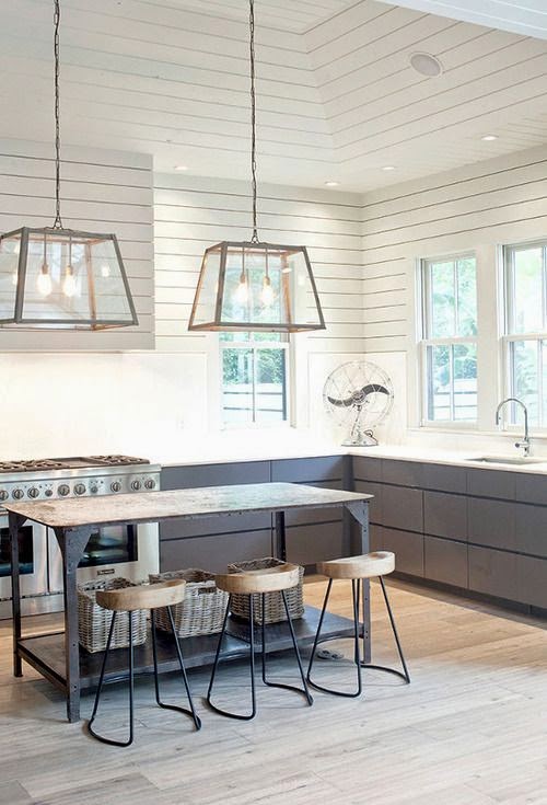
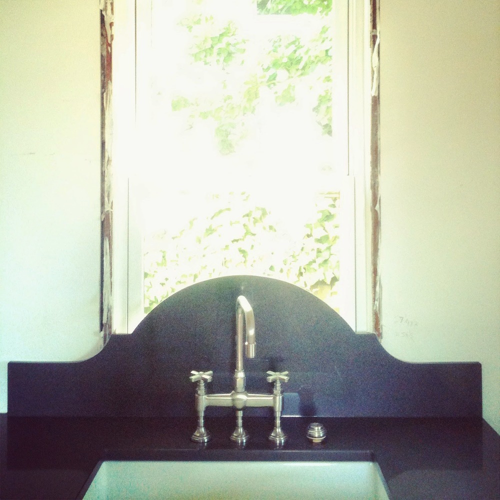
This kitchen is perfect.  We are wanting to create a farmhouse feel for the inside of the Victorian and we feel this kitchen has the perfect combo of farmhouse and modern style.  Our plan is to create a similar look with the ship lap walls, but our plan is to incorporate a more traditional cabinet with brass hardware, unique lighting and a stunning spot for the kitchen sink.  Can't wait!

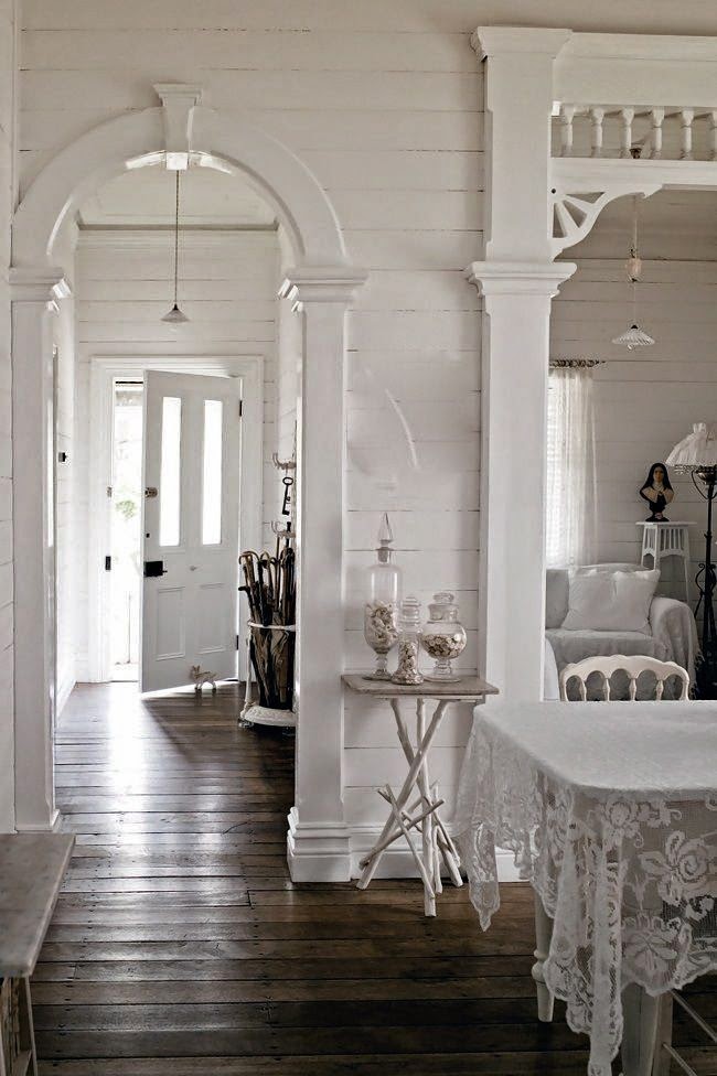
As much as we would love to create these amazing Victorian details around the passageways in the house, it's probably not realistic.  But we do love the walls, rustic floors and the layout is almost exactly the same as the Morrison House! 

Now here is where we add our touch of modern.  The minute we saw this staircase we decided it needed to be done in the Victorian.  We've done black staircases before and we are excited to do it again.  We are even hoping to recreate that wear on top of the railing and newel posts.  An all white interior with an all black staircase?  Serious style!

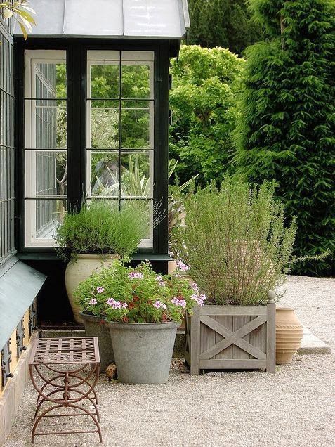
The landscape at the house is already on it's way but from the beginning, we'd dreamed of a Mediterranean landscape.  Think lavender, sage, cypress trees, decomposed granite patios and gracious outdoor living areas.

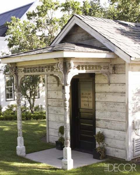
Now the outdoor area wouldn't be complete without a mini Victorian shed!  We have plans to convert the shed into a cute Victorian outdoor living space...perfect for guests in the summer.  This converted shed has us in love, so we will see what we can accomplish to ours on our budget and time frame.

So there you have it.  A glimpse into what we have in store for the Morrison house.  If you want to see more of what is inspiring us for this project, take a look at Chelsea's and Brandt's Pinterest boards...and follow us!  We are excited to incorporate these ideas into our design and vision for the house while putting our spin on them.  The little things are starting to come together and it is going to be exciting to watch it all come together.  More to come!


The Morrison House.


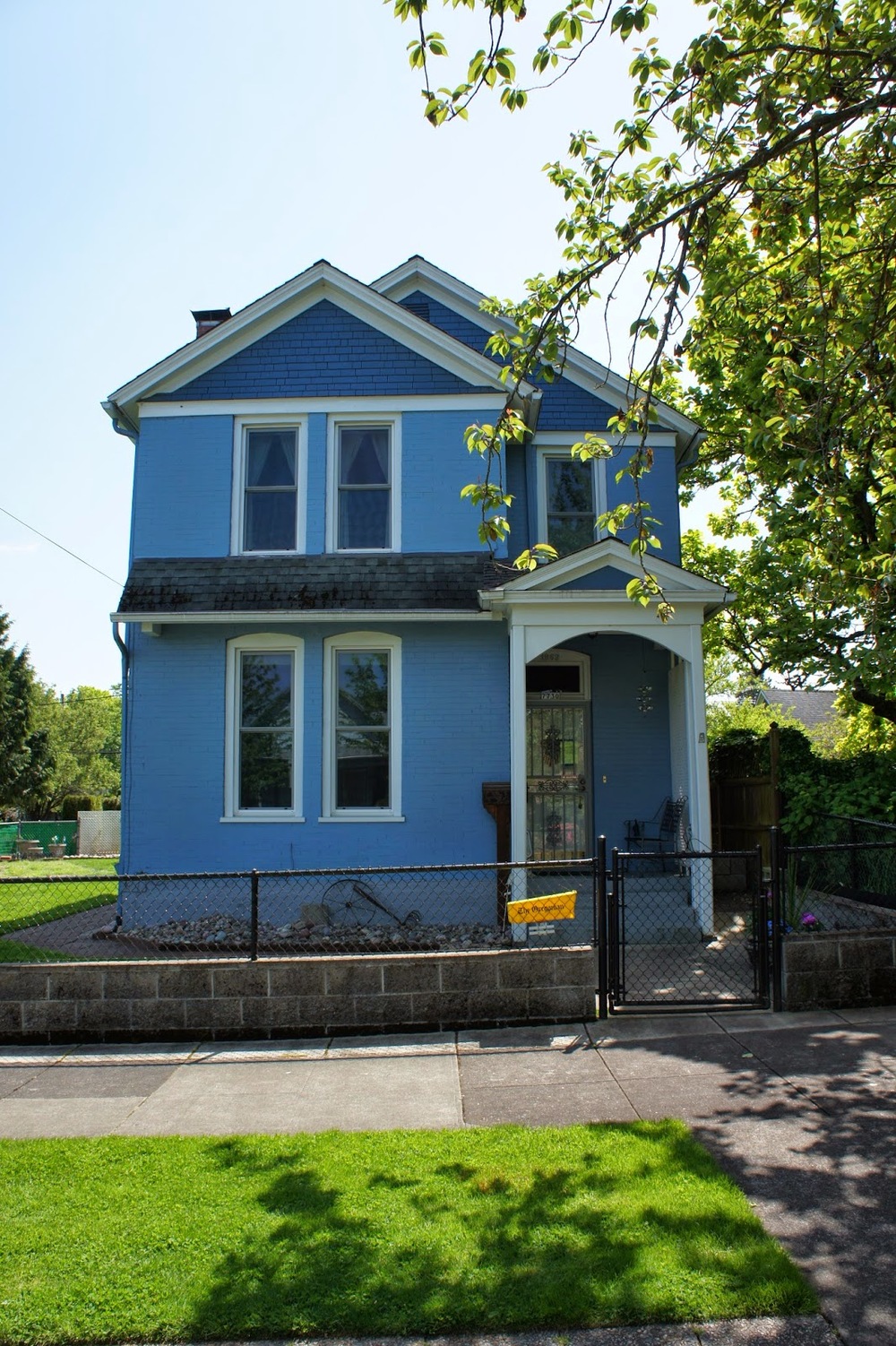
Remember way back, when we mentioned how much we love Victorian homes?  Well, we have our next project lined up and guess what?  It's nothing other than a 1894 Victorian!  We are wrapping up our latest project this week (which I will post more about later), and work will start on this home shortly thereafter.  We already have a large scale of ideas ready for this project but have some fine tuning to do as we move along.  

The house is gorgeous and in great condition.  It is hard to tell from the picture, but the siding is brick and that really excites us.  Over the years, some of it's original character has been stripped and we have plans to add some of that back during renovations.  Word has it, a porch ran the length of the house but was torn off sometime before the 1950's.  One thing is certain about this house is that we can go either way with it...super simple Victorian farmhouse or a more ornate version adorned with corbels and intricate trims.  Stay tuned.

This front porch was original but the columns have been replaced as well as the stairs leading up to the front door.  Although the original stairs were wood, we like the fact they are poured concrete.  We have exciting plans in store for those steps!

Now the brick siding is evident in this picture.  Isn't it beautiful?  We especially love the arched windows.

We love that the original staircase is in tact.  Since we love historic staircases, our plans are to keep the integrity while modernizing it and making it something really special.

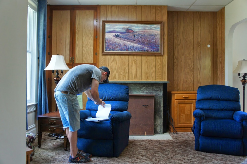
 The living room is right off and completely open to the entry way.  We have plans to make this space feel more intimate and special, like a true Victorian "parlor" or living room should feel.  There were drop ceilings installed throughout the main floor in this house, so that means tall ceilings!  Those will be the first to go!

The dining room right off the living room is very spacious and can you say bright?!  Lots of potential here.

Now off the dining room, is a room that was being used as a bedroom but we plan on turning into the kitchen.  Our plan is to create an open living, dining and kitchen area that caters to modern day living while keeping the Victorian spirit alive.

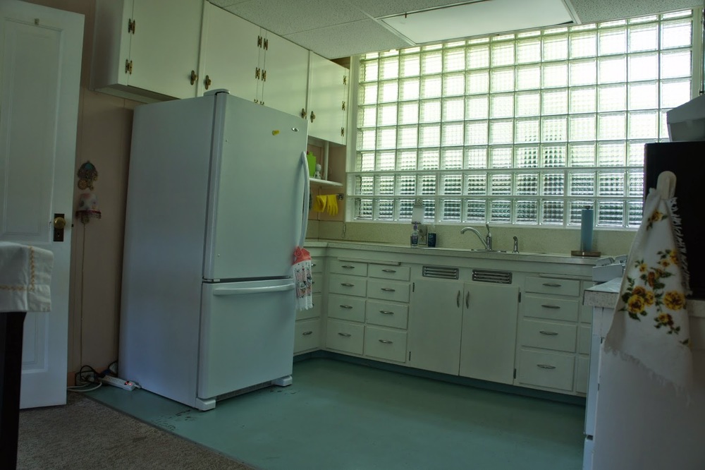
How funky is this kitchen?  We love the light the glass block adds but we plan on changing the opening to something a little more traditional.  The current kitchen is an open and large space, which is good, but we plan on moving it as mentioned earlier.  The plans for this area are to become an awesome bedroom...that is on the main floor!

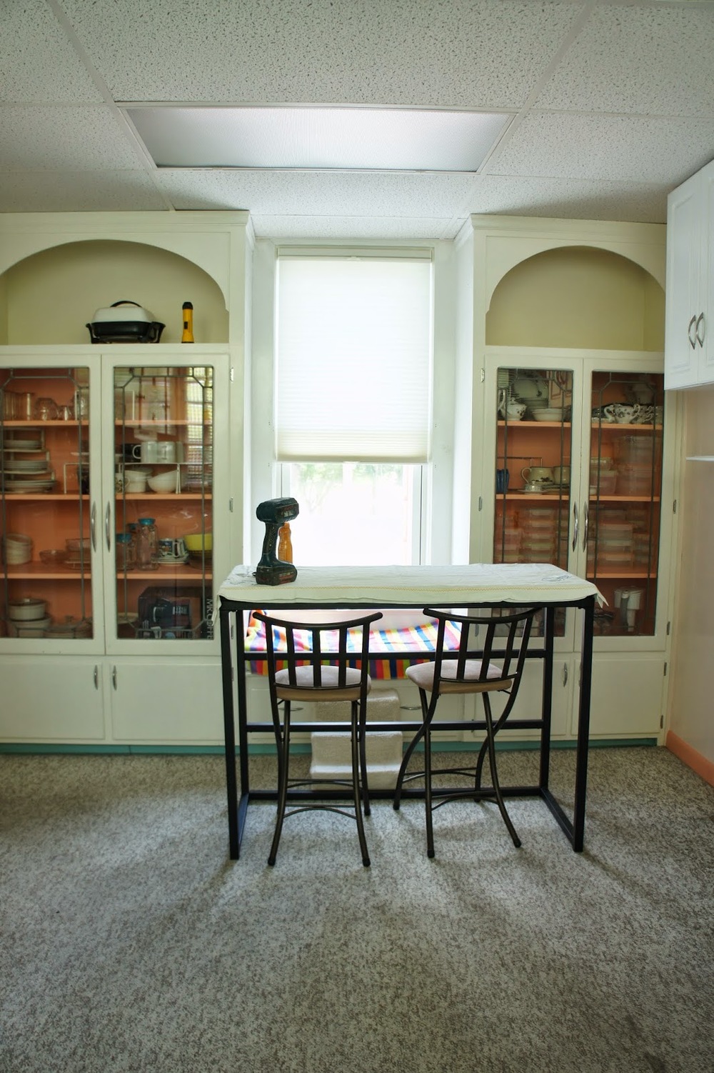
The other side of the kitchen houses these leaded glass built-ins, which we plan to keep and update.   Our plans are to make this space a hallway.  Upon removing some of the drop ceilings in this area...we found a surprise which I will elaborate more on later! 

Off the kitchen, there have been a couple of additions which make the back of the house and the interior spaces pretty awkward.  Although we love salvaging, we plan to demo and rebuild this area to look more cohesive with the rest of the house on the exterior, while providing optimal flow on the interior.

One thing that will remain the same in this area is the entrance to the basement.  We plan on keeping this area and turning it into something truly special.  Let me just say...I would die for something like this in my dream home!  More to come on this...

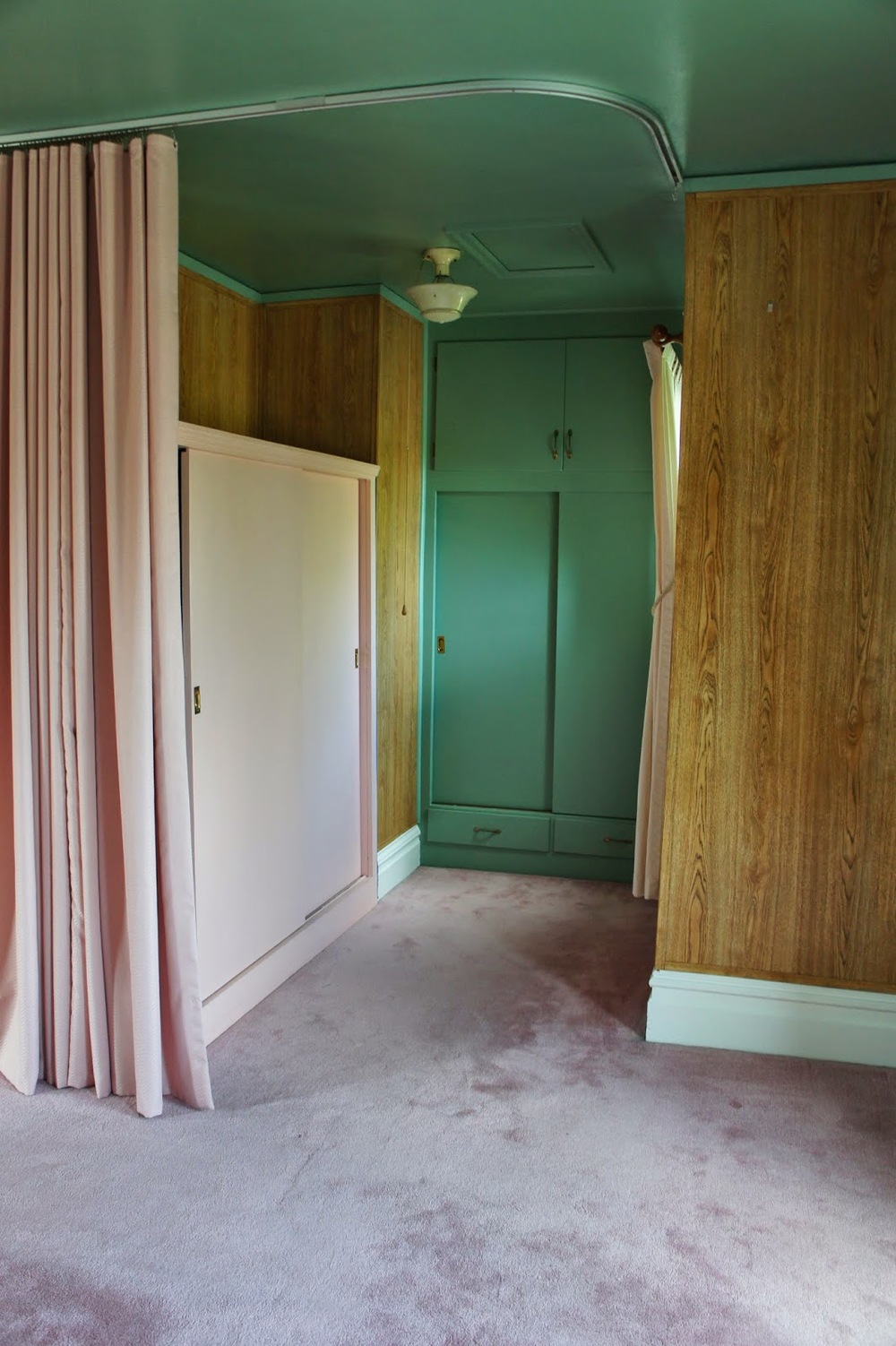
The master bedroom is located on the second floor and has huge potential.  The space is large, bright and unique.

We plan on converting this area into a unique walk in closet.

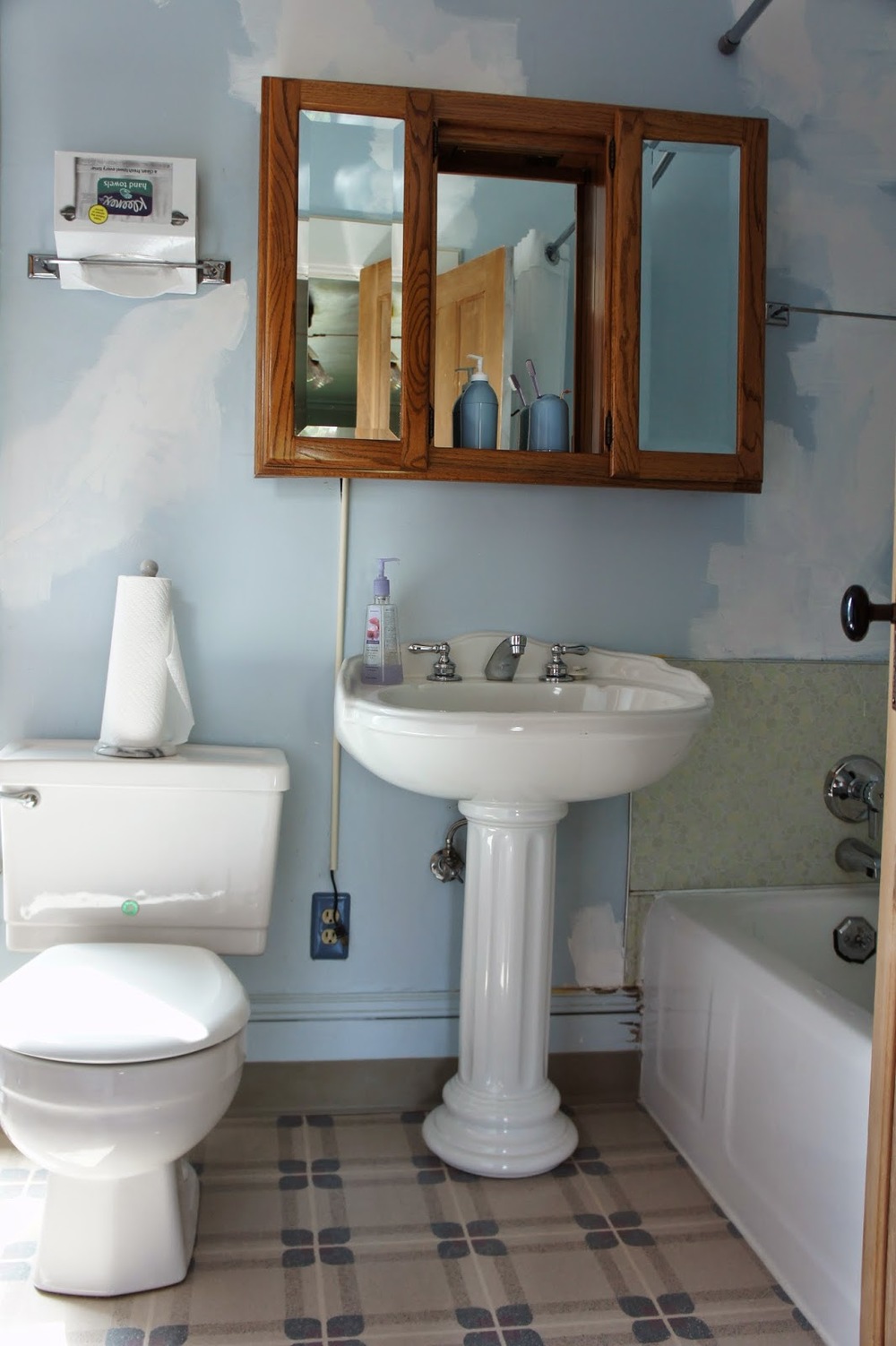
Since there is already a bathroom attached to this bedroom our plans are to expand the existing bath into the master since the space is there and currently unused.

The current master bath is small, but not tiny.  We plan on rearranging the fixtures and expanding it to make it more luxurious and practical.

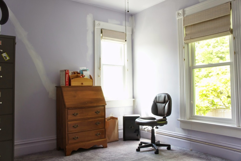
The upstairs guest bedroom is charming and doesn't need much other than small cosmetic changes.  We plan on taking some square footage from the adjacent bath to make a closet for this space.  How about those original trims?

One other special thing about this property (other than the amazing home sitting on it) is the yard.  Being a corner lot, the property is a commanding presence from the street.  The house also sits very close to the edge of the lot, making a large lot in Portland feel even larger.  We have plans to make this yard as gorgeous as we plan to make the house.  Think entertaining spaces, a special retreat, and a Mediterranean vibe.

This property has a lot of out buildings.  They are all clustered toward the back of the lot, making it somewhat awkward and cramped.  We plan on moving the shed and converting it...to something we are really excited about!  

Work on this project begins very soon. There is so much to write about this place, it's difficult to fit it all in one post.  We can't wait to break ground!  Stay tuned!


Livingetc Magazine!

The past month we have been in and out of magazine stores around town trying to get our hands on the 2014 May issue of Livingetc Magazine.  For some reason, their issues don't arrive a month early here like other magazines.  So today, we were finally able to get a hold of their May issue and take a peek of the article in which we were featured.  


Look familiar?  Yes...it's the shower in Bold European Design.  We were surprised to find out that the picture was featured twice in the issue.  They also featured it on their Design Planning table of contents cover.


The article features numerous showers of varying styles that are on trend right now.  Though all the other rooms were completely stunning, one thing we noticed that distinguished our shower from the rest was that we were the only one to use a shower curtain...and brass.  We will always be fond of shower curtains because they add a layer of softness where frame-less glass doesn't.  Both the curtains and brass also offer a period look to a seemingly modern space, which is something we LOVE and love to incorporate into our designs.


It was a pleasure to be featured in such a widely known magazine.  We are thankful for the people who stand behind us in our work as we continue to grow and refine.  We couldn't do it without you guys!  More exciting news for us to come, more blogging, more pictures, more design, all very soon!

And...Happy Mother's Day to the wonderful Moms in our lives.  We love you!